by Debbie Hodge | Jun 11, 2013 | Composition, Feature, Photos, Picture Your Story
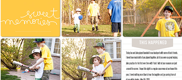
Got lots of photos? Check out the Get It Scrapped team’s ideas for getting 10 photos onto the page. Tara McKernin says, “This layout is for my Project Life album showing my boys and their friends playing baseball one night after school.” “I love grid...

by Debbie Hodge | Jun 6, 2013 | Feature, Patterned Paper
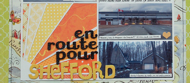
by Debbie Hodge Love mixing lots of patterns on your scrapbook pages? One of the many lessons Lisa Dickinson shared in Oomph and Polish at Masterful Scrapbook Design was this one for combining patterned papers: Multiple patterns directly overlapping one another can...

by Debbie Hodge | May 30, 2013 | Composition, Feature, News
[threecol_one] by Debbie Hodge Since I finished the newest Scrapbook Coach Class “Symmetry,” several lines from Jane Siberry’s geek-girl song of the same name are running through my head. I’ve been singing them to my family: “Symmetry is...

by Debbie Hodge | May 29, 2013 | DoubleUp, Feature, Sketches and Layered Templates
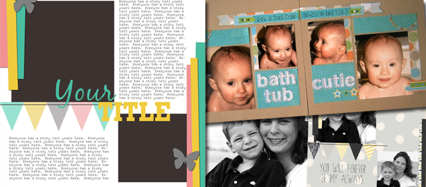
See how scrapbookers Tara McKernin and Brenda Becknell used a one-page sketch/template from Amy Kingsford’s May 2012 Freebie Pack on their two-page layouts. Brenda Becknell says, “My nine month old grandson loves bath time! I rotated the original...

by Debbie Hodge | May 28, 2013 | Color, Feature
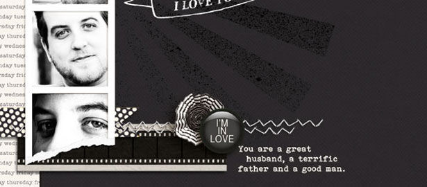
Creating a black-and-white scrapbook page offers opportunities and challenges. You can create eye-catching contrasts, but attention to values becomes important for adding interest, creating a focal point, and guiding the eye. See how our Creative Team...

by Debbie Hodge | May 22, 2013 | Color, Feature, Ideas via Product & Technique
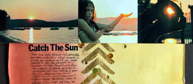
by Debbie Hodge Surface treatments that add a golden finish are trendy in home decor, and gold is showing up in fashion, too. Gardener Susan Cohan says, “Opulence isn’t a dirty word. After years of frugal garden and DIY design options ie. the pallet craze and...
