
Got lots of photos? Check out the Get It Scrapped team’s ideas for getting 10 photos onto the page.
Tara McKernin says, “This layout is for my Project Life album showing my boys and their friends playing baseball one night after school.”
“I love grid layouts, which was part of the draw of project life for me in the first place. This template from Cathy Zielske allows for photos and journaling spots in a clean grid format. It also allows me to highlight lots of images, and I was able to pull it together cohesively by pulling my accent colors from the images.”

Sweet Memories by Tara McKernin | Supplies: Template,Cathy Zielske; Elements Jade and Midnight Project Life digital kits
Meghann Andrew says, “This layout records my absolute obsession with food and how I think I missed my calling by not becoming a chef. I often photograph my food with Instagram, so I had plenty of photos to choose from. I just chose the 10 best meals from the past few months.”

My Love For Food by Meghann Andrew | Supplies: Patterned paper- Studio Calico (polka dot, stripe, heart), Crate Paper (tag), American Crafts (red dot); washi tape- Freckled Fawn; journaling tags- October Afternoon & Elle’s Studio; vellum shape- Studio Calico; stamp- Studio Calico; ink- Stampin’ Up!; dimensional alphabet- American Crafts; wood veneer shapes- Studio Calico; epoxy stickers- My Mind’s Eye; button- Queen & Co.; tab- Smash; letter sticker- Cosmo Cricket; die-cut file- Studio Calico; twine- Martha Stewart
Adriana Puckett says, “This layout shows the story of us eating our way through Disney World–and it reveals our obvious family-wide sweet tooth!”
“I love double-page layouts with lots of photos to tell a story like this, one in which there are lots of similar photos (like these of us eating). To create uniformity between the two sides, I used the same paper as the base and repeated the patterned paper in elements on each side.”

Hello Sweetness by Adriana Puckett | Patterned paper and embellishments: Sweetness by One Little Bird; Templates by Janet Phillips; Flair: Petal Pushed by One Little Bird Designs; Font: DJB Digi Jenlin
Terry Billman says, “My husband and I recently visited our daughter and her husband in Hawaii. My husband is an avid golfer and was excited to visit several courses in Waikiki.”
“Since most of the golf shots were taken vertically, I grouped ten narrow vertical photos across the two page layout at varying heights. I applied a soft light blending mode on one copy of the photo blended in the background, and applied a color burn blending mode on the bottom copy of the photo.”

Golf Waikiki by Terry Billman| Maplebrook Studios: Just Linens 28, Just Linens 24; Anna Aspnes: Word Label Template 2
Sue Althouse says, “This page is about celebrating my mother in-law’s 80th birthday.”
“The 4″ x 6″ photo is the largest, the only photo in portrait orientation. It’s placed at the the beginning of the layout on a separate mat, making it the obvious focal point. The supporting nine photos are 3″x3″ candid shots taken during the birthday luncheon. Patterned paper strips and the title span the entire layout, while three embellishment clusters form a visual triangle.”

Happy 80th Birthday by Sue Althouse | Supplies: Cardstock: Bazzill; Patterned Paper, Alphabets, Stickers, Flair: American Crafts; Border Punches: Martha Stewart
Heart Punch: Fiskars; Ink: Tim Holtz; Stickers: Jillibean Soup; Brad & Flower Die Cut, Chipboar: Simple Stories; Wood Veneer: Studio Calico; Design based on a sketch by Allison Davis
Stefanie Semple says, “These photos are of my second son and some of his classmates when they went paint-balling.”
“I added the photos in order from left to right chronologically, starting with their before group shot. The second large photo is a gorgeous action shot of him firing his gun which I thought also deserved a bigger allotment of space. The smaller landscape photos are group shots, showing action and interaction between the players. The smaller portrait shots are all focused on him. I chose this template from Janet Phillips for the options of photo spots, but also for the triangular paper spots shaped like banners or flags, knowing that one of the objectives of their games is to capture the flag. I used paint spots behind my word tags as a foundational element and to add some contrast from the photos. The word tags form the visual triangle, they all have a foundation of paint splat, a metal embellishment and the grey word art in common. The title also has paint splats and doodles behind it, a metal embellishment and flair to dot the eye and some string woven through it to add a sense of movement. My journaling and date are in white and add the information without detracting from the photos.”

PaintBall by Stefanie Semple | Supplies: Janet Phillips: 2 many photos 165 (template); Victoria Feemster and Litabells Designs Collaboration: 100% Boy (kit)
Brenda Becknell says, “We visited the Warther Museum in Dover, Ohio and were amazed at the hand-carved wooden trains with the amazing detail on every item.”
“Since the photos had fairly dark backgrounds, and were mainly in shades of brown and black, I kept the papers neutral, using medium and light tone browns with some touches of red and black. The photos were sized at 3″x4″ and 3.25″ x 5″, leaving some open space of patterned paper at each end. Since the photos were arranged in linear blocks, I fussy-cut the chevron paper for the border and added torn washi tape and round brads, just to add a little contrast to all the straight lines. I also added a train-shaped ticket from the museum as a page accent.”

A Visit to the Warther Museum by Brenda Becknell | Supplies: Cardstock: Bazzill; Patterned Paper: Jillibean Soup, Echo Park: Alphabet stickers: American Crafts, October Afternoon; Alphabet rubons: American Crafts: Diecuts: Crate Paper; Brads: Basic Grey
Rosann Santos-Elliott says, “I love cars. Always have and always will. The pictures are from the NYC Car show. I wanted to show that a girly girl could like muscle cars so I used ink and yellows in the journaling cards.”

A Few of My Favorite Things by Rosann Santos-Elliott | Supplies: Cathy Zielske: Hello Girlie Journaling Cards, Daily Journaling Cards; Ardent Sparrow Designs:Lulu 4×6 Cards; Melissa Wilson: Filler Up journaling card #3, Domesticated Lady; Heidi Swapp Enjoy Words.
Debbie Hodge scrapbooked ten streetsign photos from New York City on this two-pager. She says, “I featured one photo on a vertical band along with the titlework. The rest of the photos I grouped together, cropping them in a variety of sizes and filling in with patterned paper bits to complete the block.”
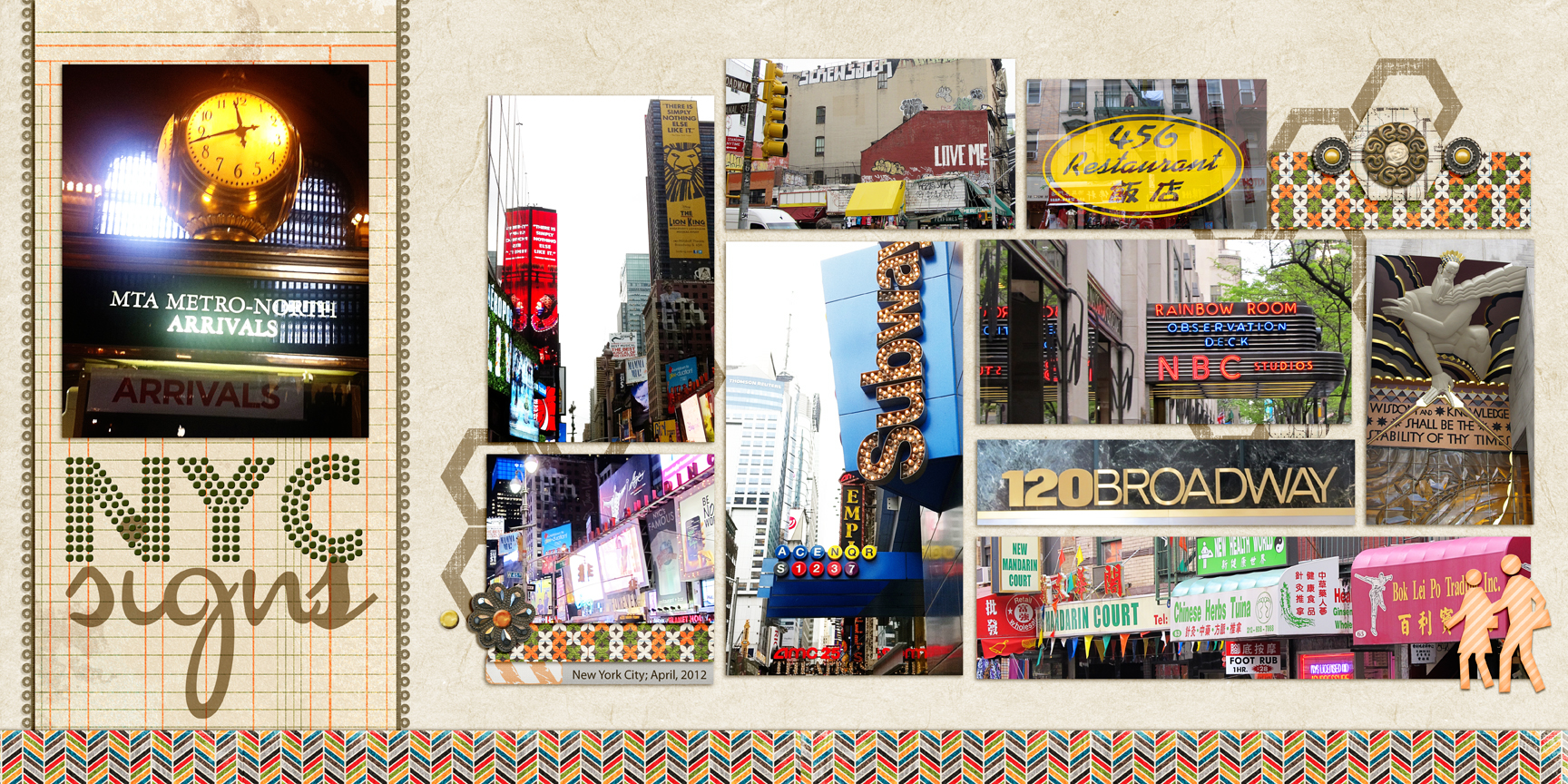
NYC Signs by Debbie Hodge | Supplies: The Traveler by River Rose; 11:30am by Amy Wolff; Thankful for You by Jenn Barrette; Artplay Concerto by Anna Aspnes; Master Gardener Borders by Jesse Edwards; Fortuna Dot, Cocktail Script fonts
[current]
