
 Creating a black-and-white scrapbook page offers opportunities and challenges. You can create eye-catching contrasts, but attention to values becomes important for adding interest, creating a focal point, and guiding the eye. See how our Creative Team has approached this challenge — and make your own page.
Take the challenge: Make a new black-and-white scrapbook page. Put it in our Community Gallery with “B&W Challenge” in the title by end-of-day Monday, June 10, and be entered into a drawing for a $15 Get It Scrapped gift card. Congrats to Annie B winner of the gift card. Click to see her page.
use black and white for striking contrasts
Amanda Jones says, “Lilies are one of my favourite flowers and invoke many memories for me – on this day the lilies I found in the garden stirred up some less than happy thoughts. Despite the cheerful nature of flowers in general, when I found these lilies the mood was more melancholy. To capture this without words I printed the photo in black and white and created my page without colour. I find black and white to be a great way to achieve contrast on a layout. To ensure that the contrast between dark and light was accentuated I kept the other elements on my page a similarly small size to avoid other conflicting contrasts.”

Lilies by Amanda Jones | Supplies: Cardstock – Bazzill Basics; Ink Spray – Mr Huey, Studio Calico; Letter stickers – Lily Bee; Other – Black journaling pen, black rhinestones, acrylic flower.
Amy Kingsford says, “I made this page for my husband, so that he might always know what a wonderful man he is. I think the high contrast b&w color treatments for my photos were perfect for highlighting their details and I love the masculine feel that this achromatic color scheme created when paired with a bold and graphic page design. I think that an all black-and-white page has the capacity to be very striking and I tried to keep things clean and simple and focus on a nice balance of contrast as to create the most amount of visual pop in my page as possible.”

Everday I Love You More by Amy Kingsford | Supplies: Spacey Templates Mega V. 9 by Amy Martin; Dayplanner Collab by One Little Bird and Paislee Press; Stay Tuned by One Little Bird; Meant to Be by Paislee Press; Darkroom Papers by Sahlin Studio; Worn Collab by One Little Bird and Sahlin Studio.
Barb Brookbank documented the development of her photography skills with a clean and high-contrast black-and-white page.

It Clicked! by Barb Brookbank | Supplies: Susie Roberts: Chevrons; Background paper – Crisscross Gelato (desaturated),
Travel Mates Stamp Frames; Joanne Brisebois: Sun Glare
Stamp View; Font:
VT Portable Remington
incorporate a range of gray values for a compelling black-and-white composition
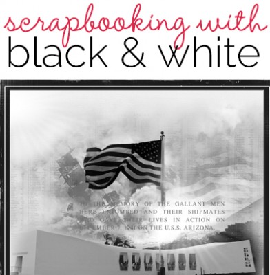
Terry Billman says, ” My husband and I recently took a trip to Hawaii and visited the U.S.S. Arizona Memorial. This page was created as a tribute to the men who lost their lives on this dreadful day in 1941. The photos taken at the memorial basically had no color other than the water and the trees in the background, which made them perfect for a strictly black-and-white layout. There are actually four photos (the actual memorial, the stone wall with the names of those that lost their lives, the photo of the Arizona sinking, and the American flag) in this layout blended together to depict the memory of this horrific day. I added texture to the water to give the layout dimension and strategically placed foto glows to accentuate the flag.”

U.S.S. Arizona Memorial created by Terry Billman| Maplebrook Studios: Just Linens No. 37, Just Linens No. 5 ; Katie Pertiet: Ledger Grid Overlay No. 1; Anna Aspnes: Foto Glows 4
add interest to black-and-white layouts with texture
Kiki Kougioumtzi says, “This layout is about a tough period in my life, when really good and really bad things happened and I had to balance things. This contradictory situation was perfect for an absolute black-and-white layout. The absence of color gave me the opportunity to work with texture to make the layout more interesting visually. I have smooth/soft areas (acrylic paint,shinny embossed paper, feathers, ribbon, rub-ons) and rough areas (crackle paint,glitter,gemstones,tangled thread,crinkled tissue paper).”

Balance by Kiki Kougioumtz i| Supplies: Cardstock: DCWV; Stamps: Tattered Angels, Viva Decor; Alphas: American Crafts, Doodlebug; Stencil: Prima; Stickers: 7Gypsies; Ranger glitter glue; Liquitex acrylic paint & gessso; Viva Decor crackle paint; Other: ribbon, thread, feathers, doily, tissue paper, ink.
Brenda Becknell says, “In an effort to get a few photos of myself into my scrapbook albums, I took this self portrait by shooting into the mirror with the flash turned off. There wasn’t a lot of color in this photo to begin with, and since color wasn’t important to the theme, I converted the photo to black and white. I didn’t want the page to be boring, so instead of adding color, I added texture: dotted cardstock, foam alphabets, filmstrip transparency, large button, ribbon and twine. I also varied the types of patterned papers, with two types of text, polka dots, and tiny flowers.”

Just Me Behind the Camera by Brenda Becknell | Supplies: Cardstock: Bazzill, Patterned Paper: K I Memories, Sandy Lion, 7Gypsies; Alphabets: American Crafts, Jenni Bowlin, Doodlebug; Camera stamp: Technique Tuesday; Filmstrip ribbon: Tim Holtz
use black and white for a formally-styled page
Rosann Santos-Elliott says, “This layout is about my cousin and her husband on vacation this past year for their anniversary. I titled it admire because I admire their marriage and their relationship. I used a Martha Steward punch to mimic a net and the silver charms represent some items that could be found in the net at a beach.”

Admire by Rosann Santos-Elliott | Supplies: Creative Imaginations – Narratives; MME – Lost and Found Halloween; Close to My Heart – Brown and White twine; Charms from Michael’s
use black and white for meaning and mood
Audrey Tan says, “We went camping during the spring break and it was awfully cold. Despite the weather, we couldn’t resist tucking into the well-known Cornish ice-creams. The black-and-white colour works well here as the weather was sombre and chilly and it fit the colour scheme perfectly!”

A Taste Of The Cold by Audrey Tan | Supplies: Anna Aspnes: ArtPlay Palette Achieve, Script Tease Life Overlays No1, Multi Media FlutterBys No2
Fonts: Sailor Larry Extra Fancy & Redressed
Vicki Walters says, “The subject of this page one that is “black and white.” Bullying is never OK and that’s black and white, no colors, no exceptions!”

Stop Bullying by Vicki Walters | Supplies: Dawn Inskip at Scrapbookgraphics – Real Messy Stitches and Sticks and Stones
one bold color with black-and-white compositions
Adryane Driscoll says, “This is a photo of my son taken almost 6 years ago. I converted the photo to black and white to reduce the impact of the distracting background. Then, I went with a black-and-white with one color (yellow) scheme. I like this for graphic-looking and dynamic pages.”

enjoy the ride by Adryane Driscoll: Credits: Anna Aspnes I Road Rider Page Set, EnRoute No.1 BrushSet, ArtPlay Palette Metro Graffiti, and ArtPlay Palette Social Network; O’Scraps Seven Birthday Collab
black and white with small amounts of color in light values
Chris Asbury scrapbooked a black-and-white heritage photo on “My Irish Ancestors. She says, “To keep the focus on the black-and-white photo, I created a clean layout with few elements, generous white space, and a bit of red for accent.”

My Irish Ancestors by Chris Asbury | Supplies: Anna Aspnes Designs: ArtPlay Palette Heraldry,ArtPlay Palette Sophistica,Family Word Mix No.1; Scanty Journal Lines No.2; Fonts: Bohemian Typewriter, Soymilk
Audrey Tan says, “While on a recent holiday, my boys had their portraits drawn and ‘tooned.'” Most of the page is rendered in black and white with limited gray tones. Around the edge are pale splotches of several colors, which work to frame the high-contrast focal point.”

You’ve Been Tooned! by Audrey Tan | Supplies: Angie Young: DARE To Believe In Something Bigger; Fonts: Trashed & Shark In The Water
Join the challenge: Make a new black-and-white scrapbook page. Put it in our Community Gallery with “B&W Challenge” in the title, by end-of-day Tuesday, June 11, and be entered into a drawing for a $15 Get It Scrapped gift card.
