by Debbie Hodge | Feb 23, 2012 | Color
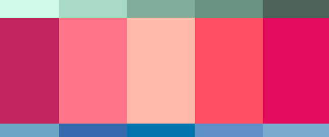
A complementary color scheme uses colors opposite one another on the color wheel, for example red and green or blue and orange. This is the highest contrast color scheme. Use it with fully saturated colors, and you’ve got a strong, vibrant look. If you...
by Debbie Hodge | Feb 22, 2012 | Journaling, Scrapbook Page Elements
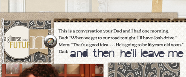
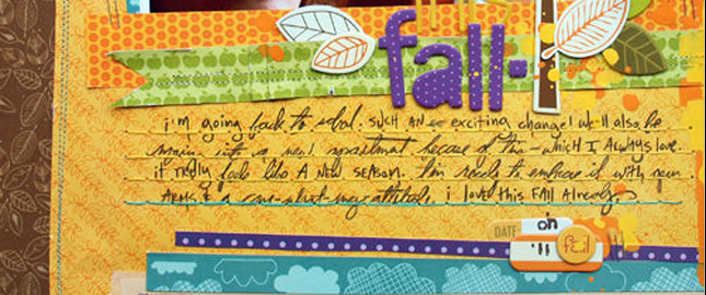
by Debbie Hodge I love scrapbooking. I love having scrapbook pages made. And sometimes, in my rush to try a new look or use a new product or just get those new photos on the page, I neglect journaling. Yep. Even though I’ve written countless articles and lessons...
by Debbie Hodge | Feb 21, 2012 | Copic Markers
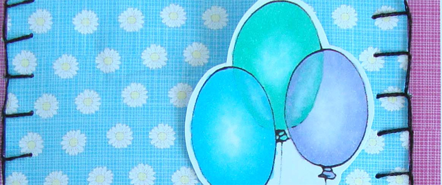
by Michelle Houghton This lesson teaches the basics of coloring a transparent object. The image is a simple one, as is the coloring, but the results are amazing. When coloring these, I want to make the balloons look like you can see through them. I used 3 lighter...
by Debbie Hodge | Feb 21, 2012 | Finding and Using Inspiration, Ideas via Product & Technique
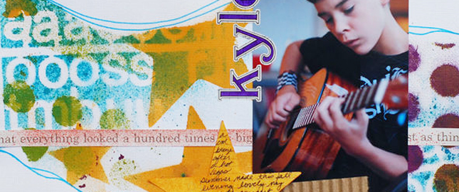
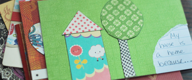
by Amy Kingsford Inspiration truly is EVERYWHERE–including right under your very nose! We accumulate hundreds of mementos and objects throughout our lifetime. As such, our own homes are natural places to begin the search for scrapbook page inspiration. Using...
by Debbie Hodge | Feb 20, 2012 | Design Elements, Design Principles, Design Your Story, Journaling
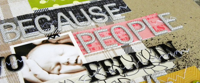
by Debbie Hodge Texture is tactile. When you add texture and dimension to your scrapbook page, you engage the viewer’s sense of touch — another sense in addition to sight. As a result you draw your viewer in on another level. It’s an obvious design...
by Debbie Hodge | Feb 17, 2012 | Sketches and Layered Templates
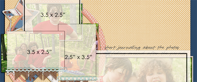
by Debbie Hodge Here are three new coordinated scrapbook page sketches with free layered templates for digital scrapbooking. Use one of these singly or, when you’re making a multi-page album, these sketches complement each other well. You can find all of our sketches...
by Debbie Hodge | Feb 16, 2012 | Color
by Debbie Hodge A monochromatic color scheme uses variations in lightness and saturation of one color for most of the elements on your scrapbook page. Neutrals are often combined with the monochromatic colors. A scrapbook page with a monochromatic color scheme looks...
by Debbie Hodge | Feb 15, 2012 | Ideas via Product & Technique
Got stash? Whether that pile of scrapbook supplies is paper or digital, these 4 approaches will have you looking at your supplies in new ways–with two goals: 1) to use your stash, and 2) to make scrapbook pages with new looks you’ll love. Get ready to:...
by Debbie Hodge | Feb 15, 2012 | 5 Year Journal
by Tami Taylor Welcome back. This is the second installment of this series: “Keep a 5 year Journal.” Click here to see all 12 months. I’m back with a quick list of observations and another list of questions. I’ve been plugging away at my...
by Debbie Hodge | Feb 10, 2012 | Theme Quickstarts
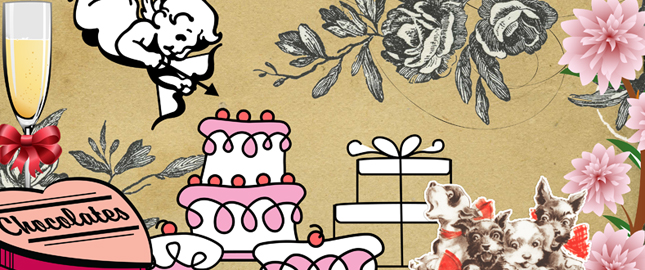
Making a Valentine’s Day page or a page about your love for someone? Use these “quickstarts” to get ideas for your page motifs, embellishments, wordart, titles, and fonts. Hallmark Images of Love | Love Sayings and Phrases | Fonts for Love...

