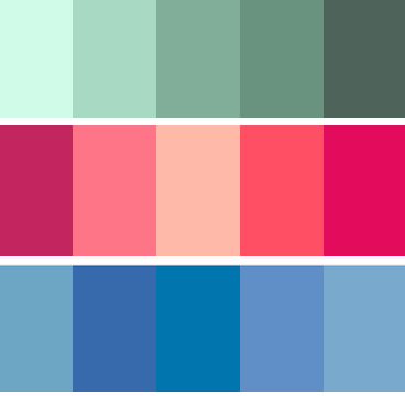
Here's a look at 3 monochromatic color schemes: green, red, blue.
by Debbie Hodge
A monochromatic color scheme uses variations in lightness and saturation of one color for most of the elements on your scrapbook page. Neutrals are often combined with the monochromatic colors.
A scrapbook page with a monochromatic color scheme looks clean and elegant — and it’s easy to choose your products and know they’ll go together when you narrow down your choices to one color and its various shades and levels of saturation.
Ideas for making the most of monochromatic color schemes on scrapbook pages follow.
1. Use a monochromatic scheme to cue season or holiday
Many of us have seasonal and holiday associations with particular colors. Orange is the color of autumn and harvest, and Amy Kingsford used shades and hues of it on her “Pumpkin Patch Kids” for a page that immediately says: “autumn.” (Grab autumn quotations and word art to go on your fall pages.)

Pumpkin Patch Kids by Amy Kingsford | Supplies: Sweater Weather Kit by One Little Bird Designs, Drop Shadow Actions by One Little Bird Designs, Epic Collaboration by Paislee Press, One Little Bird Designs and Biograffiti, Stitched Tan No. 1 by Anna Aspnes, Paper Bag Alpha by Lynn Grieveson, Sketch #79a by Debbie Hodge,CK Summer font.
2. Use a monochromatic color scheme to set scrapbook page tone
Kelly Purkey‘s page about her Best Friend lightening things up when skies are metaphorically gray is well presented with a monochromatic scheme that pairs bright yellow with the neutral gray. Three clusters of yellow stand out, make her point, and guide the eye through the page. (See more ideas for scrapbook pages with cloud motifs.)

When Skies are Grey by Kelly Purkey | Supplies: American Crafts; Patterned Paper - American Crafts; Stickers - American Crafts, My Mind's Eye; Stamp - Studio Calico; Buttons - Basic Grey; Mist - Studio Calico; Embossing Powder - American Crafts
3. Use a monochromatic scheme for “punch” when paired with a neutral
The red border, titlework and accents against a cream canvas makes an eye-catching holiday page by Amber Ries. It’s elegant and it grabs the eye by virtue of the strong contrasts. (Read more about color contrast.)

This Story is About Wishing by Amber Ries | Supplies: Anna Aspnes: Water Drops No. 1 Sahlin Studio: tell the story word art | Brown Paper Packages paper | after dark (wishing) | season of giving snipettes | very merry (snowflake) |Washi tape | So Grateful, Amy Wolff: Stationary Studio, CD Muckosky: Random Type, Valorie Wibbens: Pocket Stuffers
4. Use a monochromatic color scheme for easy pattern mixing on scrapbook pages
Mixing a variety of patterned papers always gets easier when you use a monochromatic color scheme. Lisa Dickinson combined 10 different patterns on this monochromatic grid-based page. (Get more ideas for mixing patterned paper on scrapbook pages.)

My Boy by Lisa Dickinson (Masterful Scrapbook Design Smorgasbord Issue) | supplies: Bazzill cardstock (White, Mediterranean) + KI Memories patterned paper, chipboard letters, and star Puffies + Creative Memories circle punch + Studio Calico mist + Silhouette die cut machine + Creative Memories pen + Typenoksidi font
5. Use a monochromatic scheme for a clean and elegant scrapbook page
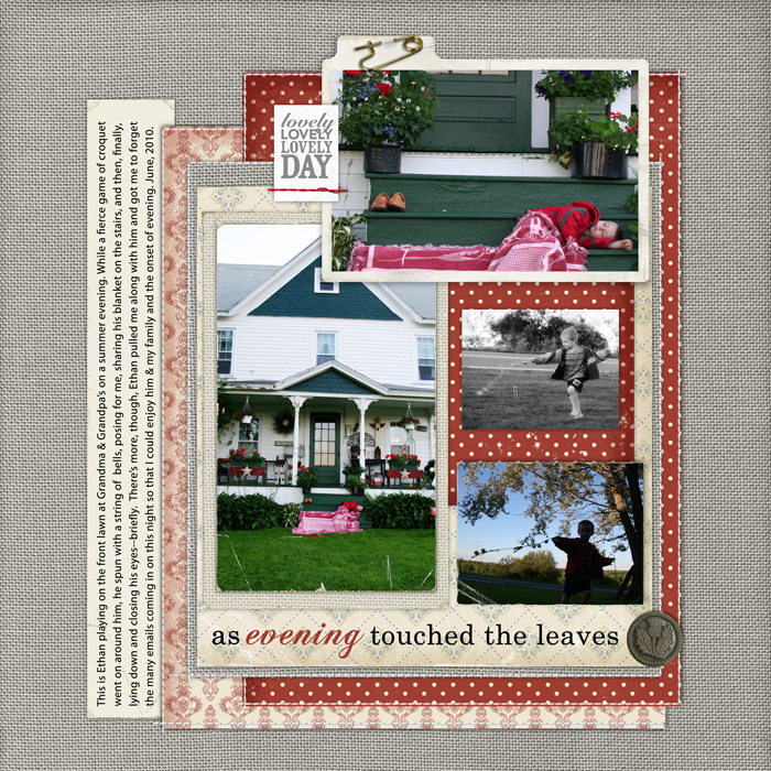
I took the bits of color in my photos — red — and used them on this red-and-gray monochromatically-schemed page for a clean and elegant look befitting any evening.

As Evening Touched the Leaves by Debbie Hodge | Supplies: Contessa Paper Pack by Jesse Edwards; Just Linens Paper Pack No. 01, Aaron Solids Paper Pack, Just Linens Paper Pack No. 02by Maplebrook Studio; Filed Photo Frames No. 04, Nana's Buttons No. 02 by Katie Pertiet; Today Mini Stitched Tags by Ali Edwards; Stitched by Anna White No. 01 by Anna Aspnes; Fasten Its! No. 03 by Pattie Knox; Worn Photo Edges, Worn Edges Mixed by Lynn Grieveson. Title is from poem by William Stafford; Century Schoolbook, Chopin Script fonts

