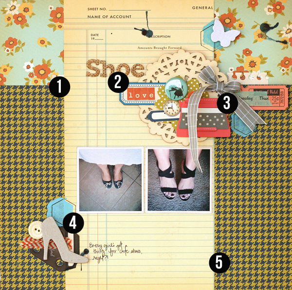
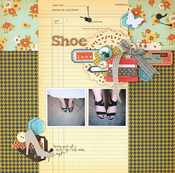
 It’s the accumulation of well-chosen and carefully crafted details that create a masterful scrapbook page. Check out 5 details on “Sweet” by Leah Farquharson and see if one or two of them can inspire your next page.
Leah says, “Every girl loves a cute pair of shoes, right? It was fun taking this title and making it pretty by adding the main cluster of embellishments to the page right at that point – and then leading a bit of the title right on to them!”
1. Back up a band foundation with a pieced canvas.
The band foundation is a tried and true foundation upon which to arrange page elements, and a pieced canvas is a great starter for incorporating interest and patterned papers. When you combine the two you get the stability of tried approaches with the oomph of the unexpected: you amp up the design. Leah pieced her background with a 1/4 height band of floral print at the top and a 3/4 block of herringbone print below.
On top of that is her “band” of ledger print which guides the placement of her elements.
2. Put part of your title in an embellishment cluster.
Getting creative with titlework adds interest to the page and draws the viewer immediately into it. Leah’s title “Shoe Love” begins the page with “Shoe” being the first element we read (in Western countries, we’re accustomed to reading from top left across to the right and back again). The 2nd part of the title (“love’) sits on her elaborate embellishment cluster–right next to and below the beginning of the title.
3. Place embellishment cluster at intersection of pieced canvas and band.
Embellishment clusters can be showy or simple–allowing you to combine several elements, including images, to reinforce page theme and just plain add charm. Intersections are a great place for putting embellishments, and Leah has chosen the point at which her pieced canvas parts meet the band on the right side. It’s a natural and appealing placement.
4. Repeat an element three times.
Repetition is a great tool for creating unity on a page—or in any work of art. Leah include three hexagons made of blue paint and an offset outline on the page. They flow in an upward diagonal from bottom left to upper right. Three is a number that works well in visual designs.
5. Combine floral + geometric + office/ledger patterned papers.
There are several things to consider when mixing prints including styling, motif, scale, and density. Leah has masterfully combined three motifs (floral, abstract geometric herrignbone, and and ledger). She used the busier floral and herringbone prints for her canvas and the more subtle ledger print (always a good mixer) to back up her page elements.

Shoes by Leah Farquharson | Supplies: patterned paper, diecuts, stickers, brads, flair, chipboard shoe, letter stickers: October Afternoon. Stencil: JBS MErcantile special release. Paint, button: Jenni Bowlin. Wooden Doily:Maya Road. Canvas Butterfly: Studio Calico. Tapes: American Crafts, October Afternoon. Typewriter, chipboard letters: American Crafts.
Leah Farquharson is: Wife. Mommy. Amateur photographer. Scrapbooker. Photoshop geek. Sewist. Entrepreneur. Owner of Bluebird Chic, LLC. Lover of all things creative. Join her at A Musing to Create and get creative.
[getinspired]

