by Debbie Hodge
There are several layout configurations of combined elements that scrapbookers use again and again when making scrapbook pages (for example, blocked, clustered, and shaped). These foundations are used again and again because they work well for housing the most frequently encountered combinations of elements (1 to 5 photos with title and journaling) and they consistently yield well-designed pages.
The “band” is one of these foundations.
Using a horizontal or vertical band as the foundation for your elements simplifies the scrapbook process because it places a limit. Defining the area in which you’re going to work reduces the decisions you have to make about placement.
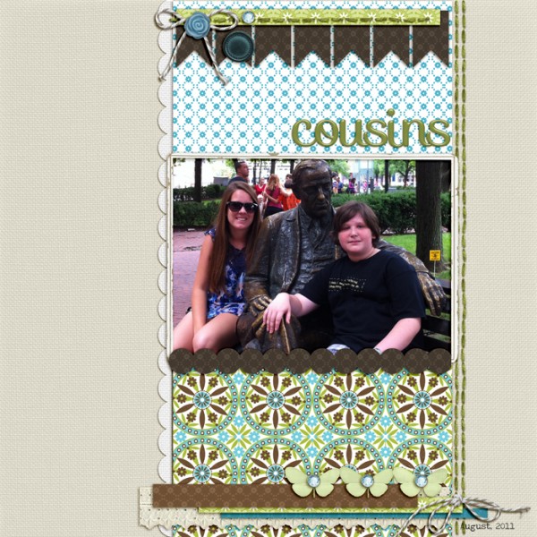
A clean vertical band foundation
All elements fit within the vertical band on “Cousins,” with embellishing strips running off the edges to break up the white space and add interest.

Cousins by Debbie Hodge | Supplies: Ginny Paper Pack, Ginny Solids, Just Linens 20 and 28 by Maplebrook Studios; Papercuts No 1, Oiselet Rouge Elements, Bakers Twine Asst 1 by Katie Pertiet; Border Medley by Quirky Twerp; Storytelling Alpha No 2 by Amanda Heimann; Spiced Jewels by Anna Aspnes; 2:30pm by Amy Wolff
A clean horizontal band foundation
All of Lynnette Penacho’s elements including three photos, journaling and a big title fit within a horizontal band on “25+1.” Lynnette likes using this composition and often stitches a square border or layers a square mat on the background canvas.
When you make a banded design like this, the edges of the bands offer opportunities for layering and adding interest. Lynnette has a “stamp” scalloped edge along bottom and top as well as a birthday banner spanning page width. On “Cousins (above), scallops and stitching are added to band edges.

Birthday by Lynnette Penacho (from MSD Canvas issue) | Supplies: Supplies: Birthday Boy by Zoe Pearn Border Basics: Squares by Libby Weifenbach Font is DJB Lynnette by Darcy Baldwin
A wide and centered band foundation
Doris Sander likes to shake things up. While we’ve all been learning that asymmetry is more visually interesting than symmetry (and, thus, placing our bands off center) she’s gone and centered her wide vertical band on “Every Rose has It’s Thorns” and then reinforced that symmetry with title and silhouette embellishment placement.
Still, though, the band serves the purpose of limiting her compositional area and offering edge layering opportunities.

Every Rose Has Its Thorns by Doris Sander (from MSD Embellishing issue) | Supplies: stickers, stamp, stencil, patterned paper – Jenni Bowlin, ink – Jenni Bowlin for Ranger, transparency – Hambley, rose – vintage, embroidery floss – DMC, punch – Martha Stewart, masking tape
A curving band foundation
Your band doesn’t have to be a solid rectangle. Tami Taylor misted and stamped a curving band across “Kyle.” It guides the eye in a soothing line that complements the music subject of her page.

Kyle by Tami Taylor | Supplies: Paper- Bazzill. Spray Inks – Tim Holtz. Stencils/Cardboard – Unknown. Alphas/Wordstrips/Diecut – Jeni Bowlin.
A band along the page edge
It’s not just the bold papers and big contrasts that energize this page by Jana Morton. It’s also the unexpected placement of photos — hanging from the top of the page in series atop a band of patterned paper. (See the step-by-steps Jana provides for making this page at EasyScrapbookPages.com)

Today by Jana Morton | Supplies: All Products Available at Designer Digitals. Maplebrook Studios: Layla Kit, Jelly Alphabet No. 21; Katie Perteit: Fineline Border Lines Brushes and Stamps No. 02, Classic Cardstock: Into the Night, Photo Clusters No. 16, Painted Edgers No. 04, Little Shores Kit; Mindy Teresawa: 100% Boy Stickers
A suggested band foundation
Your band doesn’t have to be explicity defined with straight edges. Amber Ries used layered transfers and brushwork to back up her elements in a horizontal band on “Driving Cars at Obi.”

Driving Cars at Obi by Amber Ries (from MSD Embellishing issue) | Supplies: Anna Aspnes: Artplay Palette Crazy Life | Artplay Palette Life = Love | Multimedia Keys | Canvas Textures No. 1 | White Paint | Punched Frames No. 1 | Original Fotoblendz Clipping Masks No. 14 | LoopDaLoop Arrows No. 02; Lauren Reid: Road to Nowhere | You’re Moody | Pumpkin Butter; Fruitloop Sally: RoadTrip; Sahlin Studio: Vintage Carnival; Ida Scraps: Lullaby
Go outside the lines of your band foundation
You don’t have to stay within the confines of your band. Use it to define a foundation and overall shape for your composition and then “layer it up” as Paula Gilarde has done on “Why.” Her journaling creates a secondary band on the page — this one vertical and placed centered with her largest photo.

why? by Paula Gilarde (from MSD Typography issue) | Supplies: Stampin’ Up cardstock; Patterned papers: October Afternoon (floral, stripe), SEI (polka dot), Scenic Route (grid); Stamp: Imaginisce (bird), Studio Calico(faq); Sticker; Jenni Bowlin; Digital Frames: Katie Pertiet (Little Vintage Frames); SS Whimsy Font-journaling.
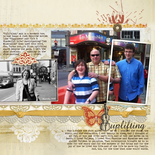
My “Uplifting uses a wide band to hold photos and journaling, but my embellishments, title, and additional journaling spill off top and bottom. These two “spill-off” points combine with the chipboard embellishment within the band to create a visual triangle.

Uplifting by Debbie Hodge | Supplies: Artplay Palette Concerto by Anna Apnes; Pippin by Lynn Grieveson; Rimmed Framers 1, King Me, Supersize Decorative Labels by Katie Pertiet; I Believe by Cinzia; Storyteller by ViVa Artistry; Reminisce by Leora Sanford; Amaze, Triumph Tippa fonts.
There you have it: the banded foundation is versatile and great way to get your photos and elements arranged quickly so that you can spend time telling the story with your journaling, color, styling, and embellishment choices.

