
by Debbie Hodge
This article appears in the March issue of Paper and Pixels alongside many more how-tos and ideas for paper and digital scrapbooking.

Creating white space: figure and ground
As you create a scrapbook page, you are:
- telling a story or conveying your concept (or meaning or big idea)
- by combining page elements (photos, journaling, title, and embellishments)
- within SPACE (i.e., your scrapbook page canvas).
The combined elements create a “figure” (or scrapbook page foundation). That figure (or foundation) creates white space.
A figure is always seen in relation to what surrounds it (ground). The butterfly here is the figure, and our perception of it is influenced by the ground, or the blue sky. The open space to the left of the figure conveys a butterfly in flight, in motion and headed toward the white space.
When you look at the image of a vase below, there is ambiguity between the figure and the ground. Your eyes may go back and forth between seeing a vase on a black ground to seeing two faces in profile on a white ground.

Even a little bit of ambiguity with regard to figure and ground can add energy to a piece. We’re accustomed to the ground of a figure being passive and unremarkable. When you can carve white space with interest you can create tension and engage the viewer at a deeper level.
More about white space
White space on scrapbook pages is not always white. It can be any color –it can even be patterned paper. The term white space refers to an area devoid of photos, embellishments, journaling, and title.
White space provides a resting point for the eye and breathing room for the viewer taking in your photos and journaling.
White space has a shape that can be active or passive
When the shape of white space is symmetrical:
- It’s predictable.
- It’s less consequential (than a symmetrical shape would be) to how we perceive the elements in the design; if it’s noticed at all, it’s noticed as background.
- It’s passive.
When the shape of white space is asymmetrical:
- It’s dynamic.
- It’s unpredictable and requires active involvement from the viewer.
- It can make the parts on your page look great.
The scrapbook page foundation is the “figure” that creates white space
When you are scrapbooking, consider your combined elements to be the figure and your canvas to be the ground.
Understand that the shape of one defines the shape of the other.
The balance between figure and ground can bring energy and order to a page.
(mostly) symmetrical white space
The white space on “Beauty” is less dynamic than that on “Punch Bowl.” It is centered and regular. The bits of ribbon and paper beneath the photo and at diagonal corners break into it and add some interest. I wanted a peaceful design, though, to support my subject.
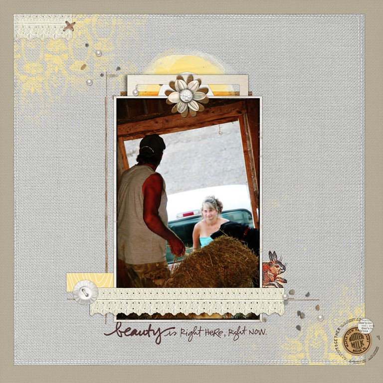
Beauty by Debbie Hodge | Supplies: ArtPlay Palette Genuine, ArtPlay Palette Easter Bunny, ArtPlay Palette Floralis, ArtPlay Palette Ex Libris ValueSet, ArtPlay Palette Find My Way ValueSet by Anna Aspnes; Faux Bois: Spring Paper Pack by Andrea Victoria; Oiselet Rouge Element Pack, Rimmed Framers No. 01, Vintage Photo Frames No. 24, Vintage Milk Caps No. 01, Wooden Flowers No. 01, Around Words Brushes and Stamps by Katie Pertiet; Fasten Its! No. 03 by Pattie Knox; Just Linens Paper Pack No. 01 by Maplebrook Studios.
asymmetrical white space
The white space on “Punch Bowl” is asymmetrical. The grouping of photos, title, and embellishments create a diagonal cluster that shapes the surrounding white space.

Punch Bowl by Debbie Hodge | Supplies: Silver Glitter Alpha No 1, Distressed Toolset No 5, Dripped Stains No 5, Distressed Edge Overlays No 1 by Anna Aspnes; Just Linens 1 by Maplebrook Studios; Speech by Paula Kesselring; Between the Lines Alpha 5, Old Time Christmas No 2, Holiday Trim by Katie Pertiet; Fastenits 2 by Pattie Knox; 11:30am, 11am by Amy Wolff; Also A Very Small Alpha, An Additional Very Small Alpha by Allison Pennington; Restoration by Gina Cabrera; Vinnie Pearce Journey Back
5 scrapbook page foundations and the white space they create
There are several layout configurations of combined elements that scrapbookers use again and again when making scrapbook pages. We will call these “foundations.”
These foundations are used again and again because they work well for housing the most frequently encountered combinations of elements (1 to 5 photos with title and journaling) and they consistently yield well-designed pages.
Each of these foundations creates white space shape, and, as such, offers opportunities for setting tone and involving the viewer.
1. the grid and blocked foundations and white space
The grid and blocked designs provide homes for your page elements and, usually, extra spots for layering embellishments and papers. Every grid spot or block is like a small canvas to be layered and filled with elements that support your story and add charm.
The white space on a grid or blocked page is often in the shape of a uniform border around 4 sides of the foundation, thus it is usually a more passive kind of white space. Placing the grouping off center will create asymmetrically-shaped white space. Allowing elements to spill into the margins will interrupt the white space and add interest.
Lily: a grid foundation with symmetrical white space
The grid on “Lily” is “suggested” by rough pink brushwork over square masks that were removed. Photos fill 3 of the 9 grid blocks on “Lily.” The title and journaling each take a spot, also. The other spots are layered with embellishments.
The white space is symmetrical with interest added by the irregularities in the brushwork that defines the grid and the bits of embellishments that spill out into the margins.
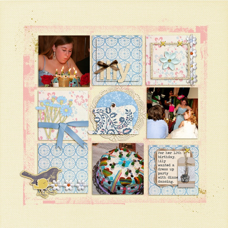
Lily by Debbie Hodge | Supplies: French Summer by Lynn Grieveson; Restoration by Gina Cabrera; The Daily Details by The Digi Chick Designers; Art Play Palette 3, 4, 7, 10, floralis (brushes) by Anna Aspnes; Count Your Blessings by ViVa Artistry; Just Linens 1 by Maplebrook Studios
Braced: a blocked foundation with horizontally symmetrical white space

Braced by Debbie Hodge | Supplies: Sweet Nothings Alphabet by Lisa Sisneros; Gearhead, Lost in the Wild by ViVa Designs; Brackets No 1, Distressed Overlay No 2, Artplay Chevron Sweet Baby by Anna Aspnes; ArtyPants Architectural Digital Stamps; Believe in Love by Cinzia; That's Classic by Erica zaneCorben, Pea Olson fonts
The blocked design of “Braced” is casual, and, yet, the grouping is centered horizontally, and the white space is in the form of wide margins comprised of chevron print paper. The white space organizes the page but the real interest is provided by the elements grouped in the foundation. It’s not a design mistake to use a more passive kind of white space. Just understand this choice and be sure to get your interest included in other ways.
2. band foundations and white space
Using a horizontal or vertical band as the foundation for your elements simplifies the scrapbook process because it places a limit. Having a defined area to fill takes removes other choices and gets you to focus on including and emphasizing the important elements for your story.
You can affect the shape of the white space by creating equal (and symmetrical) borders or unequal (and asymmetrical) borders. Another way to alter the shape of the white space is to make your band with “jiggled” and layered element placements.
Bonfire: a vertical band foundation with asymmetrical white space
The white space on bonfire is asymmetrical, with one side wider than the other, yet, still, it’s controlled white space. The spilling of embellishments out into the borders adds interest.
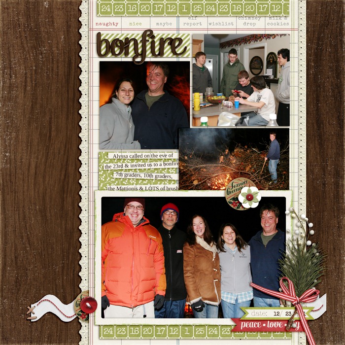
Bonfire by Debbie Hodge | Supplies: North Pole Kit by Mari Koelgelenberg; Christmas Village Elements, Journaling Strip Masks, Ric Rac Basics, Flossy Stitches White by Katie Pertiet; Stitch Medly by Quirky Twerp; Kitschy Christmas by Sahlin Studio and Jenn Barrette
Merry Friends: horizontal band foundation with asymmetrical white space
While the band on “Bonfire” is defined by a strip of ledger paper upon which everything is place, the band on “Merry Friends” is defined by the grouping of elements and the alignments of them. The result is white space that feels less formal.
Elements sit well above and below the band on the right side, adding more energy to the white space. The strips at top right also shake up what could be a more formal composition.
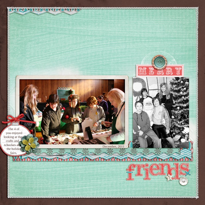
Merry Friends by Debbie Hodge | Supplies: Dashing Papers, Dashing Trimmin's by Allison Pennington; Star On Top by One Little Bird and Amy Martin; Multimedia Elves No 1, Stitched by Anna White No 3, White Paint No 1 by Anna Aspnes; Rubber Wraps, Flossy Stitches Blue, Academic Sanded Alpha by Katie Pertiet
3. shaped cluster foundations and white space
Because many page elements are rectangular, grouping them in a clearly shaped (and often rectangular) cluster allows easy organization and layering. The placement of this cluster will define your white space. Center placement will yield symmetrical white space. The extent to which you go off vertical or horizontal center will yield increasingly asymmetrical white space.
Here: rectangular cluster with asymmetrical white space
Photos, title, journaling, and embellishments are mounted on a portrait-oriented, rectangular mat and placed flush with the right edge of the page. The resulting white space is a “U” of only 3 borders.

Here by Debbie Hodge | Supplies: The Daily Details by The Digi Chick Collaboration; Restoration by Gina Cabrera; Speech by Paula Kesselring; Flossy Stitches Brown, Journaling Strip Masks, Art Time Elements, In Words Brushes by Katie Pertiet; A Very Small Alpha by Allyson Pennington; Traveling Typewriter font
4. free-form cluster foundation and white space
If you love working with an “explosion” of elements and getting an artsy look, the free form cluster offers lots of room for creativity and variation.
Punch Bowl: free-form cluster foundation with asymmetrical white space
The white space on “Punch Bowl” is asymmetrical and energetic as befits a party page. The cluster of photos, title, and embellishments create an asymmetrical grouping that simultaneously shapes the surrounding white space.
Punch Bowl by Debbie Hodge | Supplies: Silver Glitter Alpha No 1, Distressed Toolset No 5, Dripped Stains No 5, Distressed Edge Overlays No 1 by Anna Aspnes; Just Linens 1 by Maplebrook Studios; Speech by Paula Kesselring; Between the Lines Alpha 5, Old Time Christmas No 2, Holiday Trim by Katie Pertiet; Fastenits 2 by Pattie Knox; 11:30am, 11am by Amy Wolff; Also A Very Small Alpha, An Additional Very Small Alpha by Allison Pennington; Restoration by Gina Cabrera; Vinnie Pearce Journey Back
5. multiple-cluster foundation and white space
Dynamically shaped white space running between clusters is unexpected and eye-catching.
Each cluster has foundational layers connecting elements to the canvas and shaping the white space around and between them.
Being Happy: multiple clusters with asymmetrical white space
“Being Happy” is a page with multiple “free-form” clusters. The largest photo sits on a digitally-blended vintage illustration and immediately catches the eye.
Three smaller photos bleed off three different edges of the page. They each sit on small collages of ephemera, lace, and tags. Putting together this kind of a page is like putting together several small canvases, each with its own focal point flow and embellishments.
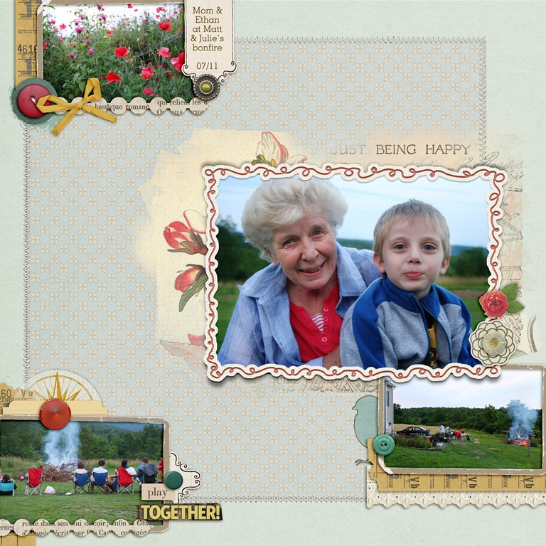
Just Being Happy by Debbie Hodge | Supplies: Sweater Weather, Wildflower, Interlude by One Little Bird; Chasing Fireflies by Paislee Press; Collageable No 2, Doodle Do Frames No 2, Paper Frames Kraft No 1, In Text Paper Pack, From my Bookshelf Blendables No 3 by Katie Pertiet; Ransom Words by Vicki Stegall; Thankful for You by Jenn Barrette; Duly Noted by Leora Sanford; Mellow by Lynn Marie; DIY Board Game by ViVa Artistry
Take a look at your favorite pages – by yourself and by others – and look at the shape of the white space on them. Is it symmetrical or asymmetrical? Does it add to the page or is it of a passive and assumed aspect of the design. If it is passive white space, where does the energy and interest come from.
Make your next page conscious of how your combined elements create the white space on the page, and, what’s more, how that helps you tell your story well.
