Design principles are the rules that let you put the parts of a scrapbook page together so that they: capture the viewer’s attention, control the eye’s movement, convey information, and evoke emotion–all awesome things to achieve with a page.
Design Principles
Six design principles that will go a long way toward making pleasing pages are:
- Emphasis, Dominance
- Contrast
- Balance
- Alignment
- Flow, Movement
- Repetitions, Rhythm
A quick look at each of these follows. For more information, grab the free 12-lesson ecourse “Learn Scrapbook Design Principles” linked at the bottom of the post.
Emphasis
Different parts of your page have different levels of importance, and the way you present all of the pieces should make this hierarchy apparent to the viewer.
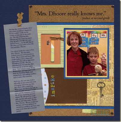
On This page, the photo of my son with his teacher is the dominant element. It’s colorful and compelling and set off from its background with double matting. The next thing the eye takes in is the title, which is a quote from my son: “Mrs. Dhoore really knows me.” The viewer of this page immediately understands the subject and can then move on to the journaling and other details.
Read more about emphasis: Creating a focal point on scrapbook pages
Contrast
There should be obvious visual differences between the elements on your page. Contrast will draw the viewer’s eye and add interest and variety.
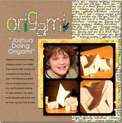
Let’s take a look at just a few of the contrasts on “Origami of Joshua Doing Origami.” The elements that sit on the craft-paper background on the left side of the page all contrast strongly in color and color value with the craft paper, and the fonts/alphabets have crisp, clear shapes that make them easy to read. A script patterned paper contrasts with the bold orange paper in motif and color. A square block of square photos sits atop three rectangles (the orange mat, the strip of script and the strip of craft). The photo of my son is the strongest of the four photos because of its content. All of these differences draw the eye and make the page pleasing and easily understood and viewed.
Read more about contrast: Use color contrast to make art journaling pages pop
Balance
The parts of your scrapbook page should be distributed to create “visual” balance — a sense of balance. We never want to feel like the pieces in a layout are going to topple one another.
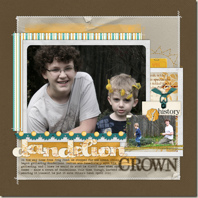
There’s lots to talk about when we get to the lesson on balance, including addressing what might be your first question: Why not just balance things symmetrically. For now, take a look at “Dandelion Crown” and note how the larger, focal photo sits higher up and to the left AND how the layers, including a smaller photo and embellishments like a button and ribbon tie, balance it. It “feels” right – and we talk a lot more about how to get to this “good feeling” in Learn Scrapbook Design Principles.
Read more about balance: Scrapbook Page Design: Asymmetrical Balance
Alignment
Alignments provide order, margins, and meaningful white space–they let you organize and group elements. You can even create visual connections between elements that are not near one another. (Note—this does not mean that everything needs to be perfectly lined up, but, rather, that you should consider when to align and when to break from alignment.)
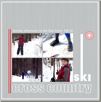
Here’s a page with several obvious alignments. Here, just to start, notice how “cross country” aligns on the left with the block of photos and on the right with the end of ski—AND on the bottom with the bottom of the pink stripe. There’s more: the top of the “k” in ski aligns with the top of the photo block. The photos within the block are aligned in a grid. The very short journaling aligns with each side of the photo block.
Read more about alignment:
- Scrapbook page journaling: justification that strengthens design
- Strengthen your scrapbook page design with alignments
Repetition
Repeating elements on a page adds unity. You can repeat colors, shapes, textures, motifs, and patterns. Note, though, that repetition without variety can be dull. The challenge, then, is to think about how to change something while keeping it the same.
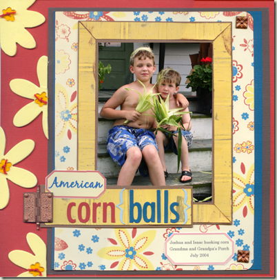
Here’s a page I made several years ago. Can you see the repetitions? There’s flowers – yellow flowers on the patterned paper and chipboard flowers painted yellow and plastic flower buttons in the center of the chipboard. So, the flowers are repeated – but in different materials and sizes and shapes. There are also repetitions of yellow, red and blue throughout and of metals. [In retrospect: While I love all of the parts here on this page, if I were scrapbooking this photo today, I think I’d do more to emphasize IT over all of the embellishing. It’s not a bad page, though. And it’s scrapbooked and in the album and my family loves it.
Flow
Flow refers to how the viewer’s eye moves through the layout. The flow will begin with the element that has the most emphasis. You can arrange and choose other elements to move the eye through the rest of the page—and then end up back at the first, dominant element. If you can get the viewer to take in your page in a particular order – then you can show them the story as you’d like it understood.
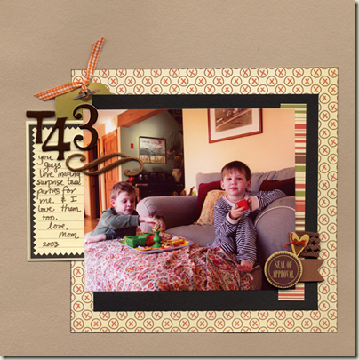
There are several flow patterns that work well on scrapbook pages. On “T43” the flow is diagonal from the top left of my photo (your eye is drawn by the embellishment cluster) down to the cluster at bottom right. So basically the flow is right through the most important part of the page (to me) the photo of my sons.
Read more about flow: Place embellishments to support scrapbook page flow
More design information :
- Step it up: a 3-step process for improved scrapbook page design
- Improve scrapbook page design with white space: 1 layout 3 ways
- 5 scrapbook color questions to ask and answer
- Using straight lines in your scrapbook page designs

