 by Debbie Hodge
Try this. As you place elements on your scrapbook page, consciously place each of them in relation to some other element on the page. This is alignment. Using alignments provides order, margins, and meaningful white space. It lets you organize and group elements. You can even create visual connections between elements that are not near one another. (Note—this does not mean that everything needs to be perfectly lined up, but, rather, that you consider when to align and when to break from alignment.)
Centered alignment
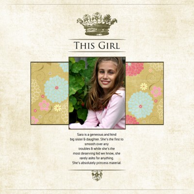
When you line your elements up along their center lines, as I’ve done on “This Girl,” you achieve a more formal look — think wedding invitations and poetry.
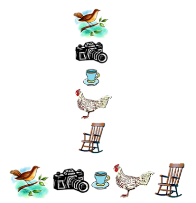
Centering is good for lining up elements that are not regularly shaped. See here examples of horizontal centering and vertical centering with a series of images. If they all sat upon a common base, the look would be less appealing.
Edge alignment
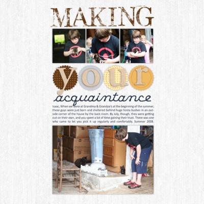
What about “Making Your Acquaintance” shown below? It’s centered—so why doesn’t it have the same formal look as “This Girl?” Because, while the block (made up of photos, journaling, and title) is centered, the elements within the block are not center-aligned. Rather, they are edge-aligned.
Photos, blocks of journaling, and mats (all typically rectangular shapes) lend themselves to edge alignment. Take a look at the five horizontal strips of paper and ribbon on “Riding Late.”
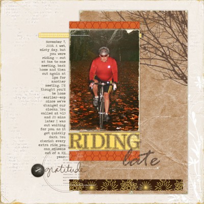
At least one edge of every one of these strips lines up with something else. Three of them align with both sides of the photo, and the long brown one at the bottom aligns with the left side of the photo. Once you’ve got a good strong line (like that created by the alignments along the left side of the photo), you can add power to your composition by using it well. I further emphasized this line by left justifying the journaling block and creating a gutter between it and the photo block.
More alignments: The left edge of the ribbon at the top is aligned with the left edge of the journaling block. The bottom of the journaling block is aligned with the bottom of the orange strip of paper.
When you’ve established a strong alignment you may purposefully break it for design interest—which is what the “gratitude” stamp and button on this page do—though even here there are subtle and centered alignments. The center of the button is vertically aligned with the left edge of the journaling block and yellow ribbon. The word “gratitude” is horizontally center-aligned with the strip of stitching.
Axis alignment
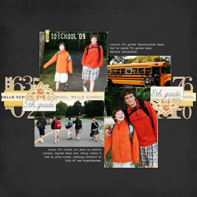
The edge-aligned layouts above align things along margins or gutters. You may also align along an axis. “To School 2009” uses a vertical axis and a horizontal axis. The vertical axis runs between the two photos on the right and the two photos on the left (yes, there is a bit of jiggling in the bottom right photo, but, remember, when you’ve got a strong line, you can purposefully break it for interest). This vertical axis line is further emphasized by the journaling on either side of it. Notice how the journaling on the right is left-justified and the journaling on the left is right-justified. The ribbons running the width of this page establish a second, horizontal axis around which photos and embellishments are arranged.
Did you find this information helpful? Are you already consciously using alignments on your pages?

