by Debbie Hodge
Deciding upon the colors to use on a scrapbook page isn’t usually a straightforward process for me. I don’t have a series of questions I use that go from point A to point Z and then yield an answer.
My approach is a “circling” one – one that returns again and again to my key goals and the knowledge I have of my subjects and color.
As I begin, I hold some options in my mind. I collect my photos and think on a title and a message or mood I want to convey. As I pull together papers and elements for the page, I begin to see possibilities and patterns.
1. what emotions do I want to evoke OR what associations do I want to trigger?
I begin by thinking about my page meaning and the tone or mood I hope to achieve with it. Is it an exciting and fun page? It it a bit gloomy? Is it peaceful? Is it a themed topic – like school or Saint Patrick’s Day or growth or exercise?
Color conveys meanings or evokes feelings in three chief ways:
1) by triggering a physiological response (there are colors that excite across cultures)
2) making associations to occurrences of colors in nature (the sky and ocean are blue and generally peaceful), and
3) through psychological symbolism (this has to do with connections your culture makes with regard to a number of factors including politics, religion, lore and more).
With just a little bit of color meaning study (and some life experience) you’ll realize you don’t need charts and lists of color associations. You need to run through a few checkpoints in your mind and you’ll know how particular colors will support your scrapbook page story.
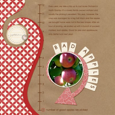 Bad Apples by Celeste Smith.
Apples are red in nature. The page is about an annoying aspect of Celeste’s recent apple-picking outing — and, it turns out, red is a color that can excite and even anger people. Thus, Celeste’s choice to use lots of red along with white and the almost-neutral tan of kraft paper works well to support her page subject and tone.
2. what are the colors in my photos?
… and how are they going to work with the colors I’m already considering after thinking about the first question. Add this knowledge to the things you’re holding in your mind and determine what kind of contrasts or complements they’ll set up with particular colors. Consider converting to black and white if you can’t reconcile things.
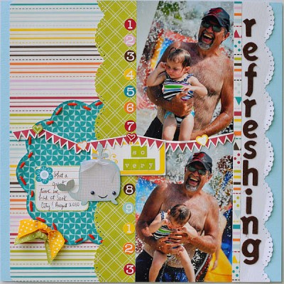 Refreshing by Alicia Geiss
The blues, yellows, and greens in Alicia’s photo are not overwhelming, and, what’s more they work with her subject of summer water play. She has chosen papers and embellishments that echo the colors in her photos.
3. how many colors will I use?
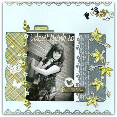 I Don’t Think So by Alicia Geiss
Alicia converted her photo to black and white and worked with shades of two colors: blue and green. It’s a striking page. While there’s some whimsy in the styling of the embellishments, the color scheme adds an element of restraint and maturity — which is just what Alicia is looking for in her daughter as she grows up.
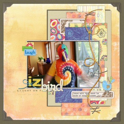 Iz Bird by Debbie Hodge
For this page I went all out with the colors using orange, violet, blue, green, pink, red and more. My subject (my son in his crazy shirt and mask) seemed to ask for a riot of color. To make sure my photo didn’t get lost, I paid attention to placement, size, and framing so that it would still stand out. It’s very rare I use this many colors on a page. Additionally, I relied on one kit of coordinated papers — thus my palette was decided for me by paper designer Jesse Edwards, which is a safe course to take!
4. how much contrast should my colors create?
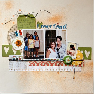 Forever Friend by Amy Coose
Amy has chosen green and orange on this page — two colors with some good contrast to them. However, she’s used shades with more black which subdue the contrast — a good choice for a page about enduring good feelings of friendship
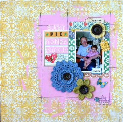 Sugar Pie Honey Bunch by Doris Sander
Now here’s a page with some big-time contrast going on. Two sets of complementary colors: orange and blue and red (pink) and green make this a page that grabs your eye and delivers a big charge. Deep intensity in the pink and blue add to the energy here.
5. what color will be dominant?
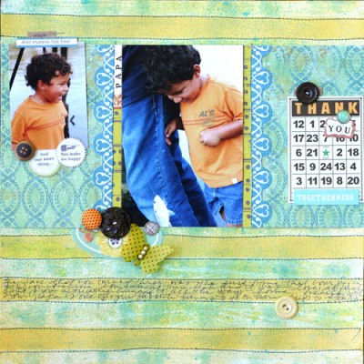 page by Doris Sander
On this dreamy page, blue is the dominant color. Note, though, that there are different shades of blue here–some you might even think wouldn’t work together, but the preponderance of blue creates unity. Blue is the “gallon” color here. Green is the “quart” showing up in stripes and embellishments, and then orange is the “pint.” The bits of orange add tension and flow to the page.
We delved into all of these color considerations and more at Masterful Scrapbook Design this past September.

