by Debbie Hodge
“Active white space is carefully considered emptiness.”
– Alex White, The Elements of Graphic Design
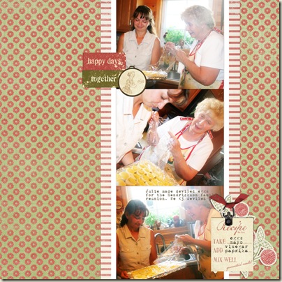
Take a look at three versions of the same scrapbook page as more and more considered white space is incorporated.
White space on scrapbook pages is not always white. It can be any color—it can even be patterned paper. The term “white space” refers to an area devoid of photos, embellishments, journaling, and title.
White space provides a resting point for the eye and breathing room for the viewer taking in your photos and journaling.
White space has a shape that can be active or passive.
When that shape is symmetrical:
- It’s predictable.
- It’s less consequential (than a symmetrical shape would be) to how we perceive the elements in the design; if it’s noticed at all, it’s noticed as background.
- It’s passive.
When that shape is asymmetrical:
It’s dynamic.
It’s unpredictable and requires active involvement from the viewer.
It can make your page look great.
Version #1

One of my favorite ways to begin a page is with a series of three photos. If they’re landscape-oriented, then I crop them all to the same width and put them in a column. If they’re portrait-oriented, I crop them to the same height and put them in a row. I wrote about this design approach in 3-in-a-row: the little black dress of scrapbook page design.
I’ve placed the photos with abutting edges and matted them with white cardstock – and then that’s bordered with strips of striped paper. The entire block is just right of center.
My embellishments are placed at top left and bottom right creating diagonal-draw flow. See Place embellishments to support scrapbook page flow.
This design was quick to put together and tells my story well. . . but it doesn’t totally please me.
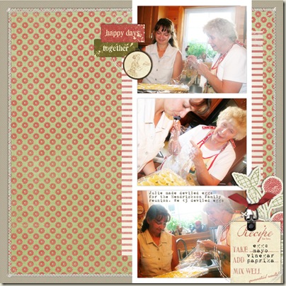
Version #2
My first changes to this layout were to add what Doris Sander calls in her Page Pizzazz classes “micro” white space. This is organizing white space: margins and gutters. I made the photos smaller and added gutters between them and borders at page top and page bottom. I also trimmed the patterned paper background about an inch smaller in height and width and mounted it on solid-colored cardstock.
Doris Sander talks about another kind of white space in Page Pizzazz: “macro white space.”
Doris says: Macro white space is what you see when you glance at the overall design of a layout. It is the larger chunks of white space between your major design elements such as the photos, title, journaling, and larger embellishments.

This is what I worked on next—my “macro white space.” To add energy and interesting lines to the overall design:
- I moved the entire block of photos and embellishments farther to the right. I increased the amount of white space to the left,thus making it more dramatic.
- I trimmed the striped borders down. They no longer extend from page top to page bottom – thus creating “steps” within the foreground elements.
- I also “stepped” the two word embellishments. Notice how the red tag with “happy days” and the green tag with “together” are both aligned in version 1—but here in, Version 2, they are set a bit ajar.
- I added circular stitching behind each embellishment point to contrast with the predominant right angles.
- I moved the bottom embellishment cluster to bleed off page right and page bottom.
The page was looking better. I really like it, in fact. But then again, I could keep playing. . .
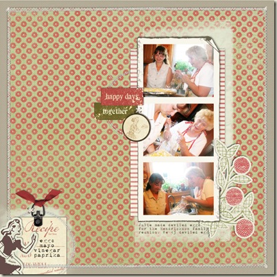
Version #3
I actually don’t think it’s necessary to push the “white space envelope” all the time – but . . . it can be a lot of fun to see what happens to your design when you make more extreme changes.
In this version:
- I decreased the size of the entire photo block and its matting so that there is generous white space all around. Borders on each side are of differing sizes.
- I used brushwork behind this grouping on the top, right, and bottom edges.
- Embellishments now extend much farther out into the bordering canvas.
- I separated the embellishment grouping at bottom right and created a new embellishment spot at bottom left. Now there is white space running in between this cluster and the main grouping. This is a great way to add interest and energy to your designs. (If you want to know why this is a way to add energy to your designs read about figure-ground perceptions. I also cover this topic extensively in Building Pages.)
 Layouts by Debbie Hodge with supplies from Designer Digitals

