by Amy Kingsford | Apr 9, 2019 | Composition, Finding and Using Inspiration, Get It Scrapped!
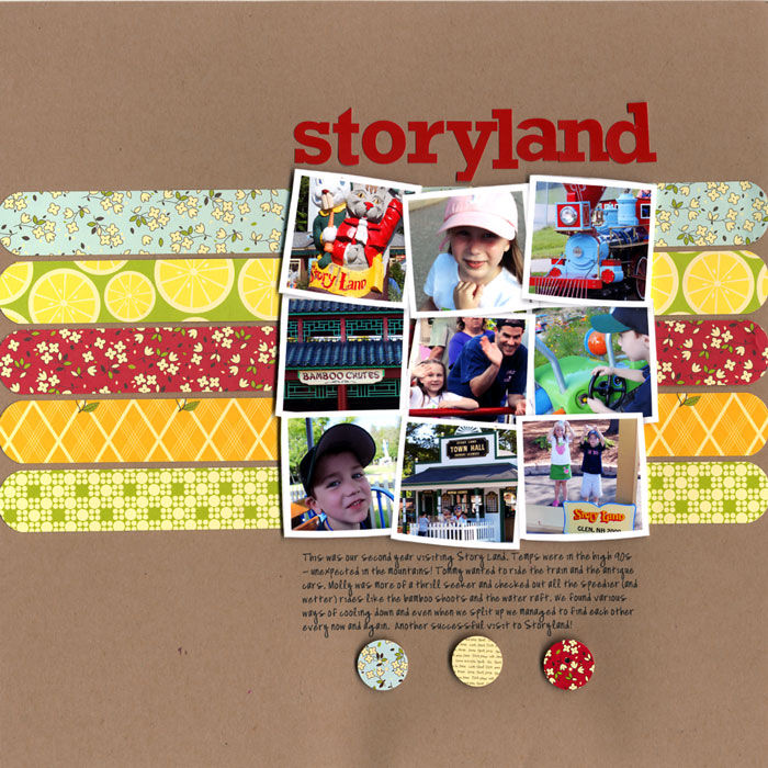
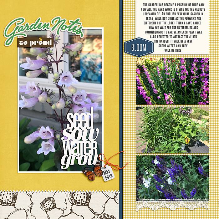
The grid foundation is one of several layout configurations scrapbookers use again and again when making scrapbook page designs. Over the years we’ve shared a number of different ideas for using the grid design on your scrapbook pages. Here’s a roundup of...

by Amy Kingsford | Aug 28, 2018 | Composition, Feature, Ideas via Product & Technique
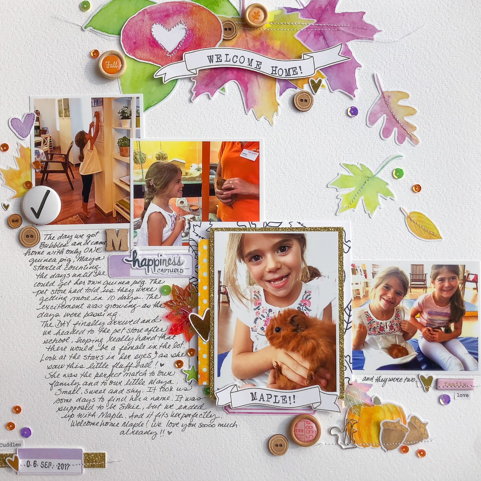
“Sparkle” or “shine” is a great way to add oomph to your scrapbook page designs. There are many materials that can be used to add that little bit of sparkle to your page, including metallic paints, inks or sprays, glitter, and metal elements. See how our creative team...

by Amy Kingsford | Jul 31, 2018 | Color, Composition, Feature
Physical balance in our surroundings is something we’re used to. We understand that if all the kids sit at one end of a narrow bench, it’s going to tip. Achieving balance on a scrapbook page isn’t quite as clear-cut. There isn’t any actual physical weight to work...

by Amy Kingsford | Jul 3, 2018 | Composition, Feature, Photos
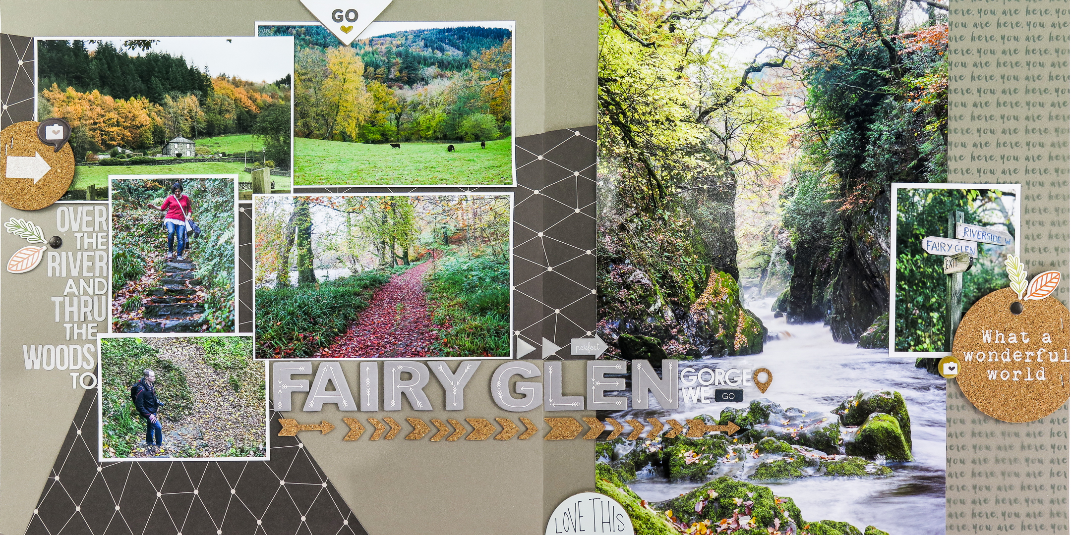
The lines in your photos can “point” the viewer’s eye in a direction, which contributes to flow on your page. Be sure to use the opportunity these lines present to get the viewer’s eye moving the way you want. Ignored, the lines in your photo can mess up flow...

by Amy Kingsford | Jun 26, 2018 | Composition, Feature, Ideas Spurred by Design, Scrapbook Coach
The half-and-half design is one of several layout configurations of combined elements that scrapbookers use again and again when making scrapbook pages (blocked, clustered, shelf, cross, band and more). These foundations are used again and again because they work well...

by Amy Kingsford | Apr 17, 2018 | Composition, Design Principles, Feature, Ideas Spurred by Design
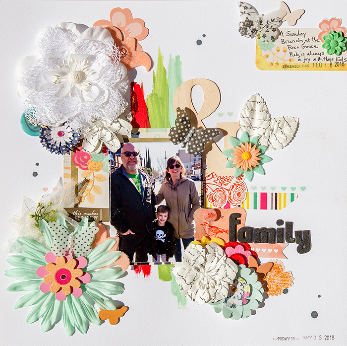
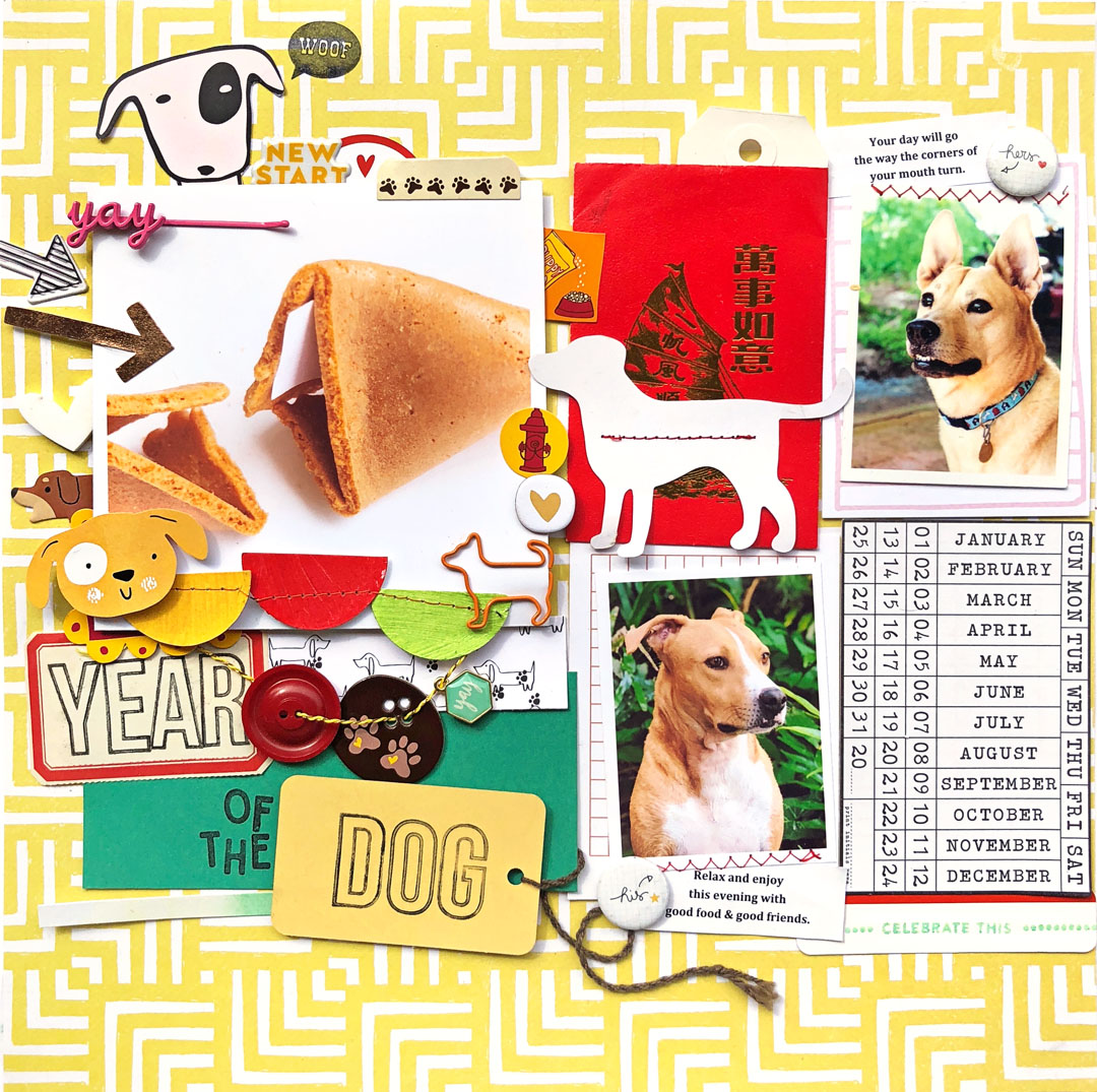
An easy and appealing way to emphasize your focal point is to embellish it. Not only does this draw the eye, but it can also be used to add an additional layer of meaning to the page. Our Creative Team members share their pages with embellished focal points here....
