 Physical balance in our surroundings is something we’re used to. We understand that if all the kids sit at one end of a narrow bench, it’s going to tip. Achieving balance on a scrapbook page isn’t quite as clear-cut. There isn’t any actual physical weight to work with. Instead, we need to anticipate how the viewer’s eye will perceive the visual weight of “elements on the page.
There are many things that affect visual weight including size, isolation, embellishment and color. In this post, we’re looking at one of those aspects: color. We are keeping in mind:
- Dark colors have more visual weight than light colors
- Warm colors have more visual weight than cool colors
- Bright colors have more visual weight than neutrals
Marcia Fortunato says, “As my family spreads out across the country and around the world, the ability to connect through modern technology is becoming more and more important to me. I used a few text message photos to document this on my layout.”
“While I started with a symmetrically-balanced design, the bright colors in my photos could potentially throw my design out of balance so their placement on the page became important. Since the pink in the top left photo is the brightest giving it the most visual weight, I balanced it by placing the other lighter pink photos on the right side with the darker of the two at the bottom. The darker warmer photo underneath also supports the bright photo, keeping the design from feeling top heavy. Keeping the few embellishments fairly neutral and towards the center of the page made them easier to balance.”
“Thinking about the visual weight of the bright colors in my photos made it easy to decide how to place them to create a balanced design, and I’m happy with the results.”
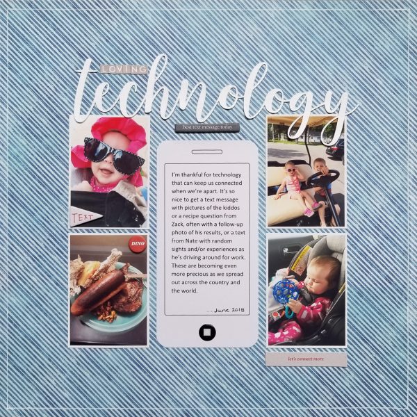
Loving Technology by Marcia Fortunato | Supplies: Patterned Paper: Just Jaimee for Cocoa Daisy; Cardstock (for title): Bazzill; Title: Malisia Script font (Silhouette Design Store), Webster’s Pages (small letters); Journal card and Embellishments: Ali Edwards; Pen: Gelly Roll (Sakura).
Dawn Farias says, “The story of my page is of how different my husband’s approach to being a stay-at-home-parent is from mine, and the things I’ve learned by watching him.
“I used the color balance approach of bright colors having more weight than neutrals. I used this approach mainly to draw attention to the “dad” in the page title but also to create a visual triangle on the page. I really love the end result. I used a shelf starter foundation and once I decided to go with mainly neutrals and one color, the process of finding papers and elements for my page became very quick and easy.”
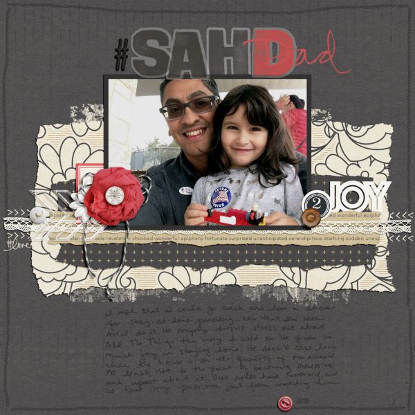
#SAHDad by Dawn Farias | Supplies: Papers from Surprised; Elements from Surprised, Christmas Time, Days of December, Strawberry Shortcake; torn edges from Collaged 1 and 2; Plump Alpha; Date Stamps – all from Dawn by Design at The Digital Press
Nicole Mackin says, “This layout is about an afternoon I had with my girls at a Christian festival.”
“I focused on the approach of showing that dark colors have more weight than light colors. Because the ‘believe’ sticker was a very prominent dark element on the page, it gave a lot of weight to the upper cluster. Since the word ‘life’ on the lower cluster did not quite balance it out, I journaled under the bottom cluster in black pen to add more weight. Also, the lower cluster being larger helps balance the weight as well. As far as the other colors, I tried to balance each cluster with the use of both multicolor and solid color embellishments that kept them tied together color-wise. I did not feel as though every color in the multi-color patterned had to be represented but picked a couple colors that stood out in the main cluster and included them in the upper. I also penned a thin black line around the page to bring even more cohesiveness to the page (and another dark element).”
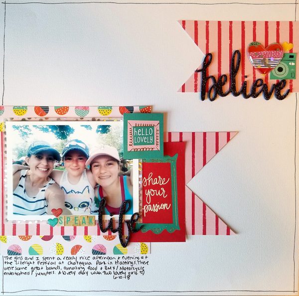
Believe by Nicole Mackin | Supplies: Cardstock: Colorbok; Patterned Paper, Stickers, Embellishments: American Crafts (Shimelle).
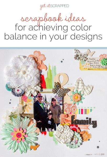
Karen Poirier-Brode says, “This layout is a page about family love. A local pub is a fun spot for brunch and a favorite of my son, Chris. This photo is of him and his wife and son in front of the Fox and Goose.”
“I started off with three vertical brush strokes of color in the center and slightly to the left. I placed a photo in the lower center of the stripes. To make sure the viewer looked at the picture I used two copies of the same image but trimmed one about an eighth of an inch smaller around the edges. I fasten the large print of the photo to the page, then attach the smaller one on top with dimensional adhesive like foam tape. I layered pocket page cards behind the photo.
“To create contrast with the dark photo, I used bright, light-colored flower embellishments starting with a white lacy flower, at top left. I used brighter colors in the groups at the bottom right and left of the photo for more weight. Since the large flower clusters on the left side of the page did not wholly balance with the lower right group, I used a smaller grouping of elements in the upper right corner. The parts are small, and all but the teal button are not very vibrantly colored. The size and tints of color keep this area from being too heavy in balance, but the separation from the central part of the page does give that small cluster some weight. Repetition with variety and lots of visual triangles also help the balance and flow of the page.”
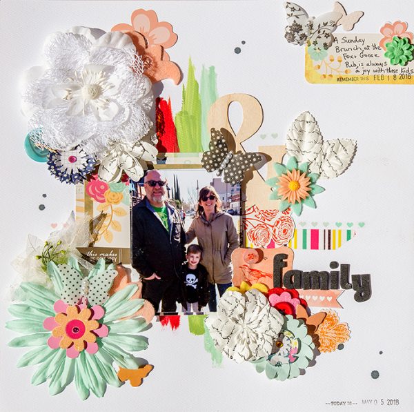
Family Makes Me Happy by Karen Poirier-Brode | Supplies: Butterflies – Jenny Bowlin, Hearts – Deco Pen, MMBI, and paint – Deco Arts.
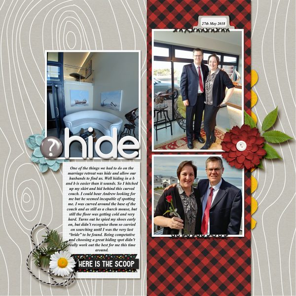
Stefanie Semple says, “Here I told a humorous story of our recent marriage retreat getaway.”
“The neutral, light grey background contrasts with the deep red and black band backing up my photos. Even though the page is split in two by the photo placement, the bold patterned paper highlights the photos of us, allowing the title, journaling, and scenery photo to recede, playing more of a supportive role. The smaller blue and white flowers balance the large red photo. I love the way it turned out and would happily try this again, even though I usually shy away from such bold color and pattern choices.”

