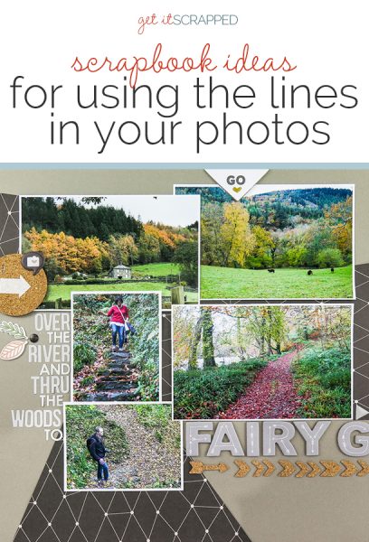
 The lines in your photos can “point” the viewer’s eye in a direction, which contributes to flow on your page.
Be sure to use the opportunity these lines present to get the viewer’s eye moving the way you want.
Ignored, the lines in your photo can mess up flow and focus, misdirecting the eye and creating unintended emphasis.
See how the Get It Scrapped Creative Team used the lines in their photos here to create strong designs.
Lynn Grieveson says, “These photos show my daughter going up in a cable car in France. I loved the lift cables in the photos of the view from the cable car, I did not love the interior of the cabin with its horizontal grey barrier blocking the view of the mountain, but I wanted to include those photos of her.”
“I used both lines–the cables and the horizontal barrier behind my daugher–in the design. I extended the grey barrier off the photo with wide-striped patterned paper backing up the photos. I extended the lines of the cables from the photos to the background with stitching. The result is a strong inverted triangle design.”
“I always look for strong lines and shapes in my photos while I crop and place them to see if they can be lined up either with the lines and horizons in the other photos on the page or with the paper or elements I am using.”
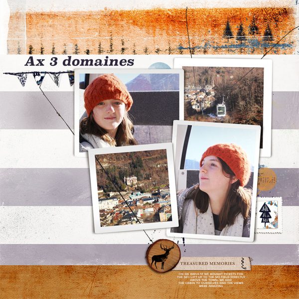
Ax3 Domaines by Lynn Grieveson | Supplies: Sprout Paper Pack, Oh My Deer Kit, Frames in Fours and Stitch in Time Lengths (all Lynn Grieveson Designs at The Lilypad).
Iris Fox says, “I made this page to showcase photos from our visit to Fairy Glen Gorge in Wales, UK. In all our travels, this is the most beautiful place I’ve ever stood.”
“These photos were important to my story because it was quite a trek to get to the gorge, filled with lots of different vistas. I wanted to recreate the feeling of our journey through meandering paths that followed the river and went up and down through the forest. I enlarged the picture of the gorge itself to capture the beauty and detail.”
“To create flow on my page, I took my cues from the curves in the landscape, and the sight lines from my husband and I, to arrange the photos in a collage. I used patterned paper to accentuate the curves I was following, and to connect the collage to the final destination by extending the line of the green rolling landscape across the two pages.”
“I also extended the alphas (that serve as journaling and title) from the left side of the collage through to the right, ending on top of the enlargement. For emphasis I added arrows, triangles and chevrons above and below the title. I stuck with a mostly monochromatic design to let the forest colors of the photos pop, further drawing attention to them.”
“One tip I have for working with photos that have very organic lines is to emphasize them by extending those lines through the use of layers, but keep the rest of the design clean and simple, lining up elements like titles and journaling in straight lines. That way the overall page design doesn’t distract from the photos, letting the eye follow their flow.”
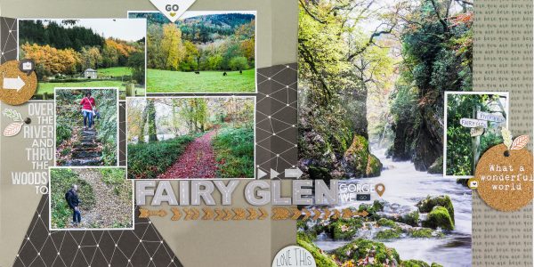
Fairy Glen Gorge by Iris Fox | Supplies: Cardstock: Studio Calico; Patterned Paper: Gossamer Blue; Acetate: Pretty Little Studio; Cork Shapes: Ali Edwards, Studio Calico; Chipboard: Ali Edwards, Gossamer Blue, Studio Calico; Puffy Stickers: Evalicious; Alphas: Basic Grey, Simple Stories, Studio Calico.
Deborah Wagner says, “My sister and I took dozens of photos of the stunning sunsets in Marco Island. I used the lines of the deck to draw the viewer’s eyes into the page and focus attention on the photo and cluster. It is important to use the lines in your photo to bring the viewer in rather than distract their attention to unimportant details or off the page.”
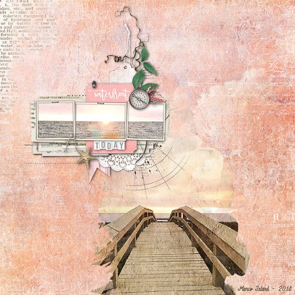
Sunset by Deborah Wagner | Supplies: Katie Pertiet – Blythe Papers, Art Option Mini Mix No. 1, Surf Lagoon Kit, Atlantic Kit, Lens Flares Color No. 1, Dictionary Blendables Beaches No. 1, Blendable Layers No. 86; Studio DD – Layer Works No. 927
Jill Sprott says, “My daughter’s semester abroad in Europe produced lots of photos, and lots of opportunities to document her travels. The majority of the travel pages that I have made involve multiple photos, because who can choose just ONE when making a travel layout?!”
“When working with lots of photos on a page, it helps to attend to the lines in the photos, and to arrange the photos in such a way that they contribute to a sense of order on the page. My daughter’s photos of Monaco included lots of landscapes, and only two photos of her, in which she wears a dark coat and stands out against the landscape. Putting those photos in close proximity would throw off the balance of the page, so I arranged the photos in such a way that they are on separate sides of the layout, though still connected by an invisible diagonal line that moves from right to left. The viewer’s eye moves gently upward from my daughter’s gaze in the focal photo (and the helpful arrow over it) toward the group of photos to the right — specifically to the rise of mountains across two photos, leading to the other photo of my daughter.”
“These aren’t the only photos that I arranged while mindful of lines. A few of the smaller photos in the left column of the block of photos include some element (like a mountainous landscape or an arch) that moves the eye slightly upward to the photos next to them on the right. The photos on the right have some element that pushes the gaze back to the left, like the scooter’s tilt or the cathedral’s angle. Being attentive to lines in photos also involves being attentive to visual weight, which is why the visually “heavier” photos — for instance, the ones that seem darker or where the frame is filled by a large building — are placed closer to the bottom of the page.”
“Ultimately, it can take a little time rearranging photos on a page before you find an arrangement that clicks into place, but keeping an eye for the lines within photos will make the process much easier.”
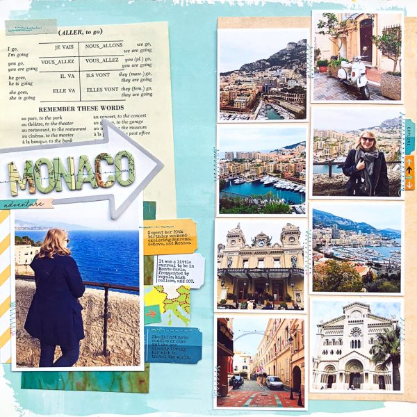
Monaco by Jill Sprott | Supplies: Patterned Paper: Crate Paper, 7Gypsies, Studio Calico; Journaling Card: Elle’s Studio; Alphabet Stickers: October Afternoon; Arrow Sticky Note: Ali Edwards; Labels/Tickets: Studio Calico; Fabric Tabs: Studio Calico; Sticker: Crate Paper; Fabric Tape: 7Gypsies; Other: circa-1960s French lesson book page.
Debbie Hodge has placed her photos on “Volleyball” to take advantage of the flow lines within two of the photos. Her son’s arm in the photo on the left points up and to the right. Thus, she placed the photo of the girls on the other side of the net right where it points. The girls are looking back to the left–and that’s where she’s placed the title: right in their line of sight.
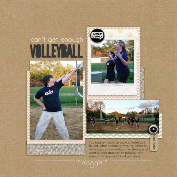
Volleyball by Debbie Hodge | Supplies: Fairy Tale, PageKrafty by One Little Bird; Sprinkles No 9 by Valerie Wibbens; Hello My Name is by Leora Sanford; Snippy Alpha by Gennifer Bursett; Artplay Palette Rockstar by Anna Aspnes; Flair Box 3 by Paula Kesselring; Whimsy Borderlines by Andrea Victoria; Framed Affections by Kaye Winiecki; Century Gothic, GardenC fonts

