There are several layout configurations of combined elements that scrapbookers use again and again when making scrapbook pages (blocked, clustered, shelf, cross, band and more).
A quick way to get a new look and add instant energy to your page is to take one of those foundations and put it on an angle. Check out an interview with Lisa Dickinson about “angled compositions” and see our Creative Team take on the “angled” challenge with their own pages.
What is your top way to arrange the elements on the scrapbook page? Currently I have been doing lots of tilted designs – angling all the elements at a slight diagonal on the page.
When I began this page, I printed one 4×6 photo and a smaller photo strip of 3 photos. I had planned to overlap the photo strip with the larger print. When I tried to arrange them horizontally, they looked cramped on the page. So I tilted everything slightly upward which gave me a bit more room to play with.
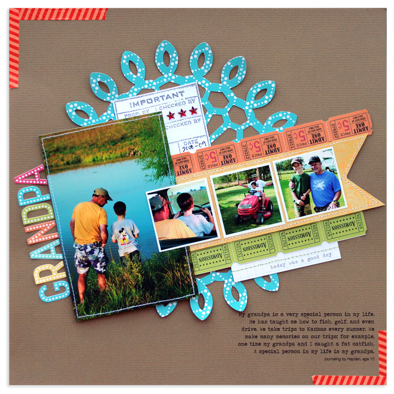
Grandpa by Lisa Dickinson | Supplies: cardstock (Bazzill Basics); patterned paper (October Afternoon, Websters Pages); stickers (October Afternoon); stamp, ink, rhinestones (Jenni Bowlin Studio); tag (Evalicious for Jenni Bowlin Mercantile); tape (Queen & Co); pen (Creative Memories); die cut machine (Silhouette Cameo); die cut file (Jenni Bowlin Mercantile); font (Bohemian Typewriter); machine stitching
Why do you keep using it? What is it that you like about it? This composition gives the page a clear visual line to follow along the diagonal. I like that the slight tilt gives a sense of action and motion to the page. The arrangement is also a bit more whimsical than a horizontally-aligned design. And bonus – it doesn’t require exact measuring of borders and placement, which I love!
How do you keep it fresh? I’m finding that just about any design can be tilted slightly to give it a fresh spin. I’ve used many of my past go-to designs (grids, photo rows, etc) and added this diagonal tilt to create a new page.
Any relevant tips? Make sure all your elements follow the same diagonal line when you adhere them. On most designs, keep the tilt less than 45 degrees. If you tilt more than that, the design might appear a bit unstable. To create even more energy on the page, add in contrasting shapes, like circles and squares. On my layout, the large circular doily adds curves to help balance out all the straight lines.
Amanda Jones says, “This page documents the fact that we’ve vowed, as a family, to make more of the fact that we live in a beautiful part of the world, by visiting local attractions.”
“Since the page was about travel and getting out and about, I gave the page a feeling of movement and exploration by rotating the main canvas of my page a little counter-clockwise. I first created the page straight-on, then trimmed it down, rotated and mounted on a second piece of patterned paper, stitching it in place.”
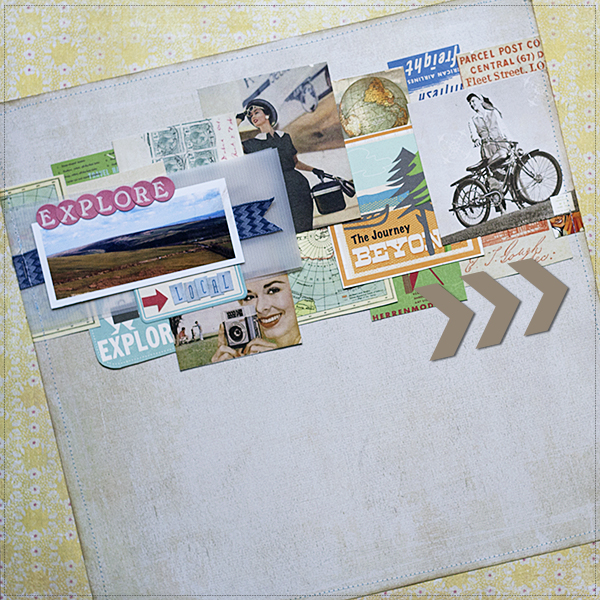
Explore by Amanda Jones | Supplies:
Kit – JBS Mercantile; Patterned Paper – October Afternoon, Basic Grey; Letter Stickers – Basic Grey; Label Stickers – October Afternoon; Other – sewing machine and thread.
Heather Awsumb says, “I saw this quote in a store in Baltimore that captured my feelings about friendships perfectly and knew immediately that I would use it for a page title.”
“I tilted everything at a -15% angle using Photoshop Elements. I started with one red photo frame and held down the Shift key while tilting it to the left until it was at an angle that I liked. Holding down the Shift key makes the angle tilt in even 5 degree increments making it easy to tilt everything at the same angle. I built the rest of my grid design from that first photo frame; tilting each element as I added it to the page.”
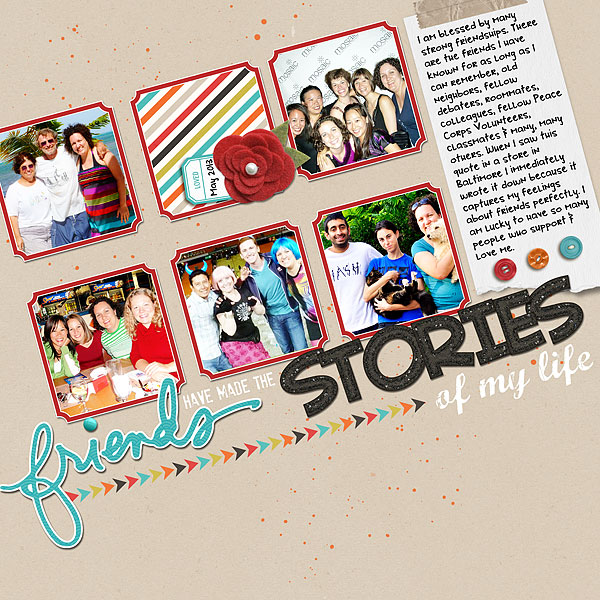
Friends Have Made the Stories of My Life by Heather Awsumb | Supplies: Stay Tuned Kit by One Little BIrd Designs; Shine On Kit by Designer Digitals; Thank You Friend Hand Drawn Brushes by Ali Edwards; Glittery Neutral Alpha by Libby Pritchett; Marcelle Font; StamPETE font.
Ashley Horton says, “I snapped these photos of our daughter reading because it’s been a bumpy battle, and I was happy to see her reading and enjoying it.”
“I built my page by beginning with the photos and placing them at the angle I wanted to use. This allowed me to line up all of the other elements on my page, once I had my photos in place. One of the great things about this page design, was that it gave me the opportunity to use a lot of scrap pieces on my layout.”
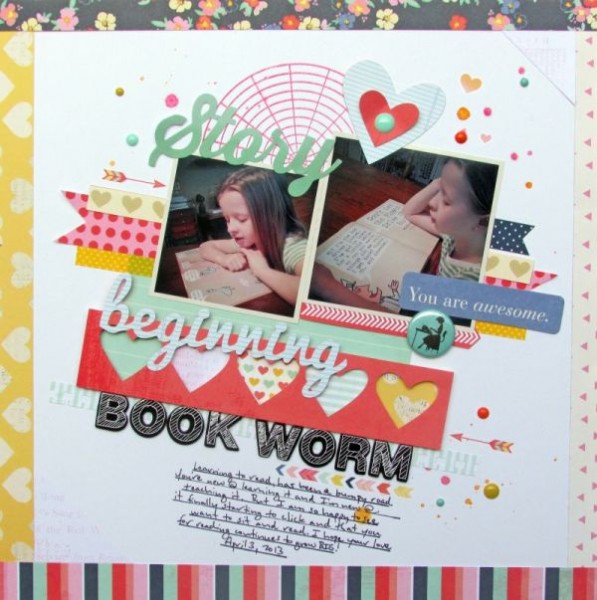
Beginning Book Worm by Ashley Horton | Supplies: Patterned Paper, Printed Chipboard Shapes, Rub Ons, & Thickers: American Crafts; Tin Pin: October Afternoon; Enamel Dots: My Mind’s Eye; Color Shine: Heidi Swapp; Stamp: Hero Arts; Font: Pacifico
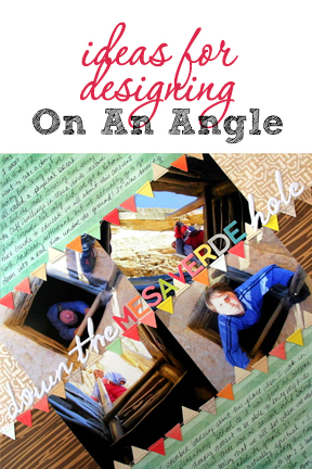
Katie Scott says, “Our ski trip to Colorado included a one-day excursion to Mesa Verde where we got to go into an underground kiva.”
“Normally I wouldn’t make such a steep angle but the topmost photo was at an angle and it worked out that the skyline in the photo was horizontal if I used a dramatic tilt. I then found a diagonally striped paper and used the angle of the lines for photo placement. I wrote my journaling in those diagonal stripes. I am happy with how easily this page came together and how it turned out; I think that I’ll keep this idea in mind for other papers that I have with diagonal stripes.”
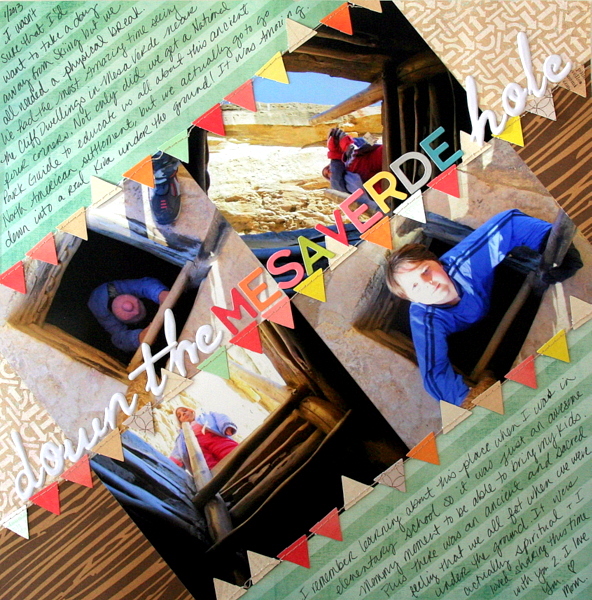
Down the Mesa Verde Hole by Katie Scott / Supplies: American Crafts Dear Lizzy, Bella Blvd. and Basic Grey papers; American Crafts banner embellishment; American Crafts and October Afternoon letter stickers;
Andrea says, “I wanted to make a layout highlighting my favorite winter photos while using my favorite technique, a blended image.”
“My inspiration came from Paula Gilarde’s Inspiration series. I started with the focal image. The photo already had nice line in it and it gave me the idea of using a Z composition. I knew that I wanted some texture showing through so I used a paper under it that had texture and used the hard light blend mode at 88%. My layout started with tilting the large photo at about 160% so that the lines would line up correctly. I did the same with the frames. It is great using blend modes on your photos and it is fun trying them out to see which works the best.”

Winter Walks by Andrea | Supplies: Celina Curtis Shades of Blue no4; mco frosted snow flurry; Anna Aspnes AA script tease learn 1-3, swim swim paperie staple 1, StitchedbyAnnaWhite1 12inchHorizontalRunATailedTied stitches; Katie Pertiet Vintage Frames No 22; Fonts 28 days later, AR Berkley, Tahoma
Brenda Becknell says, “My granddaughter got a battery powered “dune buggy” for her 4th birthday and I loved the expression on her face as she took her little brother for a ride around the yard!”
“I wanted the page to be fun, playful and full of movement, and knew that a tilted arrangement would be a great choice. I tilted everything counter-clockwise. Splatters of green and gold glitter paint and swipes of paint around the edges of the white cardstock add fun, and the chipboard chevrons, washi tape strips, and random stitching lines add movement. The alphabet stickers and chipboard pieces were a bit dull, so I heightened the color with Copic markers.”
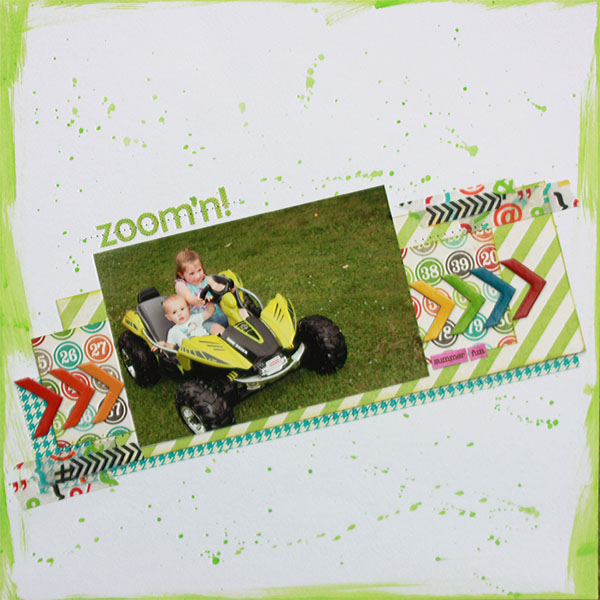
Zoom’n by Brenda Becknell | Supplies: Cardstock: Bazzill; Patterned paper: My Mind’s Eye; Chipboard: Basic Grey; Washi Tape: Doodlebug Designs and Simple Stories; Alphabet stickers: Authentique; other: Copic markers, acrylic paint
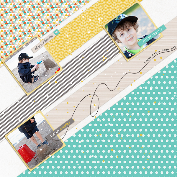
Tara McKernin says, “This is a layout from a trip to the beach, I wanted to showcase how much I loved the moment without journaling an in-depth story–just savor the moment.”
“I built my layout at an angle from the start. I worked from the bottom right corner to the top left. It flowed better for me that way. I wanted to play around and have fun since this was a bit different than a normal layout. I loved how it turned out.
Kiki Kougioumtzi says, “This is a page my daughter and I playing with glowsticks and making various designs.”
“I started building the basic foundation by placing the photos and the main elements straight on my cutting mat (which helps me because it has a grid on its surface and is 12″x12″). When I was satisfied with how it looked, I measured the height of the block and marked it on my cardstock base. Then I took a 45 degree angle triangular ruler and lightly drew a straight pencil line. Finally I started building the page.”
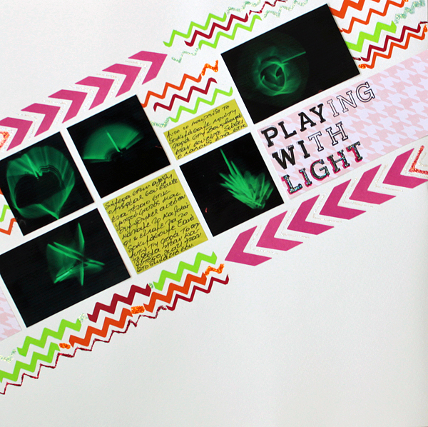
Playing with light by Kiki Kougioumtzi|Supplies:Patterned paper:Rouge de garance,Echo Park;Cardstock:Bazzill Basics,Canson;Other:American Crafts stamps,Tsukineko StazOn ink,Ranger Stickles glitter glue.
Debbie Hodge says “This is a page about my son introducing me to a smart-phone app for one of our favorite board games–Ticket to Ride–and my ensuing obsession with it (now I can play even when I don’t have a real live opponent and it’s a quicker to set-up and score.”
“Because of the theme, I started with vintage ticket strips which I decided to lay out like train tracks. I put them on a tilt for energy and laid them out to create compartments for my photos and title. This is a digital page, so I blocked out my photo spots with blank rectangular shapes and then ‘clipped’ photos to those shapes. At that point I was able to rotate each photo to get an interesting angle — the contents of the photos are straight up with the crops are angled. It adds tension and interest. layered the journaling strips and part of the title horizontally across the page for strong contrast with the angles of everything else.”
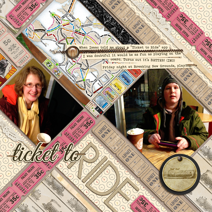
Ticket to Ride by Debbie Hodge | Supplies: Chuff Chuff by Lynn Grieveson; Daily Planner by One Little Bird; Artplay Woodland, Stitched by Anna Brown by Anna Aspnes; Brad Bonanza, Staple Its by Pattie Knox; Journaling Strip Masks, Doily Edgers by Katie Pertiet; Kraft Party by Robyn Meierotto; A Spring Day by Sahlin Studio; Ancienne Vivid by Quirky Twerp; Great Vibe, Bohemian Typewriter fonts
[current]

