by Debbie Hodge
This article appears in the August issue of Paper and Pixels.
One of my earliest and most frequently-used approaches to putting scrapbook pages together was the “blocked” design.
In construction terms, “blocking” refers to the horizontal boards placed between wall studs. To make a “blocked” scrapbook page, divide your page into columns and rows and fill the “blocks” made by the intersections of these rows and columns with page elements. There’s a spot for your title, your journaling, one or many photos, and even pretty pieces of patterned paper.
“Getting ReAcquainted” is part of a vacation album and the blocked format made it easy to create many pages quickly. What’s more I was able to keep a consistent look from page to page by repeating the basic design.
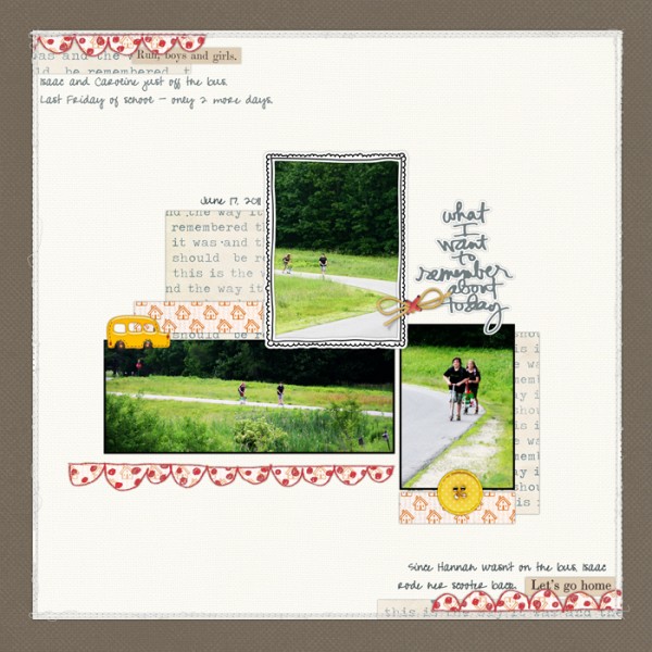
At some point, though, I deserted the block. I decided it was too “square” for my hip ambitions. I started experimenting with leaving more white space, creating asymmetrical designs, pushing myself to play with balance and unexpected flow patterns.
“What I Want to Remember” is the kind of page I enjoy making in order to play with white space and asymmetry.
These experiments are fun . . . BUT they often take a lot of time and they don’t always accommodate many photos easily. Thus, I’ve staged a return to the “blocked design” on my pages – looking, though, for ways to keep the blocked design fresh.
Here are 6 ways to “shake up” your approach to the block:
1) Mat your block
Rather than running your elements edge-to-edge and corner-to-corner on a blocked page, group them in smaller block and then mat the block.
Creating this “inner block” offers opportunities to add interest with the contrast between your background canvas and block mat. Consider whether to use gutters or abut photos. You might use stitching between photos rather than a gutter.
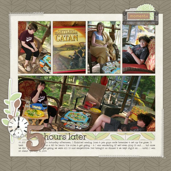
The blocked design on “5 Hours Later,” allowed me to get 5 photos onto a one-page layout and still include an eye-catching title and journaling. It’s all matted on a cream-colored square with narrow gutters between photos and a more generous outer margin. The block is centered on the background canvas—which is a piece of patterned paper. Without the cream mat, these photos would have gotten lost on the patterned paper canvas.
2) Blow things out of proportion
Just because you’re working on a square canvas doesn’t mean your block has to be square. Group your elements into a rectangular block and then mount it off-center on your square canvas to add asymmetrical white space into the design.
Asymmetry is almost always more interesting than symmetry.
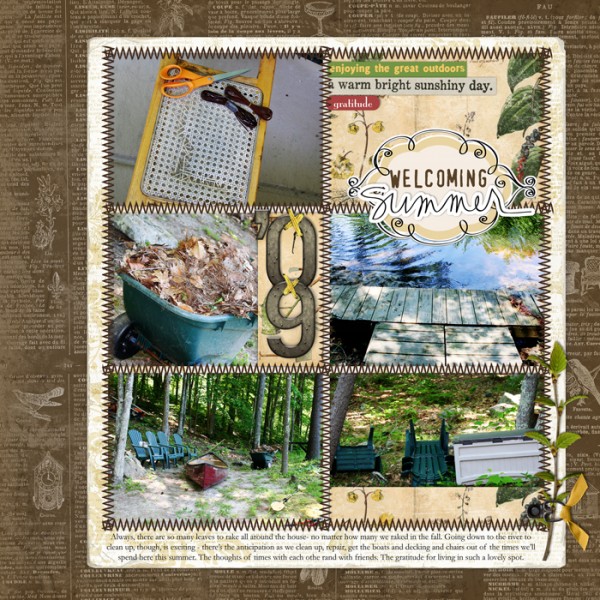
Stitching delineates 6 same-sized blocks on “Welcoming Summer.” The blocks hold photos, title, and decorative papers and are mounted on a light-colored patterned paper mat with enough space left to place the journaling on the mat. The matted grouping is mounted to the right of the canvas creating asymmetrical white space around it.
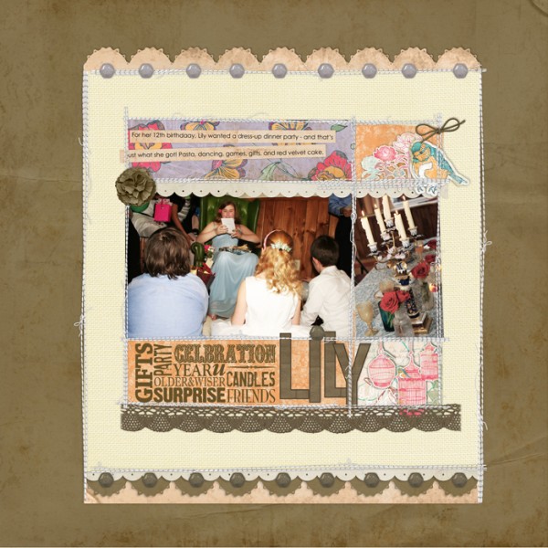
The design on “Lily” mixes proportions even more. The photos, journaling, title, patterned paper pieces are organized into a square block. This square block is mounted onto a rectangular mat, and the rectangular mat is then mounted onto a square canvas. Why? Because it adds interest and draws the eye right into the center and my photos.
3) Leave a block empty
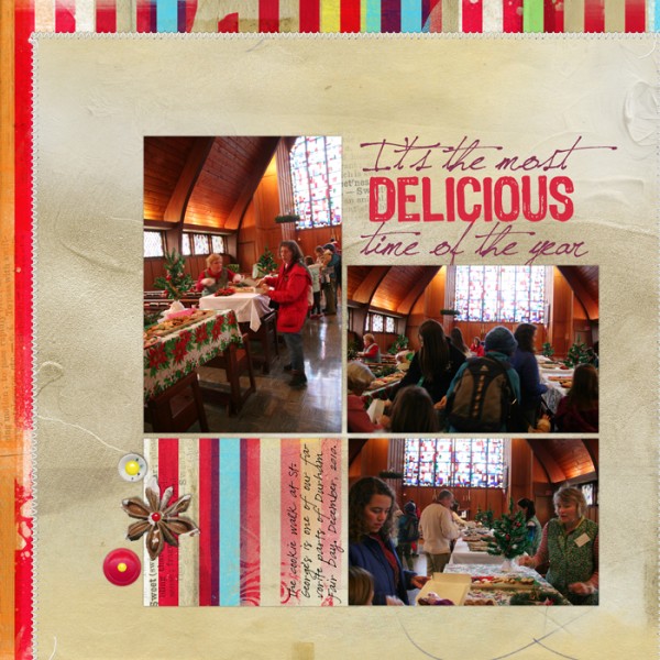
In studies of perception, there is the idea of closure which maintains: if a viewer is given enough pieces of a whole, their mind will complete that whole. What’s more: requiring the viewer to make this kind of connection more actively involves him or her in the piece they are viewing.
While the top right corner of “It’s the Most Delicious Time of the Year” isn’t completely empty (it does hold the title), its outline isn’t defined in the clear way that those of the other blocks are. It adds interest and energy to this quite linear page.
4) Jiggle, tilt, and cross boundaries
Once you’ve defined your block, make some changes that give it a less structured look. Tilt one or more of the blocks. Let elements overlap or spill into other blocks.
The subject matter of “Crazy Fun” was too carefree for my original, lined-up block of page elements. Sliding a photo over, tucking title work under other pieces, and letting the embellishments spill off the block supported the lighter mood of the photos.
5) Add scalloped, zig-zagged, or torn edges to your blocked grouping
When you remove the mat for a blocked grouping, the edges of your photos and other page elements define the block’s shape. Don’t think, though, that every edge needs to be a straight line. The eye will still perceive the whole as a block, but you will be adding interest and ensuring things aren’t too perfectly linear.
A portion of the top edge and a portion of the right side of the blocked grouping on “At the Falls” are made by scalloped lines. The result is a whimsical, light touch to an otherwise orderly page.
6) Jut out
Who says a blocked grouping has to have 4 sides? Go ahead and jut out into the margins. You’ll add interest but still have your rows and columns that make for easy organizing of multiple photos and elements on a page.
The one portrait-oriented photo on “Boston” extends above the top border of the grouping. Note that the scalloped paper at bottom right also extends outside the expected boundaries. This helped me emphasize one photo over the others and have fun with the blocked design.
What’s your take on the blocked design? Has it been a favorite or yours or have you shunned it for more exciting compositions? Here’s hoping that some of these ideas draw you back to the blocked design when you’ve got many photos to fit onto one page and, yet, still want to have fun with your design.

