 There are several layout configurations of combined elements that scrapbookers use again and again when making scrapbook pages (blocked, clustered, shelf, cross, bandand more).
With the “L” or bracket composition, horizontal and vertical arms meet to create a right angle that provides a stable spot for your page elements.
See one of the video lessons on bracket compositions from Scrapbook Coach #8 Bracket.
Get more Scrapbook Coach lessons.
Get more Scrapbook Coach lessons.
Katie Scott made this page using the video lesson above.
Katie Scott says, “My daughter likes to practice until she gets it perfect – whether it be jumprope, hula hoop, cart wheels, or, in this case, cake making and decorating.”
“I watched Debbie Hodge’s video for bracket composition and based this layout on her layout Eureka Downtown. I used a combination of border stickers and patterned paper strips for the horizontal part of the bracket.”
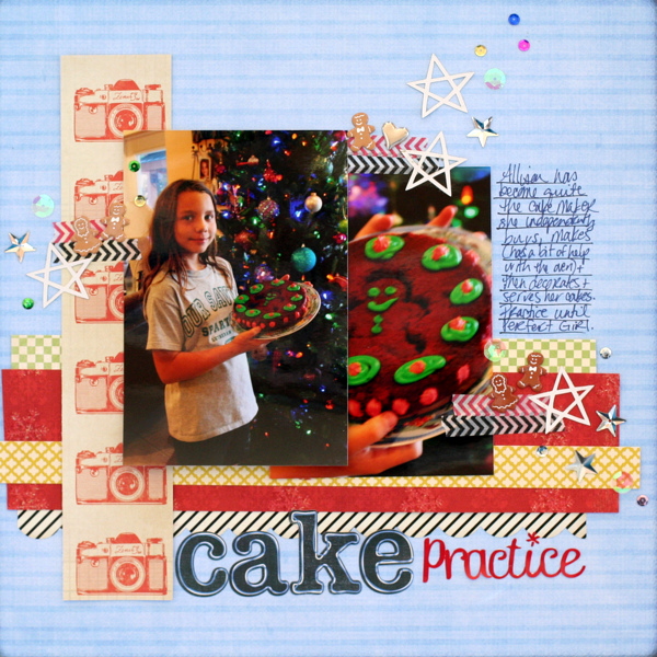
Cake Practice by Katie Scott | Supplies: Sassafras, Crate Paper, October Afternoon, and My Mind’s Eye patterned papers; Sassafras and Studio Calico letter stickers; Recollections washi tapes; sequins; Sticky Dots Thermoweb adhesive; Silhouette Cameo, KI Memories Rock Stars cut files; gingerbread men and heart brads.
More scrapbook pages with bracket foundations
Marcia Fortunato says, “This layout is about a hike my family took on an unusually warm December day and about how much I appreciate our time together.”
“To partially frame and support my photo, I made a bracket of word strips and small embellishments. Words and phrases along the bottom express how my feelings about the day. Flair and other small embellishments are along the side and help define the bottom edge, balance the layout, and focus attention on my photo.”
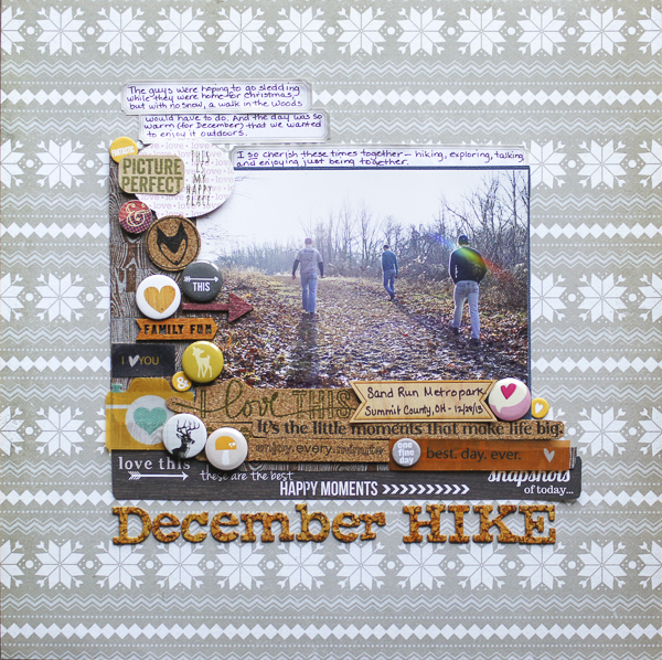
December Hike by Marcia Fortunato | Supplies: Patterned paper: Fancy Pants Designs, Simple Stories; Cork Paper: DCWV; Stamps: Studio Calico; Letters: American Crafts (Thickers); Embellishments: Studio Calico, Fancy Pants Designs, Basic Grey, Jillibean Soup; Journal labels: Martha Steward; Washi tape: Hambly Studios; Inks: Tsukineko Memento, Hero Arts; Pen: Le Pen (Marvy); Adhesive: American Crafts; Foam Adhesive: 3M, Scrapbook Adhesives by 3L.
Ronnie Crowley says, “This picture is a snapshot of my daughter while we on vacation. When I looked at it, I thought of all the planning we’ve been doing the last year in preparation for her high school graduation.”
“I made a bracket of a long title for the vertical arm and smaller pieces for the horizontal. Emily Pitts is the master of long titles and it was when I was studying her pages that I realized I could do this. I used the rest of quote in a script font to create a second arm of the bracket. If my quote had been shorter I could have continued with the alpha but unfortunately for me it was too long so to balance the weight of the large alpha with the lighter font I used stitches to underline it. This provides a stronger horizontal line to complete the bracket.”
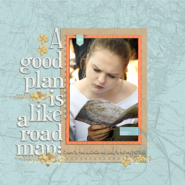
A Good Plan by Ronnie Crowley | Supplies: Ardent Sparrow – Going Places; Flergs – Crazy Stitches 2; Creashens – Eggshell Alphabet; HG Designs – Tiny Tabs; Karla Dudley – Change
Michelle Houghton says, “This layout shows the highlights from our visit to the Iowa Sate Fair.”
“I made my bracket out of title and the journaling words and phrases. To add balance to the wide open white space, I punched a small amount of confetti out of the cardstock that I used for my title and journaling.”
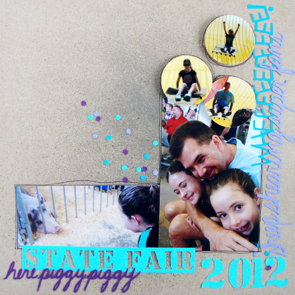
State Fair by Michelle Houghton | Supplies: cardstock; American Crafts and Bazzill Basics, mists; Heidi Swapp
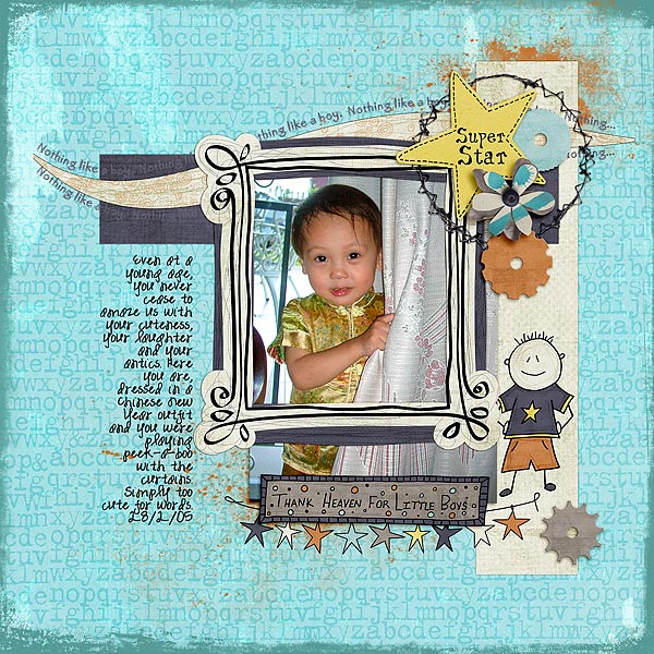
Audrey Tan says, “This is about my youngest in his Chinese New Year outfit. He was playing peek-a-boo with the curtains.”
“I anchored brackets on the upper right hand corner of the photo. To create interest, I added wavy lines to the top. I decorated the side with cogs. Where the brackets meet, I added a star title.”
Heather Awsumb says, “This page documents how I celebrated New Years Eve this year in Madagascar with friends.”
“The bracket is defined with a clear L-shape of photos that are all the same height. I emphasized the L-shape by placing a triangle of clusters: one at the top above the photos, another to the bottom left and then, finally, to the right. I used circles of orange to create repetition with variety while still unifying the clusters.”
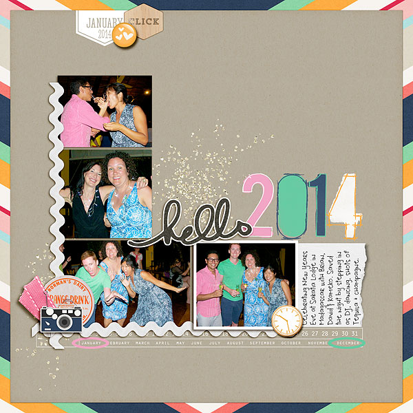
Hello 2014 by Heather Awsumb | Candid by One Little Bird Designs; Sentiment Spots No 4, Pinned Tabs No 2, Vintage Milk Caps No 1, Ric Rac Basics No 1, Curled Journal Spots No 6, Flagged Dates No 5 by Katie Pertiet; Pronuncial by Just Jaimee; Up to Date by Jen Allyson; I Heart Stories by Ali Edwards; L’Amour Sparklies by Flerg
Sue Althouse says, “This page is about a special friendship.”
“After building the horizontal and vertical arms of the bracket, I cut a large circle to fill in the space between them. The circle softens the design and is symbolic of our circle of friends.”
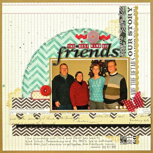
The Best Kind of Friends by Sue Althouse | Supplies: Cardstock: Bazzill; Patterned Paper: Amy Tangerine, Teresa Collins; Punches: Fiskars, Stampin’ Up!; Alphabets: American Crafts, Bella Blvd.; Stamps: Teresa Collins; Inks, Mists: Hero Arts, Mr. Huey’s; Butterfly Sticker: Jenni Bowlin; Button: October Afternoon; Ribbon: American Crafts; Enamel Dots: My Mind’s Eye; Mini Pearls: Doodlebug; Date Stamp: American Crafts Dear Lizzy

