by Debbie Hodge | Sep 30, 2010 | Color
As a part of the Masterful Scrapbook Design series focus on color, I talked to the guest designers/teachers about how they approach color when making scrapbook pages. Lisa Dickinson shared a great tip for using color and tension to guide the eye in this excerpt....

by Debbie Hodge | Aug 11, 2010 | Canvas, Ideas via Product & Technique, Patterned Paper
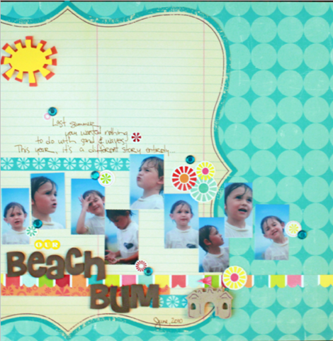
by Debbie Hodge I love using patterned papers — especially for backgrounds. However, it’s often a little tricky making sure the photos aren’t overwhelmed by the paper. As long as you employ some basic design principles you should be all set. Try the...

by Debbie Hodge | Aug 3, 2010 | DoubleUp, Feature, Sketches and Layered Templates
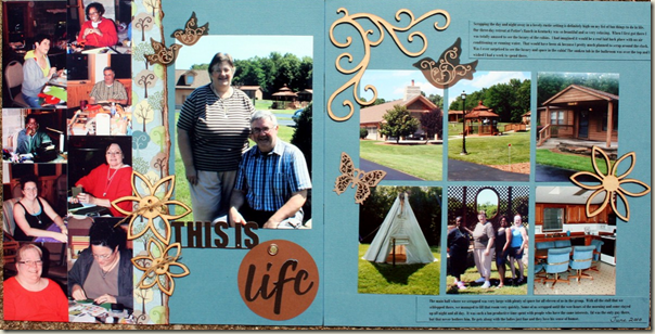
by Debbie Hodge This column is all about understanding design strategies and approaches for two-page scrapbook layouts. In each Double Up, I’ll share: a two-page layout (or even several!), design analysis of what makes this two-page design work, page sketch with...

by Debbie Hodge | Jul 19, 2010 | DoubleUp, Feature, Sketches and Layered Templates
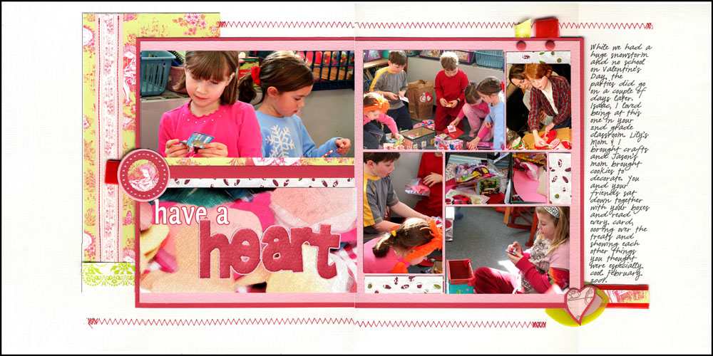
by Debbie Hodge Double Up is a new regular column at Get It Scrapped. In each Double Up, I will share: a two-page layout design analysis of what makes this two-page design work sketch layered template (I’d love to feature readers’ pages in this column,...

by Debbie Hodge | Jul 14, 2010 | Ideas via Product & Technique, Patterned Paper
by Debbie Hodge When I first started scrapbooking and shopping for patterned papers, I gravitated to eye-catching patterns with motifs like flourishes, stars, paisleys, and florals. The dots and stripes weren’t as interesting to me. I didn’t see why I needed them, and...

by Debbie Hodge | Apr 28, 2010 | Design Principles
by Debbie Hodge What is asymmetry? Asymmetry means “without symmetry.” Nothing is mirrored or centered. You could have an odd or mismatched number of differing elements. Designing with an absence of symmetry, does not mean there is not balance. Since there is no...
