by Debbie Hodge | Dec 27, 2010 | Composition
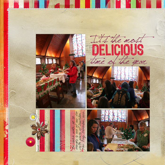
by Debbie Hodge Sometimes I like a little help getting ideas when I start my scrapbook pages. I don’t always want to use a sketch or a template because I want to play with design myself — and, yet, I’d like a starting place. The following are three...

by Debbie Hodge | Dec 21, 2010 | Composition
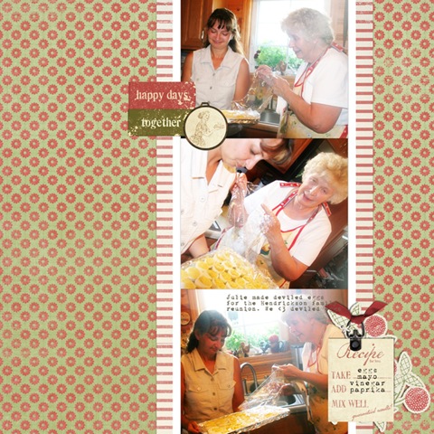
by Debbie Hodge “Active white space is carefully considered emptiness.” – Alex White, The Elements of Graphic Design Take a look at three versions of the same scrapbook page as more and more considered white space is incorporated. White space on scrapbook pages...

by Debbie Hodge | Dec 20, 2010 | Composition
by Debbie Hodge When I speak of your page’s foundation, I’m referring either to some kind of underlying grid structure, or the first one or two layers you put onto the page and then build from. That first element (or layer) is what connects the other elements to the...

by Debbie Hodge | Dec 18, 2010 | Color
An analogous color scheme uses colors that sit next to one another on the color wheel. These are pleasing low-contrast combinations. Analogous color schemes are often found in nature and are harmonious and pleasing to the eye. For “You Cannot See Me,” Doris Sander...

by Debbie Hodge | Nov 9, 2010 | Composition
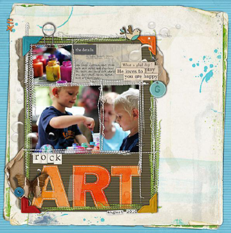
by Debbie Hodge Let’s “study” pages by Celeste Smith, Kayleigh Wiles, and Lisa Dickinson In the audio of the November Masterful Scrapbook Design (MSD) seminar on “Details” I suggested studying pages that you like in order to understand how you might...

by Debbie Hodge | Oct 8, 2010 | Color
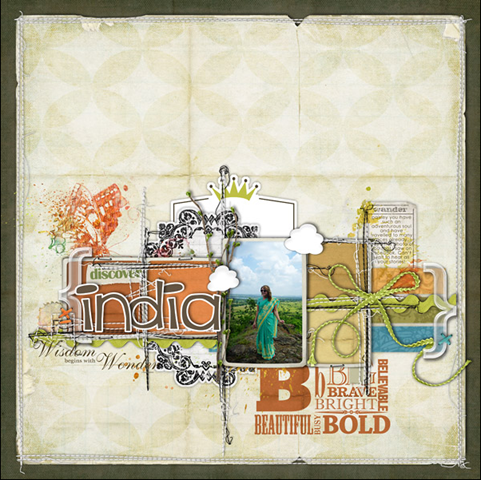
by Debbie Hodge Deciding upon the colors to use on a scrapbook page isn’t usually a straightforward process for me. I don’t have a series of questions I use that go from point A to point Z and then yield an answer. My approach is a “circling”...
