by Debbie Hodge
When I speak of your page’s foundation, I’m referring either to some kind of underlying grid structure, or the first one or two layers you put onto the page and then build from.
That first element (or layer) is what connects the other elements to the background canvas. It affects the placement of each additional layer and element as you arrange them to achieve balance and unity.Take a look at how four scrapbookers begin their pages, AND take a look at your own pages to see your favorite approaches.
Lisa Dickinson: foundations with openings
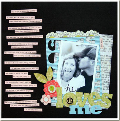
Lisa Dickinson says, “A foundation for a page can be as simple as your background card stock but I always like to try to highlight my photos with something in addition to that card stock. Whether it be patterned paper of just a simple photo mat, stitching, or something that calls your attention to the photo.”
“On ‘He Loves Me’ I wanted to use that chunk of corrugated paper. It’s from alphabet sheet that I just cut out. It had dimension and when I punched the numbers and letters out I liked that you could see through it and you could see the layer below it. I wanted to pop the photo up a little bit and that added just enough dimension to do that.”
 Layout by Lisa Dickinson from from Masterful Scrapbook Design: October 2010.
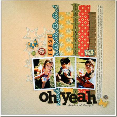
Lisa took a much different approach to creating a foundation on “Oh, Yeah”—but she’s still relying on openings and seeing through them.
The background canvas is a crosspatch textured white cardstock. Lisa laid down a template of connected stars and sprayed the page with orange and green mists. She then removed the template and outlined the white stars with a pen. From there, Lisa proceed with strips of paper and ribbon.
 Layout by Lisa Dickinson from from Masterful Scrapbook Design: October 2010.
Dina Wakley: horizontal bands
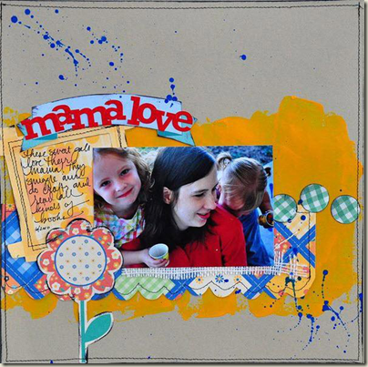
Dina Wakley says, “To me, a foundation is a place to start. A place on which to build. And I create a starting point on every page, if that makes any sense. You have that blank piece of cardstock and you think, ‘Now what?’ I have no concept of what a page will look like when I start. I grab a piece of patterned paper or I grab paint, and I mark the page, and then that becomes my foundation.”
“On this page, I happened to put just a lot of that ugly yellow-orange paint. I thought, ‘This is my visual, my foundation … I’m going to build on this–not going to build on the top, not going to build on the bottom. This is where everything’s going to come up from.’ So that’s how I think of it. It’s a starting place.”
 Layout by Dina Wakley from Masterful Scrapbook Design: October 2010.
Dina also says, “One of my favorite things to do is to take an 8.5″ x 11″ sheet of cardstock and put it on a 12″ x 12″ page. You have automatic asymmetry going on there, and then you build your page on that 8.5″ x 11″ sheet. I like to do that quite a bit. Also, quite often I’ll start with strips. I think if you look at my layouts very often the foundation is a band across the canvas.
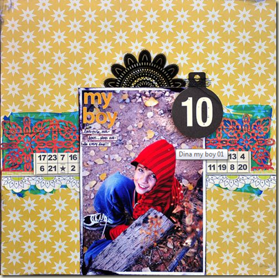 Layout by Dina Wakley from Masterful Scrapbook Design: October 2010.
Kayleigh Wiles: brushwork
Kayleigh Wiles works with a couple of foundations. She has an “inner canvas” backed up with brushwork and a foundation that contains that entire inner canvas plus white space.
Take a look at “10 Months” and you’ll see that the “inner canvas” fills a rectangular area and is backed up with a foundation of subtle brushwork. Of this page, Kayleigh says, “There are not a lot of circular details on this page. It’s very rectangular, so I wanted to add brushwork that added softness. I found the graphic dot brush with the little circles and added that. With brushes I usually use a blending mode on it or make them white or something light. I don’t normally make them bright. It’s subtle. I usually use a lot of white on my pages as a breaking point or neutral.”
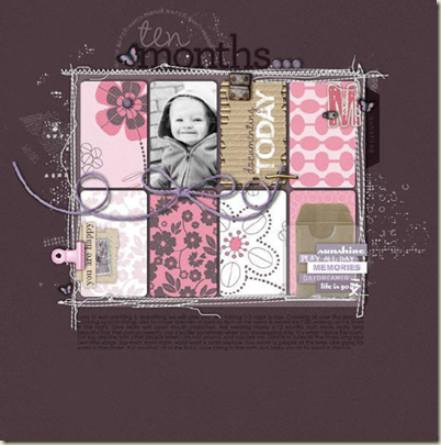 Layout by Kayleigh Wiles from Masterful Scrapbook Design: November 2010.
Of the larger matting that she often incorporates, Kayleigh says, “I like using two pieces of worn paper. Usually I have a solid color background and then there is a color that pops as the underneath paper that’s kind of tilted slightly. Then I have another paper that adds color or texture to the page, which is what I use as the last page at the bottom of the stack basically.”
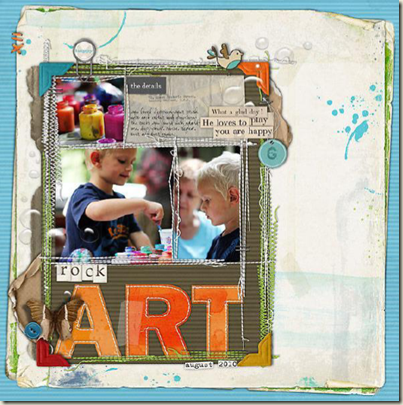 Layout by Kayleigh Wiles from Masterful Scrapbook Design: November 2010.
Debbie Hodge: rectangular mat
Many of my pages begin with a rectangle–of which only two sides (opposite sides) show. On “Fishing” a vertical rectangle of patterned paper peeks out above and below the cluster of photos and paper. I’ve stitched each end. The contrast between the patterned paper and the background canvas is low – thus this is a subtle bit of layering.
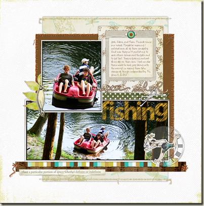 Layout by Debbie Hodge from Masterful Scrapbook Design: October 2010.
The background layers on “Light Up Durham” include a series of rectangles: stamped green (portrait), red patterned paper (landscape), green patterned paper (portrait). The first stamped layer shows above and below the layers on top of it. The next two (while they alternate in orientation—one is portrait and one is landscape) show out on the sides. This equals lots of repetitions with variety and an interesting layered background that lets the photo take center stage.
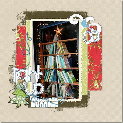 Layout by Debbie Hodge from Masterful Scrapbook Design: October 2010.
So, again, what’s your page foundation? Do you use any of these approaches or something completely different?
Lisa, Dina, and Kayleigh originally shared these layouts and thoughts in interview recorded at Masterful Scrapbook Design. Video and audio recordings are available through the archives.

