by Debbie Hodge | Feb 23, 2012 | Color
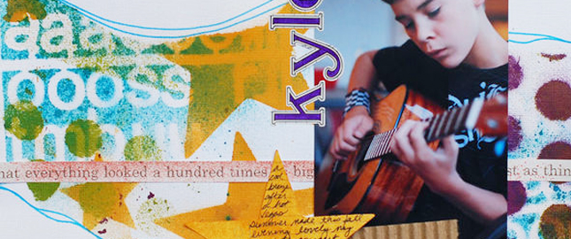
A complementary color scheme uses colors opposite one another on the color wheel, for example red and green or blue and orange. This is the highest contrast color scheme. Use it with fully saturated colors, and you’ve got a strong, vibrant look. If you...

by Debbie Hodge | Feb 16, 2012 | Color
by Debbie Hodge A monochromatic color scheme uses variations in lightness and saturation of one color for most of the elements on your scrapbook page. Neutrals are often combined with the monochromatic colors. A scrapbook page with a monochromatic color scheme looks...

by Debbie Hodge | Jun 8, 2011 | Color, DinaWakley, Everyday Life, Ideas Spurred by Design
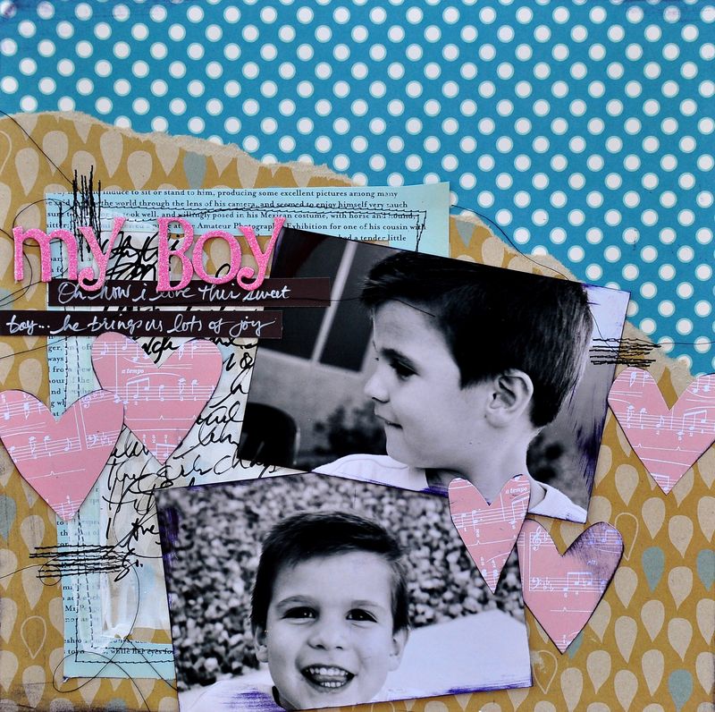
By Dina Wakley I have three boys who I affectionately call “the fellas.” I love my boys, truly and deeply! Having all boys, however, means that I have fewer opportunities to use cute girly scrapbook products and even fewer opportunities to use one of my favorite...

by Debbie Hodge | Apr 15, 2011 | Art Journaling, Color, Design Principles, DinaWakley
By Dina Wakley I love contrast. If you want a page element to be powerful, contrast it with its opposite and you have mega-impact. Contrast is what makes a piece of art surprising, or interesting, or even just plain good. Contrast is essentially the use of opposites...

by Debbie Hodge | Dec 18, 2010 | Color
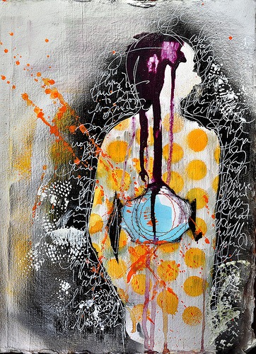
An analogous color scheme uses colors that sit next to one another on the color wheel. These are pleasing low-contrast combinations. Analogous color schemes are often found in nature and are harmonious and pleasing to the eye. For “You Cannot See Me,” Doris Sander...

by Debbie Hodge | Oct 8, 2010 | Color
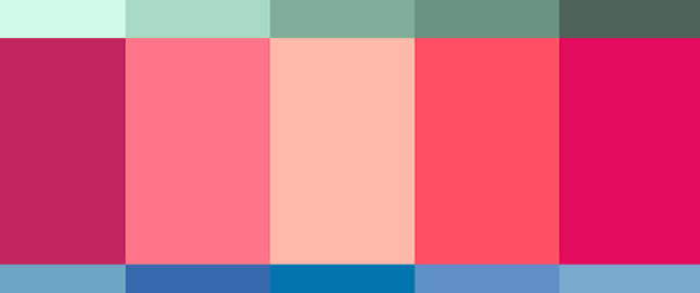
by Debbie Hodge Deciding upon the colors to use on a scrapbook page isn’t usually a straightforward process for me. I don’t have a series of questions I use that go from point A to point Z and then yield an answer. My approach is a “circling”...
