by Debbie Hodge | Aug 22, 2012 | Color, Feature
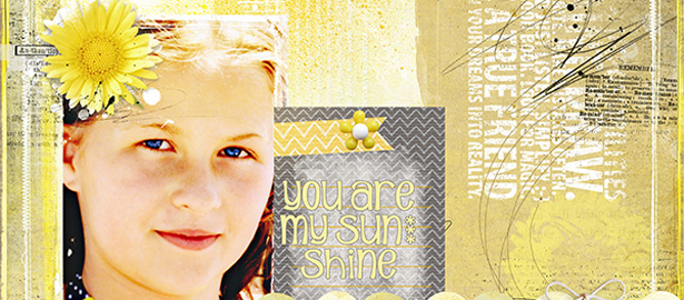
About Yellow | Yellow Dominating | Yellow Drawing the Eye | Yellow Guiding the Eye | Yellow Accenting About the Color Yellow Color conveys meanings or evokes feelings in three chief ways. See the resulting associations with yellow for each trigger. 1....

by Debbie Hodge | Jul 13, 2012 | Color, Feature, Ideas Spurred by Design
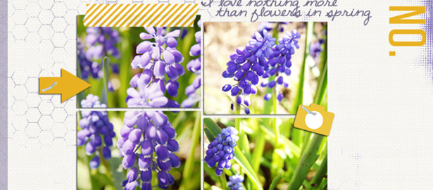
About Purple | Purple Dominating | Purple Drawing the Eye | Purple Guiding the Eye | Purple Accenting About the Color Purple Color conveys meanings or evokes feelings in three chief ways. See the resulting associations with purple for each trigger. 1....

by Debbie Hodge | Jun 14, 2012 | Color, Feature
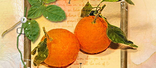
About Orange | Orange Dominating | Orange Drawing the Eye | Orange Guiding the Eye | Orange Accenting When Pantone announced that Tangerine Tango would be their color of the year for 2012, the executive director of the Pantone Color Institute said,...

by Debbie Hodge | Apr 26, 2012 | Color
by Debbie Hodge The work of selecting and combining colors for scrapbook pages is much like the work of of employing design principles: it’s not a straightforward, step-by-step task. Rather, it’s one with points or questions to hold loosely in you mind and cycle...

by Debbie Hodge | Apr 1, 2012 | Color, Design Principles
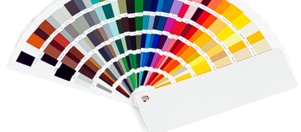
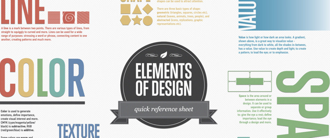
Inforgraphics are great for a quick review of things you may already have begun learning but can’t recall with perfection — or they can be an introduction of just what to study for newbies. Check out 8 infographics that cover the choices we make when...

by Debbie Hodge | Feb 29, 2012 | Color
by Debbie Hodge A split-complementary color scheme uses a base color and then the two colors on either side of its complement (i.e., the color across from it on the color wheel). With this scheme your page will have contrast but with more nuance and less tension than...
