 About Yellow | Yellow Dominating | Yellow Drawing the Eye | Yellow Guiding the Eye | Yellow Accenting
About the Color Yellow
Color conveys meanings or evokes feelings in three chief ways. See the resulting associations with yellow for each trigger.
1. PHYSIOLOGICAL RESPONSE: Yellow is cheerful but it’s the most difficult color for the eye to take in. People lose their tempers more often in yellow rooms, and babies cry more.
2. IN NATURE (associations to occurrences of colors in nature): Find yellow in nature in things that we associate with cheerfulness and sunny attitudes, things like blossoms, lemons, and the sun.
3. PSYCHOLOGICAL SYMBOLISM (associations with the viewer’s own psychological symbolism):*
- Western: happiness, cowardice, caution
- Eastern: sacred, imperial
- India: sacred and auspicious
- Egypt: color of mourning
- Middle East: happiness and prosperity
- France: jealousy
- Greek: sadness
- Buddhism: wisdom
* SOURCE: Cutural Color
Yellow Dominating
A large-scale yellow-on-white print is the base for Tanyia Deskins‘ “Beautiful.”
Tanyia says, “I love these happy pictures of my daughter, showing off not only her beauty but her beautiful spirit. I love the quote that I used and I used a patterned yellow background to help all the red and green pop and to show off the bright happiness of this page in general. To me yellow is sunshine and happiness–much like my daughter and that smile of hers.”
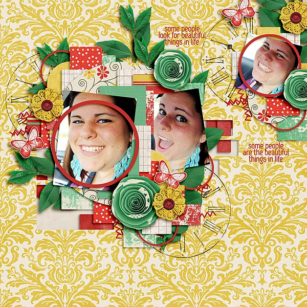
Beautiful by Tanyia Deskins | Supplies: Letters From Home by Marie H Designs and Toxic Generation 1 by Cornelia Designs
Ashley Horton‘s base for “Sand, Sun, and Smiles” is a yellow paper with a very subtle grid pattern.
Ashley says, “I used an analogous color scheme, which is choosing 3 to 5 colors that sit side-by-side on the color wheel. I chose yellow as my dominant color and incorporated smaller amounts of orange, green, and blue. I wanted to convey a happy feel on this page because our daughter was enjoying the beach so much and this color scheme is perfect for that tone.”

Sand, Sun & Smiles by Ashley Horton | Supplies: Patterned Paper & Stickers: Crate Paper; Font: Berlin Sans FB; Wood Veneers: Studio Calico & Kaisercraft; Smooch Spritz: Clear Snap; Pen: Zig Memory System; Other: Button & Staples
Vicki Walters has always been a fan of yellow, especially paired with gray. Her base is divided into two vertical bands – each in yellow, but with the band on the right “grunged up” a bit with a subway-art overlay. Vicki says, “Yellow is such a fun and happy and positive color.”
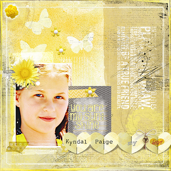
You Are My Sunshine by Vicki Walters | Supplies: Anna Aspnes @ OScraps: WarmGlows no 1, ScriptTease Learn Overlays no 1, ArtPlay Palette no 5, ArtPlay Chevron Sun Fun Papeie, MonoBlendz Banana Custard no 1 Paperie, Multimedia Flowers no 2, ScissoredHearts no 2, Stitched by Anna Borders Cream no 1, Taped Dotty Polka Element Set; Sahlin Studios @ The Lilypad: Butterflies (drawn), Candy flowers, Key to my Heart.
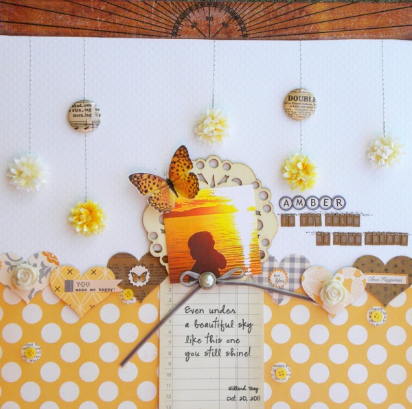
On “Amber,” Amy Kingsford paired yellows with neutrals (whites and browns). Amy says, “I combined deep yellow papers and elements with that of cream, brown and grey accents. This choice supports the meaning behind the page (which is titled ‘Amber is the color of your energy’) and it gives intensity to my photo’s deep golden sunset which is the focal point of the page.”
Yellow Drawing the Eye
Kiki Kougioumtzi backed up her focal point photo-blcok with yellow doilies which stand out on the blue canvas. Kiki says, “I picked the color scheme from my photos. It’s an analogous combination, with blue being the dominant, yellow the secondary and green barely there (it appears in the mixing of blue and yellow on the doilies). I chose an “ochre” honey-like yellow to represent the sand on this beach page.”
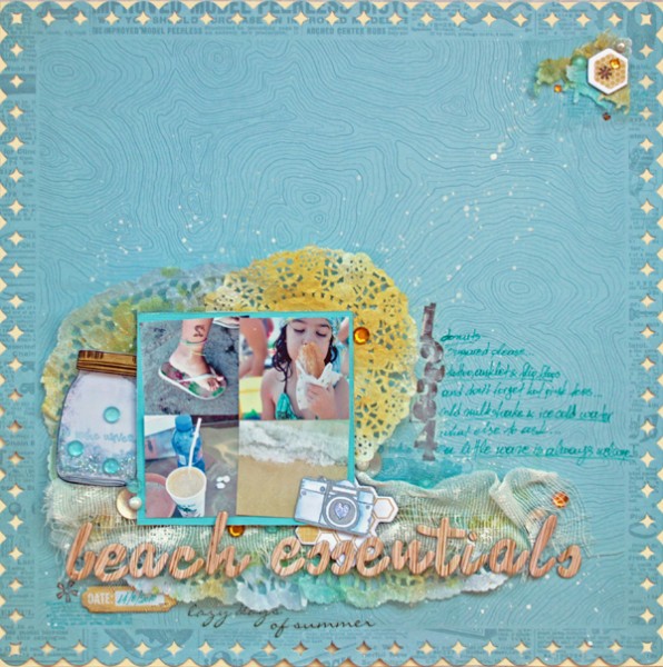
Beach Essentials by Kiki Kougioumtzi | Supplies: Patterned paper:Studio Calico; Cardstock: Canson, Core’dinations; Die cuts:My Mind’s Eye; Stamps:American Crafts, Fancy Pants; Rub ons:American Crafts, My MInd’s Eye; Ink:Tsukineko Stazon, Clearsnap Colorbox and Memento; Alphas:American Crafts; Other: Ranger glitter glue, Tattered Angels glimmer mist, Liquitex gesso, doilies, gauze, blue tulle, rhinestones, beads, buttons, Mod podge.
Katie Scott says, “Yellow is the color of post it notes for a reason: yellow grabs your attention and I’m pretty sure it has something to do with remembering stuff , which is the “why” of the story on this page. My son had a science fair project assigned right before spring break and he told me he had it totally under control, that he was big now and didn’t need my help with it. Fast forward 3 or 4 weeks and he announces at 9 pm one school night, ‘The science fair projects were due today. Ms. Campbell says I can turn it in tomorrow.’ Charlie and I scrambled to help him get the project finished and presentable and he turned it in a day late. He reported that Ms. Campbell said it was the best project in the class and that he would have gotten an A but for the day late thing, so he got a B.”
“I like the combination of yellow and grey and wanted to use that color combination as my main color combo on this page, but that often has a more sophisticated feel which is not what I was going for with this 4th grade school page, so I added in blues and greens and even a little pink to make the page more playful.”
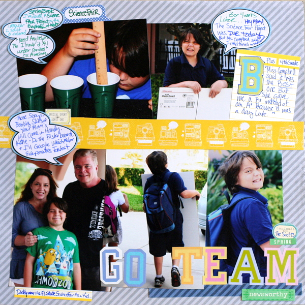
Go Team by Katie Scott | Supplies: DCWV “The Snapshot Stack” for the word bubbles and yellow strip with the glittered cameras in the middle; post it notes; KI Memories letter stickers; Little Yellow Bicycle stickers; Echo Park patterned paper (grey stripes).
Dina Wakley is a docent at the Phoenix Museum of Fine Art and an accomplished artist who understands color well. Thus, the tag backing up her focal point combo of title and photos is stenciled in yellow amidst a backdrop of gray, blue, and magenta. Dina says, “I often say I am not a strong embellisher, and I use paint and ink to embellish. So in my mind, my embellishments on this page are the spray-inked circles.” (You can find the stencils Dina designed and used on this page at The Crafters Workshop.)
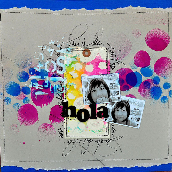
Hola by Dina Wakley | Supplies: Alphabet: Thickers by American Crafts, Pen: Water-based Extra-fine point Poster-Paint Sharpie, Modeling paste: Liquitex, Stencils: Dina Wakley Designs by Crafter’s Workshop, Tag: Xpress Tag, Ink: Dylusions by Ranger. Inspiration Source: Tree Print
Yellow Guiding the Eye
Debbie Hodge’s “Right Here” is a page with multiple clusters. Two very bright spots of yellow combined with two very subtle yellow-on-white blocks of patterned paper lead the eye in a downward diagonal flow.

Right Here by Debbie Hodge | Supplies: Maritime by One Little Bird; Classic Border Shapes by Jenni Bowlin; Wander by Anna Aspnes; Double Decker Elements by Katie Pertiet; Everyday Life by Cinzia; Raleway Thin, Andrea’s Script Upright, Cookie Fonts.
Marie-Pierre Capistran says, “When I started this page, I wanted to use a color that would pop and grab the viewer’s eye. Pairing yellow with turquoise was the perfect choice. I backed everything on black so that everything stands out even more! I started with writing my goals to know how many squares I’d have on my layout and I placed them in a grid-like pattern, leaving room for a 5″x4″ picture, the title and embellishing. I worked one square at the time, writing my goal in another way and embellishing it with my blue and yellow. And the very end I created this stack of borders underneath my pictures with a mix of papers that I cut with scissors and border punch and that I stitched one by one. I ended up sewing all around my picture with a black thread to continue with the black that was defining every pieces of my layout.”
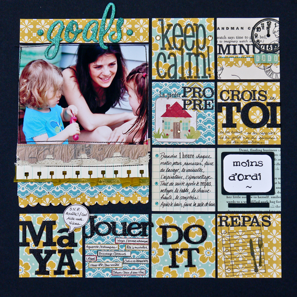
Goals by Marie-Pierre Capistran | Supplies: Cardstock: Bazzill black 12×12, SU! Very Vanilla; Paper: Sassafrass Mix and Mend, October Afternoon Fly a kite, Simple Stories 100 days of summer; Letters: Simple Stories 100 days of summer, AC thickers reindeer black, Ac thickers lullaby aqua, Making Memories mini shimmer alpha black school house; Stamps: Maya Road, SU! Taffy alphabet, Technique Tuesday icing on the cake; Ink: versamark, versafine; Embossing powder: black; Punch: SU! scalloped border punch; Rhinestones: Doodlebug design mini jewels, A Muse black rhinestones; Ribbon: yellow ribbon unknown source, Hero Arts woven lace ribbon; Washi tape: Bella Blvd.; Rub-on: Toga Orléans, Maya Road the cubicle; Labels: 7 Gypsies mini label stickers, EK success Sticko.
Yellow Accenting
The spots of yellow in the hats being worn in these photos stand out and guide the eye around the photos. Deborah Wagner emphasizes them even more with digital extractions that extend parts of the photos out of their frames.
Deborah says, “My niece studied in Peru last year. She immersed herself in the language and culture of the Peruvians. Yellow seemed the perfect color choice for this page, not only because it compliments the bright, colorful costumes but because it represents the sunshine and happiness the Peruvians brought into my niece’s life.”
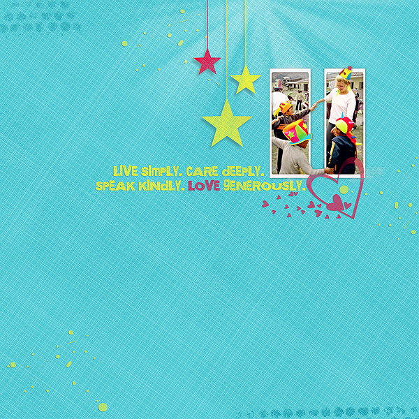
Love by Deborah Wagner | Supplies by Designer Digitals: Katie Pertiet – Classic Curled Photo Frames No. 4, Spot Dots Brushes & Stamps, Photo Glows, Flourished Love No. 3, Splatters Brushes and Stamps No. 3; Andrea Victoria – Lush Paper Pack; Maplebrook Studios – Stems of 3 Stars
Debbie Hodge’s “Recieved” was inspired by a print mash-up she saw on Pinterest and is, thus, packed with pattern. Debbie says, “The pale yellow bird, buttons, and pennants are subtle accents chose because they do not repeat any of the colors in the patterns, but, rather, stand on their own.”
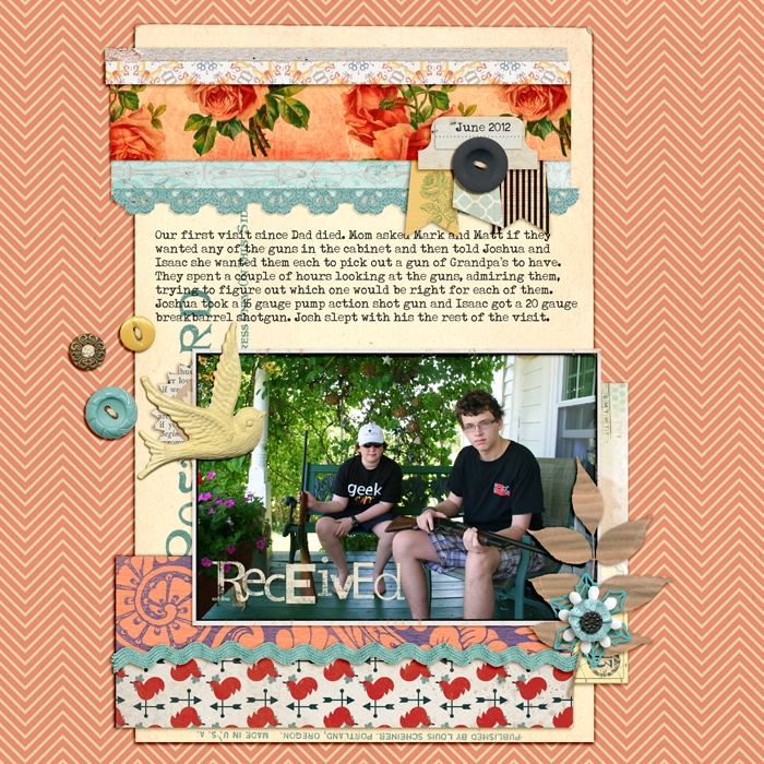
Received by Debbie Hodge | Supplies: Love is a Verb by Ju Kneipp; Smart Cookie by Lynn Grieveson; ArtPlay Bloom, ArtPlay Concerto by Anna Aspnes; Postcard Journalers, Rimmed Framers, Krafty Cuts Leaves by Katie Pertiet; A Mixed Up Alpha by Lisa Sisneros; Maritime by One Little Bird; Everything Starts as Somebody’s Daydream by Tracy Martin; Lil Miss Sassy Pants by Mari Koegelenberg; Strike a Pose by Amy Wolff; Country Carnival by Celeste Knight; Pure Happiness by Designs by Anita; Typenoksydi font.
[current]

