by Debbie Hodge
The work of selecting and combining colors for scrapbook pages is much like the work of of employing design principles: it’s not a straightforward, step-by-step task. Rather, it’s one with points or questions to hold loosely in you mind and cycle through, revisiting until it looks right.
Here are three questions to consider and cycle through as you choose scrapbook page colors:
- How many colors will you use?
- How much contrast would you like to incorporate?
- What will the dominant color be?
1. How many colors will you use?
There is no set answer to this except for: “It depends.” A good designer can pull off incorporating lots of colors, but it’s always riskier to use too many colors than too few.
Keep in mind:
- Using too many colors can make a confusing or chaotic layout that’s hard to take in and that may not show off your photos well.
- Using too few colors could be boring — but your photos will definitely have the opportunity to shine.
- You’ll want to choose 1 dominant color and use additional colors in lesser amounts.
- A monochromatic color scheme is good for setting tone with the associations people have with colors.
- A 2-color complementary color scheme will add energy to the page.
- An analogous color scheme with 2 or 3 colors is a low-contrast choice with built-in color harmony.
- If you’re planning to use more than 2 colors, start out with 3 to begin with. This gives you variety without overwhelming — and you can always add in an additional bold accent in another color as you get closer to the end of your design.
[hr]
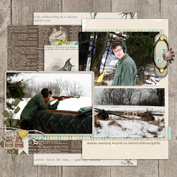
For this page of my son shooting at targets in the winter, I decided to use the green of his jacket and neutrals because of the subject and the setting.
I ended up adding bits of yellow for two reasons: 1) the small bit of yellow of the farm equipment in the photo would have otherwise been distracting, and 2) these spots create a visual triangle that guides the eye around the page.

Layout by Debbie Hodge | Supplies: Lemonade Stand by Robyn Meierotto; Flair Box 3 by Paula Kesselring; Lost World, Storytime, Gearhead by ViVa Artistry; Baker's Twine Asst, Vintage Charm Chipboard Stickers, Farm Fresh, Flossy Stitches by Katie Pertiet; Artplay Chevron Crazy Life by Anna Aspnes; Brad Bonanza by Pattie Knox; Uncharted by Krystal Hartley; Beffle Medium, Typendoski fonts.

Chemical Bonding by Audrey Neal | Supplies: Tiffany Tillman: Oh Joy Template No. 20, Design House Digital, Audrey Neal: Chemistry (papers, elements, word art), Design House Digital, Audrey Neal: Pinned (photo frame), Design House Digital, Gennifer Bursett: County Fair (stitches), Design House Digital, fonts: Just Another Stamped Font, Pea Sara Print, Bebas
2. How much contrast would you like to incorporate?
What are you hoping to achieve with the page you’re making? Do you want something vibrant and attention-grabbing or are you after a more tempered design. You’ll need some source of contrast on your page — and it doesn’t have to come from color, but using color to emphasize and create a hierarchy on your page is a great technique.
[hr]
Doris Sander used pale pink and yellow against a white canvas on “Hot Pink.” They add just a bit of contrast. You can achieve color contrast with your choice of value as well as hue. Notice the darker values of the pink ribbon, single banner, and titlework. They catch the eye and guide it around the page.

Supplies - cardstock Bazzill, patterned paper Crate Paper, stencil The Crafter's Workshop, paint and ink Jenni Bowlin for Ranger, chipboard Crate Paper, foam stamp Jenni Bowlin Studio, chipboard alphas Jenni Bowlin Studio, seam binding tape Beaux Regards
[hr]
Jewel tones of red and blue add lots of contrast to Lisa Dickinson‘s page about her children’s daily jumps on the trampoline. It’s a good choice for a high-energy subject.

Week Days by Lisa Dickinson | Supplies: cardstock (Bazzill Basics) + patterned paper, stamps (Jenni Bowlin Studio) ink (Versamark) +punch (Martha Stewart) + pen (American Crafts)
3. What will the dominant color be?
Do not use your colors in equal proportions. A good rule of thumb with three colors is to use a dominant color on about 60% of the page, a secondary color on about 30% of the page, and an accent color on about 10% of the page. This is also known as the gallon-quart-pint approach to color proportions.
[hr]
The dominant color on Amy Kingsford‘s “A Sucker for the Classics” is pink, with blue being the secondary color and yellow the accent color.

A Sucker for The Classics by Amy Kingsford| Supplies: JBS Mercantile December Papercrafting Kit + Artisan Add-on.
[hr]
Michelle Clement painted the edges of “Me + You” a bright yellow which is repeated on her journaler, splatters, and embellishments, making it the dominant color on the page. She’s added splatters and pieces of blue in a smaller amount, and, finally, just a few spots of pink make these well-balanced color choices.

Love Birds by Michelle Clement | Supplies: Cardstock by Bazzill. Patterned Paper, Letter Stickers, Fabric Brads, and Dimensional Flower Sticker by Sassafras Lass. Embroidery Floss by DMC. Letter Stamps by Hero Arts. Masking Tape. Acrylic Paint. Heart-Shaped Paper Doily. Staples.
[hr]
The next time you’re figuring out which colors to use and in what quantities, keep these three questions in mind:
- How many colors will you use?
- How much contrast would you like to incorporate?
- What will the dominant color be?
[designclass]

