
About Orange | Orange Dominating | Orange Drawing the Eye | Orange Guiding the Eye | Orange Accenting

When Pantone announced that Tangerine Tango would be their color of the year for 2012, the executive director of the Pantone Color Institute said, “Consumers look to spring for renewed energy, optimism and the promise of a brighter day.”
Take a look at scrapbook pages incorporating orange in a variety of doses and with a variety of approaches.
About the Color Orange
Color conveys meanings or evokes feelings in three chief ways. See the resulting associations with orange for each trigger.
1. PHYSIOLOGICAL RESPONSE: Orange is stimulating and exciting
2. IN NATURE (associations to occurrences of colors in nature): Find orange in nature in butterflies, citrus, and pumpkins. The resulting associations are of warmth and transitions.
3. PSYCHOLOGICAL SYMBOLISM (associations with the viewer’s own psychological symbolism): *
- Western: affordable or inexpensive items
- Eastern:happiness spirituality
- Thailand: color for Thursday
- Ireland: religious color for Protestants, appears on the Irish flag along with white for peace and green for Catholics
- Netherlands: color of the Dutch Royal Family
- Hinduism: Saffron, a soft orange color, is considered an auspicious and sacred color
* SOURCE: Cutural Color
Orange dominating
When orange is the dominating color, look for direct associations with subject and/or a desire to create an exciting and warm mood
Chris Asbury made “Tangerine Tango” in homage to Pantone’s 2012 pick. Chris paired the vibrant and energetic orange with softer harmonious colors and a little split-complimentary for contrast. A sketch effect added to the ‘dancing’ tangerines creates more painted quality.
Tangerine Tango by Chris Asbury | Supplies: Anna Aspnes Designs: ArtPlay SolidsGather Paperie, ArtPlay SunFun, ArtPlay Palette Autumn Haze, AntiquatedFrames No.2, ArtPlay Palette Jardinier, Original FotoBlendz No.13, ArtPlay Palette Genuine, ArtPlay Palette Concerto Music Notes No.1, DifferentStrokes No.5 BrushSet, ScriptTease Life No.1; Maya de Groot Midsummer Night’s Dream; Fonts: P22 Cezanne, soymilk.
Kiki Kougioumtzi wanted to evoke excitement and happiness on “Water Bombs” as well as to balance the blue in her photos. Filling two-thirds of her page with orange patterned paper did just that for the page’s mood. She used the large burst pattern as a guide to photo placement–putting her focal point photo at the origin point of the burst’s rays.
With a “loud” canvas and photo combination, Kiki held back on adding embellishments. She chose vinyl letters for the title for their shiny,”wet” quality as a complement to her page subject.

Water Bombs by Kiki Kougiouxmtzi | Supplies: pattern papper: Scenic Route, K&Co;cardstock:Canson;Stamp & Alphas:American Crafts;Chipboard:My Mind's Eye, ink:Ranger Adirondack Alcohol Ink
Katie Scott says, “Orange is definitely up there on my happy colors list. I love to wear orange because it is different and because I think it does good things for my skin tone.”
She titled this page “Orange You” because there’s so much orange clothing in the photos and as a nod to the “orange you glad I didn’t say bananas” kids’ joke. She says, “Orange is a fun and funny color and perfect for the tone I wanted to evoke with this page.”

Layout by Katie Scott
Orange drawing the eye
With its natural ability to generate an exciting physiological response, orange will catch the eye. Make sure you’re catching and drawing the eye to what matters on your page.
Kelly Purkey matted her cluster of photo, tags, and journaling on an orange block of patterned paper that catches the eye and acts as a “window” into the page–a fitting repetition of the photo content which is a shot from an airplane window.

Wanderlust by Kelly Purkey | Supplies: Patterned Paper: October Afternoon, Crate Paper, We R Memory Keepers Journaling tag: Smash Stickers: Bella Blvd Tag: Crate Paper Washi Tape: Hambly, MT Pen: American Crafts Beads: Queen & Co Other: Twine
Tami Taylor used a stamped block of orange as the foundation for her elements on “Love this Day.” As with Kelly’s page, the orange immediately draws the eye and acts as a window into the story.

Layout by Tami Tayor.
Orange guiding the eye
The bold orange strips on Jana Morton’s “Sisters” repeat the bold orange in her photo. The result is three strong spots of color that draw the eye down through the page.
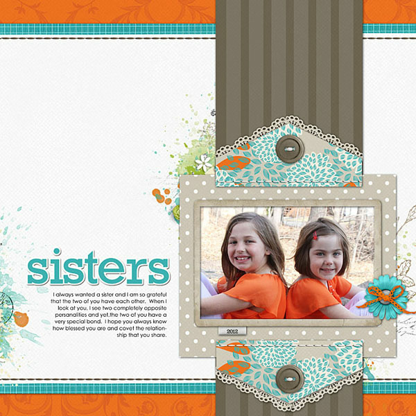
Sisters by Jana Morton | Supplies: Maplebrook Studios: Alison Kit Katie Pertiet: Vintage Charm Kit, Vintage Charm Clusters, Assorted Messy Stitches, Yesteryear Add On Lace, Gingerbread Runaway Kit, Loosely Labeled Dates No. 4
Doris Sander finds that embellishment placement can make or break a design. She says, “I always try to place embellishments where they will bring the eye to the important locations in my design rather than to random spots where the embellishment is all that will be seen. I also rely on the visual triangle and diagonal pull a great deal to bring structure and unity to my pages. On “Smile” I have two visual triangles that play huge roles in my design The green visual triangle joins the title and the two photos. The orange triangle provides the structure by leading the eye diagonally through the page from the start in the top left corner to the finish in the bottom right corner.”

Smile by Doris Sander | Supplies: chipboard letters, foam stamp – Jenni Bowlin Studio, paint, ink – Jenni Bowlin for Ranger, stencil – The Crafter’s Workshop, chipboard elements, patterned paper – My Mind’s Eye, buttons - vintage
Orange accenting
When Christy Strickler thinks of summer, she thinks of orange and its energy. She often uses it for scrapbooking photos of the pool or the beach as she’s done here, backing up her bright blue water shots with a big splash of orange for a dynamic complementary scheme.

The Tipsy Raft Solution by Christy Strickler | Supplies: cardstock: Colorbok; patterned paper: Echo Park and Basic Grey; mist: Maya Road; buttons: My Mind's Eye; other: Pencil, stencil, canvas, Kraft paper accents
Ashley Horton used orange as an accent color on “Funny Face,” and she framed her photo with a visual triangle of 3 small but eye-catching orange spots. She combined orange, pink, and green in a split complementary color scheme.

Funny Face by Ashley Horton | Supplies: Patterned Paper, Thickers, Flair, Envelope, American Crafts; Brads: The Paper Studio; Acrylic Stamp: Close to My Heart; Ink: Stampin' Up; Embroidery Floss: Janlynn; Pen: Sharpie, Edgers: Provo Craft; Other: Toothpick
Tanyia Deskins used orange flowers in two different tones to accent and to create a visual triangle on “Hello Sunshine.” The orange flowers “pop” against the greens and blues and give definition to the richly layered embellishments.

Hello Sunshine by Tanyia Deskins | Supplies: Journal It Templates Vol 2 by Marie H Designs and Fiddlesticks by Amy Stoffel
