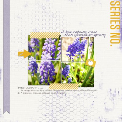
Tara McKernin added yellow titlework and embellishments to the purple in her photos for a complementary color scheme. By keeping white as the dominant color, the page energizes and yet still gives the eye a place to rest.
About Purple | Purple Dominating | Purple Drawing the Eye | Purple Guiding the Eye | Purple Accenting
About the Color Purple
Color conveys meanings or evokes feelings in three chief ways. See the resulting associations with purple for each trigger.
1. PHYSIOLOGICAL RESPONSE: Purple stimulates the areas of the brain that do problem solving.
2. IN NATURE (associations to occurrences of colors in nature): Find purple in nature in blossoms. But, really, purple doesn’t occur as much as other colors in nature and can, thus, seem artificial if used too much.
3. PSYCHOLOGICAL SYMBOLISM (associations with the viewer’s own psychological symbolism):*
- Western: royalty, military honor, high ranking positions of authority
- Eastern: wealth
- India: sorrow and comforting
- Japan: privilege and wealth
- Thailand: color of mourning for widows
- Brazil: death and mourning
* SOURCE: Cutural Color
Purple Dominating
Amy Kingsford used purple to set the mood on “Magical Ending.” She says, “I chose a dark purple background, which I’ll admit was a little scary for me at first, but it created the perfect ‘night-time feel’ once paired with some of the themed embellishments. I’ve paired my purple with a few splashes of pale yellow–purple’s complement on the color wheel, which I’ve used to add highlights to this otherwise dark page.”
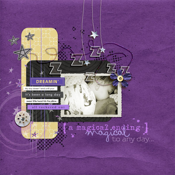
Magical Ending by Amy Kingsford | Supplies: Template from Simple Scrapper’s Premium Collection (May 2011, Single 3)After Dark, After Dark Word Art, Dream Word Art, Rejuvenate by Sahlin Studio.
Michelle Houghton used a split comlimentary color sceme on “Family” with purple providing a bold backdrop for her photo.
Michelle says, “My family tries to gather all together every two years, and my brother designs t-shirts for us all to wear on our big outing. This past summer our t-shirts were dark green and our photo was taken in front of green foliage. Purple goes wonderfully with green and really makes it pop so I decided to use a large block of purple behind my photograph. I layed a layer of green behind the purple to create a boarder and then added texture to the top of the purple with green mesh and spray mist. Leather and jewels add small touches of orange to the layout to complete a split comlimentary color sceme. The small touches of orange help draw the eye around the layout.
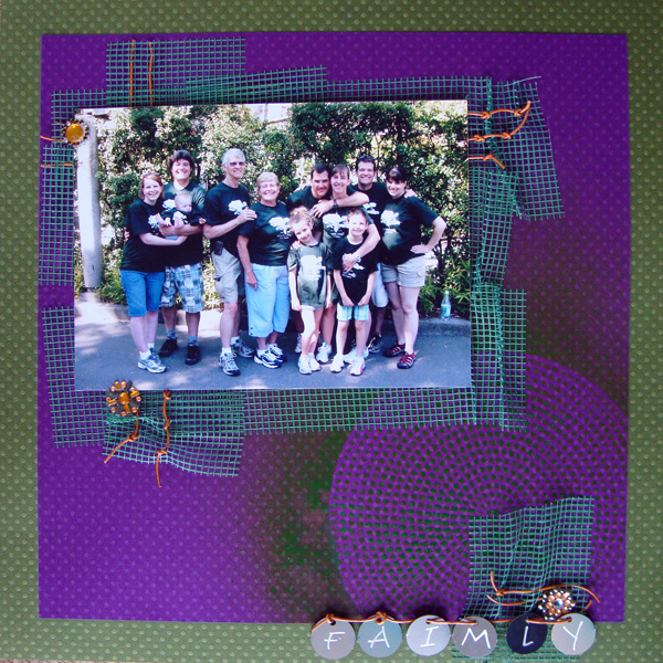
Family by Michelle Houghton | Supplies: Cardstock – Bazzill, Mesh – Magic Mesh, Leather – Mountain Craft Supply, Gems – Prima, Letters – Paperbilities, Spray mist – Mister Huey’s
Terry Billman‘s granddaughter was a flower girl in a recent wedding. Terry says, “She looked so precious I wanted something simple to not take away from the beauty of the photo. In order to keep it simple, I chose a monochromatic theme based on purple, the color of her sash. The photo pops against the light shade of purple and the dark purple mat sets off the inner canvas well.”
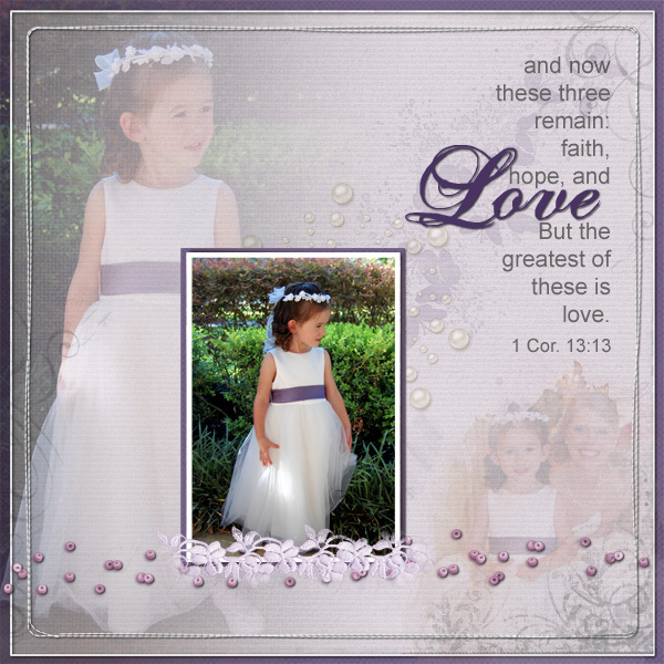
Love by Terry Billman | Supplies: Katie Pertiet: Watery Wings, Chalked rubbings No. 1, Bead Scatterings, Letterbox Overlay 5; Maplebrook Studios: Jacinda Solids; Anna Aspnes: Art Play Solids Adventure, Masking Gradient Canvas, Fotoblendz Clipping Mask No. 8, Art Play Palette Crazy Life Frame, Art Play Palette Authentic, Stitched by Anna Border No. 1, Hipster Plume Korner Edges No. 3; Patti Knox: Pearl Accents.
Purple Drawing the Eye
The photos of purple yarn in Sue Althouse‘s “Summer Project” immediately draw the viewer’s eye because of their contrast with the rest of the page. A darker and more subdued purple title draws the eye next.
Sue says, “My recent purchase of 13 balls of purple yarn for a big knitting project was the perfect subject for this layout. I chose an analogous color scheme of red-purple, purple, blue-purple, blue and blue-green. The calming colors remind me how relaxing an evening of knitting can be. I need that, because I have a whole summer of knitting ahead to complete my cardigan!”
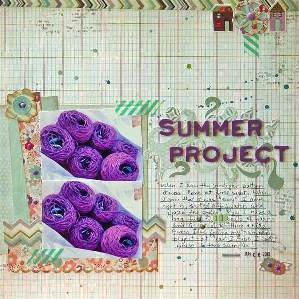
Summer Project by Sue Althouse | Supplies: Patterned Paper and Stickers: Basic Grey; Alphabets: American Crafts; Stamps: American Crafts Date Stamp; Inks, Mists: Tim Holtz, Mr. Huey’s, Hero Arts; Tools: Fiskars Border Punch, EK Success Punches; Other: purple brads, washi tape.
Tara McKernin says, “This page includes purple in a complimentary color scheme. I took my photos and played the purple off of them and used yellow accents to highlight the layout making it pop. You can use a color wheel to pick your complementary colour if you are unsure of what would work best.”
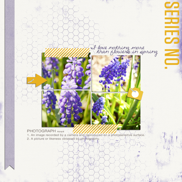
Springtime Flowers by Tara McKernin | Supplies: Photo frames from Paislee Press Presspacket no.3, White Linen Cardstock from Michelle Martin Lars Solids, Barely There Brushes set 1 & 2 from Tiffany Tillman, Staples from Jenn Barrette I love you more than ice cream kit, Purple Paper from One Little Bird Page Turner Kit, Photo elements and long banner from Paislee Press Montage
The splotches of purple behind the focal point photo on Kiki Kougioumtzi‘s “She is an Artist” draw the eye and emphasize the most important part of the page.
Kiki says, “I pulled the color scheme from the photos and used color scheme designer to come up with it. This is a tetradic scheme with the purple as the dominant color. I chose this as the dominant because all the other colors of the scheme exist in the photos in big amounts. The muted purple represents all the mess that was made during my daughter’s drawing.”
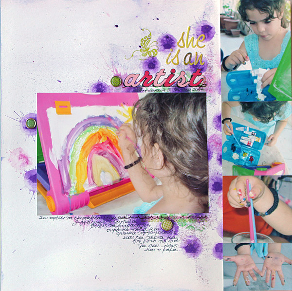
She’s an Artist by Kiki Kougiomtzi | Supplies: Cardstock: Canson;Mist: Tattered Angels;Paint:Ranger Adirondack Dabber; Brads:7Gypsies,Basic Grey; Rub-ons: Fancy Pants, American Crafts; Alphas: Basic Grey, Echo Park; Stamp: Kaisercraft; Ink and Glitter glue: Ranger.
Purple Guiding the Eye
Tanyia Deskins used a deep rich shade of purple along with black, grey, white, and blue to add the sense drama that she loves. The pops of purple stand out creating diagonal flow starting at the top left corner and moving down to the photo. Tayia says, “The contrast of the purple goes well with the extra contrast in the black and white photo.”

My Everything by Tanyia Deskins | Supplies: Unparalleled by Traci Reed and Splattered Alpha by CD Muckosky
Adryane Driscoll says, “These are some not-so-clear photos from a trip to Crab Cove. I used the purple in the jacket as the main color on the page, adding subtle misting at top left and bottom right to create a downward diagonal flow on the page. I did something a little different to get the effect on the smaller photos. I used digital frames which had rectangles to which I was supposed to clip the photos. Instead, I removed that layer and put the photos in the frame BEHIND the drop shadow layers.”
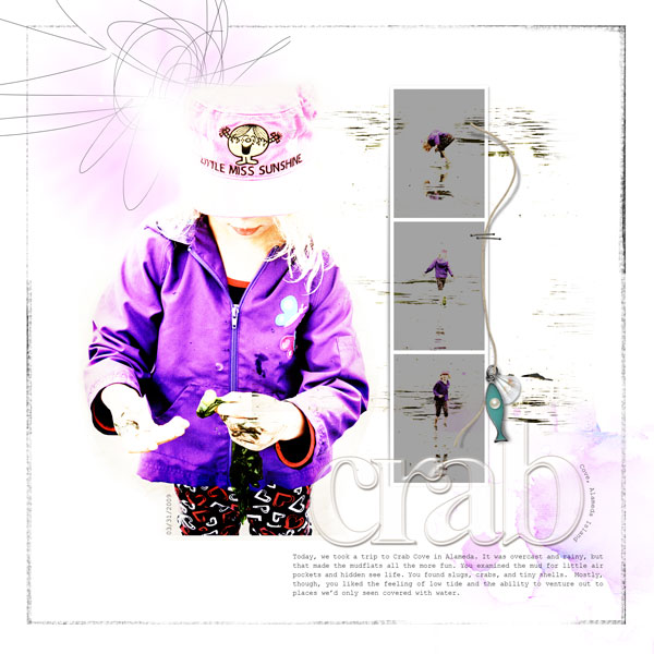
Crab by Adryane Driscoll | Supplies: Products by Anna Aspnes:
ArpPlay Palette Crazy Life, ArtPlay Palette Wander (fish/string), ArtPlay Palette Sun Fun (doodled sun), FotoGlows No.2, FotoWalltets No.2, Acrylic AlphaNumberSet No.1
Purple Accenting
Dina Wakley says, “‘Cute Gals’ started as a piece of kraft cardstock with a stenciled pattern. Next I added the large tag and bits of printed tissue. Then came the strip of hearts. I scribbled on the tag with a pencil, and then added a bit of torn cardboard and a purple flower. I added the photos and title last.”
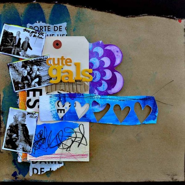
Cute Gals by Dina Wakley | Supplies: Cardstock: Hobby Lobby, Bazzill, Tag: Xpress tag, Alphabet: Sassafrass Lass, American Crafts, Cardboard: shipping supply from PaperMart, Pen: Sharpie Water-based Extra-Fine Point Poster Pen, Ink Pad: Ranger Black Archival, Stencil: Crafter’s Workshop, Ink: Colorwash by Ranger, Paint: Liquitex, Golden, Pencil: Stabilo Marks All, Tissue: 7 Gypsies
Paula Gilarde was going for an elegant feel to this page about her daughter’s first communion, and thus used script fonts and a pale background and delicate digital brushes. The dimension and purple color of the butterflies add a great accent to the page.
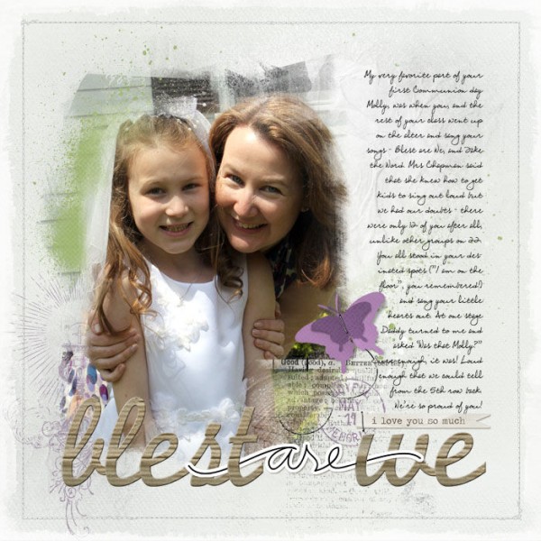
Blest are We by Paula Gilarde | Supplies: Artsy Layered Template no 24, ArtPlay Palette Mist, Stitched by Anna Borders no 3 by Anna Aspnes, Sunday Services Brushes and Stamps No. 01, Postmarked New Years 2011 Brushes and Stamps,
Harmony Grove Kit, Out of a Box Alphabet No. 03 by Katie Pertiet, Aerona Solids Paper Pack by Maplebrook Studios and Essential Words Hand Drawn Value Pack Vol. 01 by Ali Edwards
[designclass]

