[twocol_one]
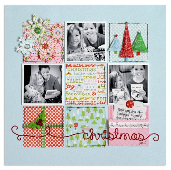
Lisa Dickinson used a classic 3×3 grid of squares on “Christmas 2010”
[/twocol_one]
[twocol_one_last]
These foundations are used again and again because they work well for housing the most frequently encountered combinations of elements (1 to 5 photos with title and journaling) and they consistently yield well-designed pages. The grid is one of these foundations.
[/twocol_one_last]
Using a grid structure is a great way to start a scrapbook page. The grid is inherently stable and makes a great foundation for establishing balance and organizing your elements.
The challenges to using a grid design are
- keeping the look fresh
- establishing flow
- grounding individual compartments and the grid as a whole to the page canvas
Below we’ve got scrapbook pages with grid foundations in several configurations.
- 3 by 3
- 4 by 4
- Odds and Evens (i.e., 2 by 3)
- “Little Boxes”
3 by 3
Of “Christmas,” Lisa Dickinson says, “This page is a simple 9-square grid, like a tic-tac-toe board, which divides the page into smaller areas that house all my page elements – photos, title, journaling, and embellishments. One downside to this design format is that a page can end up looking blocky and very square – and even boring – especially if you’re trying to convey a more whimsical page theme. Here, I’ve taken steps to add interest, detail, and plenty of curved lines to balance out all the symmetry and right angles of the squares.”

Christmas by Lisa Dickinson | Supplies: cardstock (Bazzill Basics) + patterned paper, stickers, felt embellishments, brads, jewels (KI Memories) + pen (Staedtler) + machine stitching
“I started by filling each area with my photos and squares of patterned paper, all cut to about 3 inches,” says Lisa. “This size allows for a nice 1 ½-inch border to my page, a size I think nicely contains a lot of elements and still allows plenty of white space for the eye to rest upon. Instead of patterned paper on the lower right corner, I used a small pocket folder that holds a tag containing my journaling. Not only does this add a bit of dimension to the page (the pocket expands slightly off the page) but it keeps part of my journaling hidden inside the pocket and helps this square to look clean and simple like the others.”
“In the opposite corner of the upper left, I’ve added snowflakes cut from patterned paper and allowed them to spill off the edge of their square, softening the lines of that corner. In the remaining corners, I’ve added puffy felt stickers in coordinating colors that add both texture and dimension.”
“Finally, the title – this long, glittery sticker expands across the entire bottom row of the grid and off both of the edges, providing a visual line or base for the whole design to rest upon. The dark red color visually has more weight than the rest of the softer pastels in this color scheme, and it nicely balances the weight of the black & white photos in the upper half of the page.”
The grid composition doesn’t come easily to Debbie Hodge, and she learned from Lisa’s layout above to make “Lily.” Like Lisa’s page, this is a 3×3 grid with 3 photos.
Debbie says, “The biggest challenge a grid presents for me is balance, and, to that end, I placed the photos so that there was only one photo in each column and in each row. I repeated the blue and white patterned paper in three spots to create a solid and predictable isoscoles traingle.”
“My favorite aspect of this grid,” says Debbie, “is the foundation made with digital brushes that outline the frame and the compartments within it.”
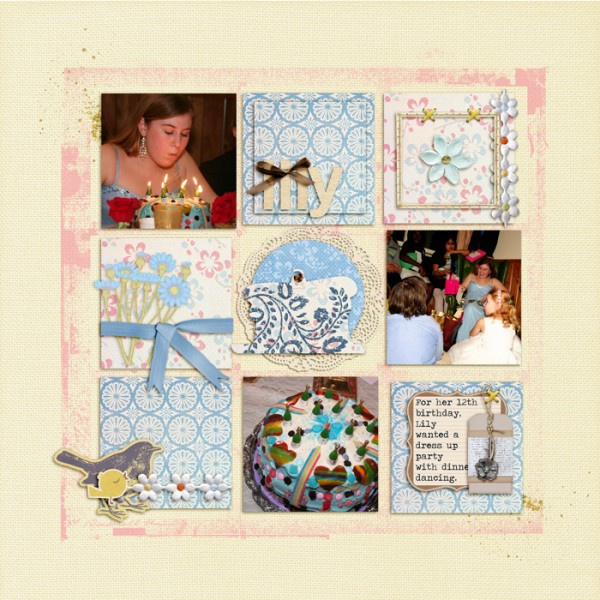
Lily by Debbie Hodge | Supplies: French Summer by Lynn Grieveson; Restoration by Gina Cabrera; The Daily Details by The Digi Chick Designers; Art Play Palette 3, 4, 7, 10, floralis (brushes) by Anna Aspnes; Count Your Blessings by ViVa Artistry; Just Linens 1 by Maplebrook Studios
Figuring out where to put her photos is Paula Gilarde‘s starting point when making a scrapbook page. Using digital frames (and digital frame clusters) simplifies the process for her on both digital and paper (hybrid) pages–like “Storyland.”
Paula says, “I love the polish digital frames add to a layout. When I started creating digital layouts my goal was to mimic paper pages — I wanted them to look as realistic as possible. Now when I create paper layouts I like to use digital elements to mimic the look of digital!”
Paula’s 3 by 3 grid incorporates smaller (2″ x 2″) photos. The grouping is placed to the right of center and backed up by a several horizontal strips of patterned paper.
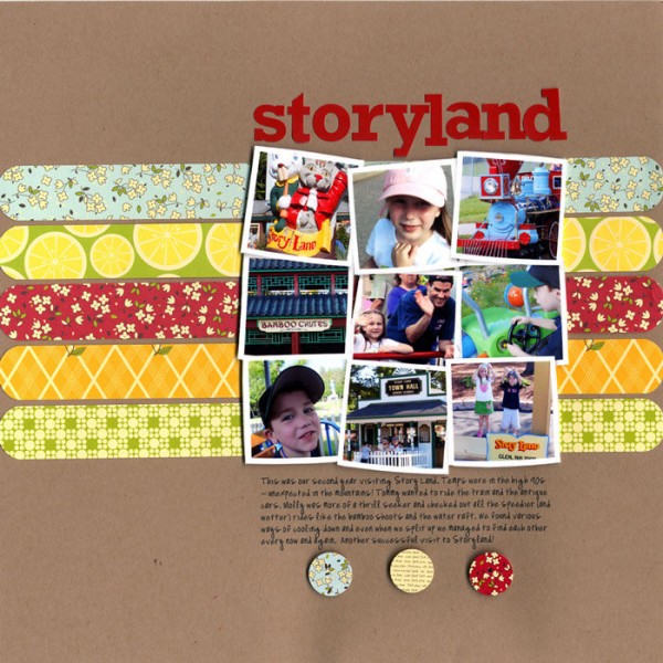
Storyland by Paula Gilarde | This uses Photo Clusters No. 16 (modified, with 3 frames removed) by Katie Pertiet
The tried and true 9-square grid comprises the foundation for Sue Althouse’s layout about her husband’s grandmother.
Sue says, “Once the colorful squares were in place, I placed the photo strip at a playful angle and added a scalloped border for emphasis. The diagonal flow across the page includes small journaling snippets of my husband’s childhood memories, the title work, and a few simple embellishments. The whole layout evokes a nostalgic feeling of happy times on Grandma’s farm.”

Grandma’s Kitchen by Sue Althouse | Supplies: this is a page I made last year, so I’m a little fuzzy on the supply list. I think I’m seeing My Mind’s Eye, maybe some Crate Paper, Basic Grey, and American Crafts Thickers.
Christy Strickler says, “When I create a page, I choose elements to enhance my story. In the case of ‘Home-made Pizza,’ I wanted a layered look. After all, pizza has layers. I chose the patterned papers because they remind me of the little pizza restaurants my family took me to as a child.”
“I am going to be honest. I am not the best at grid pages. In this case, I chose the grid because it’s a great way to tell a story that has a series of steps. I was able to group my photos into sections of the grid, each section telling the steps involved in making the pizza.”
“The viewer’s eye zigzags across the page into each section of the grid. When I do make grid-based pages, I know my grid is going to be crooked and a bit haphazard regardless of what I do. Thus, the theme of ‘homemade’ allows me a little ‘give’ on the straight lines associated with grids. The machine stitching is off-kilter and messy. Homemade is never perfect.”

Homemade Pizza by Christy Strickler | Supplies: Patterned paper: We R Memory Keepers and Crate Paper; sticker: We R Memory Keepers; other: stencil, buttons
Debbie Hodge transformed what started as a 3 by 2 grid of portrait-oriented, non-square photos (2 rows of 3 photos each) into a 3 by 3 grid by adding one “half-height” block to each column with staggered placement.
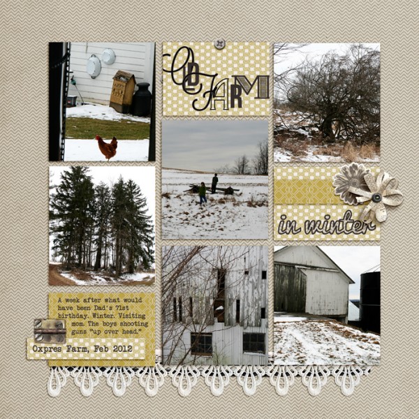
Old Farm in Winter by Debbie Hodge | Supplies: Generations by One Little Bird, Tracie Murphy, Paislee Press; Libris by Quirky Twerp; Hinge Pack by Katie Pertiet; Pacifica, Lavanderia, Villa Didot, Bebas Neue, Traveling Typewriter, Desdamona fonts.
Cindy Liebel‘s 3 by 3 grid of non-square portrait-oriented photos are placed in a staggered arrangement with several bleeding off page top or page bottom.
Cindy says, “I wanted to create a page with photos from road trips we took during the year 2010, showcasing them in ‘Polaroid’ form. I used my Polaroid die-cut by Lifestyle Crafts and created a staggered look on the page to keep it interesting. Placing some photos to run off the page adds a sense of ‘life in motion.'”

Happiness by Cindy Liebel; Supplies: All products used on this layout were provided by the July Work In Progress kit club. Tiny alphabet stickers are Lily Bee Design. Tools: Polaroid die-cut by Lifestyle Crafts; Epic by Lifestyle Crafts
4 by 4
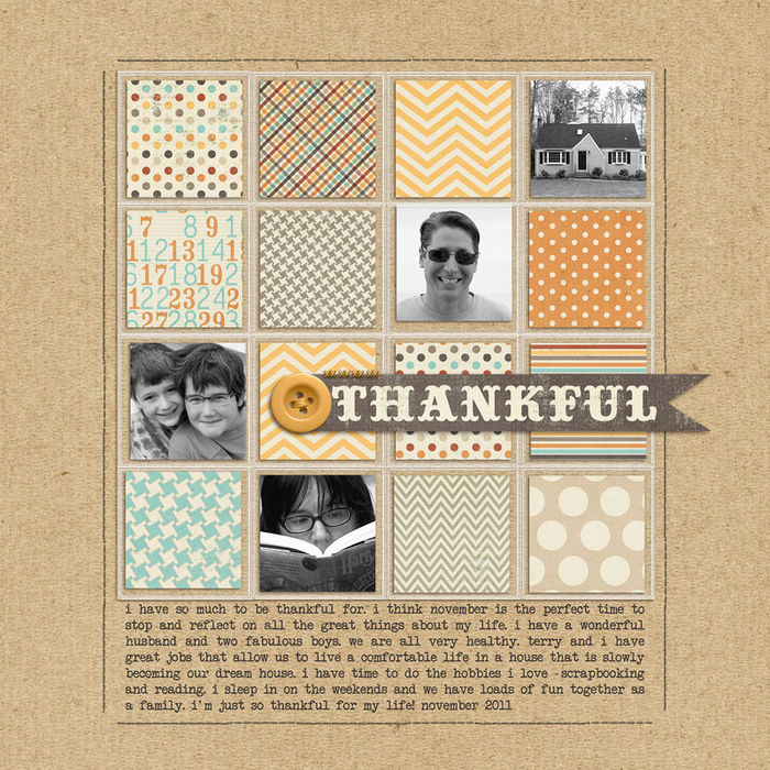
Four photos and nine different patterned papers fill a 4 by 4 grid on Celeste Smith‘s “Thankful.” The photos are all “portraits” — even the photo of the house is a portrait at its essence. Rendering the photos in black and white helps them stand out from the many patterned papers and creates flow through the page.
A banner holding the title spans three blocks and extends out onto the canvas, grounding the entire grid to the page. The banner itself is grounded to the page by the yellow button–the single dimensional embellishment on the page.
Meghann Andrew‘s “April” was inspired by an image of a pillow she saw on Pinterest.
Meghann says, “When I looked at the pattern of triangles creating squares, I immediately saw a grid design and decided to use the same pattern for my background, layering my photos over it. Because there was so much going on visually with the patterned paper and cardstock triangle design, I kept the middle simple, using it to house my title, journaling tag (hidden within a pocket), and pennant embellishment.”
This layout is part of Meghann’s 2012 monthly layouts–her alternative to Project Life.
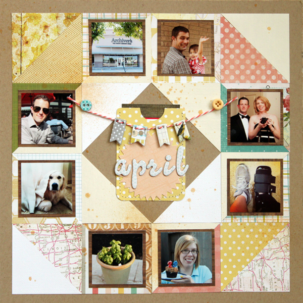
April by Meghann Andrew | Supplies: All from Studio Calico’s So Cal kit Cardstock: Bazzill (kraft) Patterned paper: My Mind’s Eye, Studio Calico, Echo Park, Tim & Beck, Crate Paper Cardstock die cuts: Studio Calico Cardstock alphabet: American Crafts Chipboard embellishments & buttons: My Mind’s Eye Mist: Studio Calico’s Mr. Huey- Gold
odds and evens
Doris Sander says, “I believe I’ve mentioned before how much I enjoy grids. They’re just so easy to work with.”
“On ‘Bay Life,’ I’ve chosen a 2 by 3 grid. The sections of the grid are all 3″ x 2″ because that is the size of the photos I was working with. Along with the two photos, I added three squares of patterned paper and a fourth square of cardstock with a fun paint effect on it. Instead of lining the squares in the grid up uniformly, I started my second column about a quarter inch above the first. This gave my layout a more organic feel. I drew a border around the entire area to frame it.”
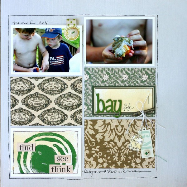
Bay Life by Doris Sander | Supplies: patterned paper by JBS, tag by Avery, buttons are vintage, foam stamp by Claudine Hellmuth, paints by Jenni Bowlin for Ranger, pen nib by Tim Holtz, chipboard alphabet by American Crafts.
Vivian Masket’s challenge on “Official Kid Reviewer” was to unite disparate elements: book cover thumbnails, chipboard embellishments, and a black-and-white photo.
Vivian says, “Once I’d laid out what I wanted to use, it seemed to me to be a hodgepodge of items in different colors and sizes. I tried clustering elements; I tried creating a banner out of the book covers and the chipboard elements; I tried using more book covers and more embellishments, and yet nothing came together design-wise. Frustrated, I put all of the pieces away and walked away from the layout, hoping for an ‘a-ha.'”
“Inspiration struck in the form of a grid design for housing all of my elements. A grid can unite seemingly disparate elements into a cohesive design. The lines in a grid serve to define separate ‘homes’ for each page element and also provide vertical and horizontal flow, ensuring that the viewer sees all page elements.”
Vivian notes, “There are many ways to form a grid: with hand-drawn borders, strips of scrap paper or ribbon, hand or machine stitching, or even border stickers.”
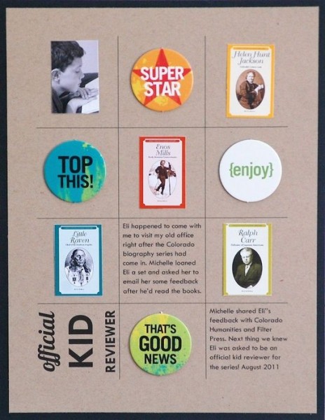
Official Kid Reviewer by Vivian Masket | Supplies: Cardstock: Bazzill Basics; Chipboard Embellishments: Scenic Route; Fonts: Lobster 1.4 and TW Cen MT
Lynnette Penacho‘s goal with “This Day in History” was to create a digital time capsule of the day that included prices, pop culture highlights, technology and current news.
Lynnette says, “When creating a layout like this, Google is your absolute friend. I used Google for researching my topics as well as finding images to represent each of the topics I didn’t have my own photos for. Since I knew I would be using web-sized photos, I designed my page as a simple but boldly colored grid that kept my photos nice and small in order to maintain their quality when printed.”
Digital “Polaroid” frames establish portrait-oriented rectangular grid spots. Lynnette backed each up with a rectangle of patterned paper. Notice how the patterned paper mats for each photo abut edges and sit on a larger piece of two-toned patterned paper. Stitching between columns and rows further delineates the grid compartments.
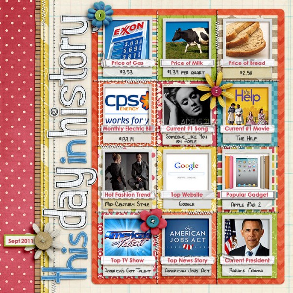
This Day In History by Lynnette Penacho | Supplies: 12 Months: August by Penny Springmann; Knowledge Factory by Penny Springmann; Life of the Party (alpha) by Dani Mogstad; Maths Class Alpha by Kate Hadfield; Embellish Now template by NettioDesigns and Traci Reed; Fonts are DJB Lynnette and Century Gothic
“little boxes”
Katie Scott made smart use of patterned paper with a diagonally-defined grid to house photos and papers cut with a 1.5″ square punch. The lines on the patterned paper eased this otherwise-difficult placement. The bits of dpapers are drawings made by her daughter.
Katie says, “It seems like in the early years of modern scrapbooking, there were a lot of mosaics made from photos. We don’t see that so much any more, but I did include one larger photo within the grid using that technique. There’s one other photo in the grid that is bigger than one square (it’s the photo of my husband, my daughter, and me). Since cutting it into two would have cut my face in half I left it intact and used it to fill two adjacent spots in the grid.”
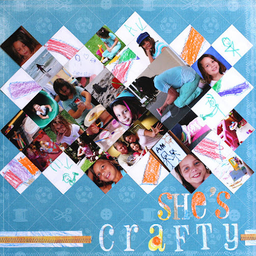
She’s Crafty by Katie Scott | Supplies: Quickutz Blossom die cuts, sewing machine Marvy 1.5 inch square punch, DCWV cardstock weight patterned paper.
Marie-Pierre Capistran‘s grid of 5 by 4 triggers an understanding of the grid of a calendar both by virtue of the title work (which is a date) and by the way the first two blocks in the top row and the last block in the bottom row are left unfilled by photos.
Marie added a hand-drawn border around the individual blocks and the entire grouping to further define the sense of a calendar shape and to unite photos, journaling. and titlework.
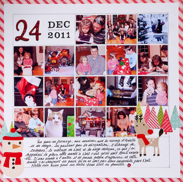
Material used:
Card stock: bazzill white
Paper: echo park paper everybody loves christmas
Others: echo park paper everybody loves christmas stickers elements, Ac Thickers Lullaby, Making Memories mini shimmer alpha, small glass bead.
Cindy Liebel has also evoked the sense of a calendar on “April 2011” with the dates represented by bracket-punched photos. Cindy says, “The style of the layout was important because I wanted to create a calendar page without using your typical calendar-style background. Using a decorative shaped punch for all the photos and embellishments gave the design a cohesive look. Even though I feel a photo tells a story, I wanted save room for and include journaling to reference each photo pictured on the layout.”

April 2011 by Cindy Liebel | Supplies: Cameo Silhouette, American Crafts: Thickers, Lily Bee Design: Stationery Collection, American Crafts: Amy Tangerine Papers, Basic Grey: Decorative Brads
The next time you’re looking for a layout starting point–or, perhaps, shying away from grids for their predictability, take a quick look through the ideas here to make your own grid-based scrapbook page.
One half of a 2-pager
Stefanie Semple says, “This page is about recording my 13-year-old daughter’s favorite things and dreams at this time. Favorites are listed in grid compartments on the left side of the spread and her answers to a “Q&A” interview are layered over a grid on the second page.
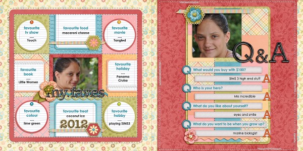
My Faves by Stefanie Semple | Supplies: Nettio Designs: Embellish now faves & Embellish Now Q&A templates: Elise’s Pieces: Besties.
[current]

