We frequently share ideas for trying out new scrapbook page color schemes at Get It Scrapped. Here are five creative looks at using color for your scrapbook page storytelling. When you get done with them, be sure to see last year’s color roundup here.
[hr]
1. Ideas for Using Highly Saturated Scrapbook Page Color Schemes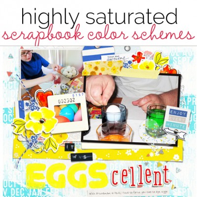
Choosing a scrapbook page color scheme is about more than the hues you use. Pay attention to variations in saturation and value to make choices for effective design and rich storytelling–and check out pages from our team that use highly saturated schemes. Click here.
[hr]
 2. How to Push Your Scrapbook Page Color Scheme Story
Most of us have a “color story,” colors that we’re drawn to and choose again and again. Here we show you how to PUSH that color story and do new things with looks you already love. Click here.
[hr]
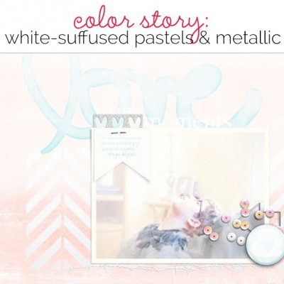 3. Ideas for a Scrapbooking Color Scheme of White Suffused Pastels and Metallic Accents
Use a scrapbook page color scheme suffused with white and accented with metalics and you set a mood of delicacy for your scrapbook page storytelling. We’ve collected white-suffused pastel inspiration for you, and we’ve got scrapbook pages that put this combo to work.
[hr]
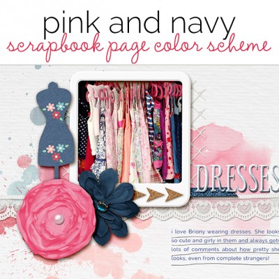 4. A Pink and Navy Scrapbook Page Color Scheme Recasts Primary Colors
A pink and navy scrapbook page color scheme for your scrapbook pages modernizes a primary color combination, and changes the associations your viewer has with the page. Red has a color story of energy, passion, and danger. Pink, though, is a calming color with associations to femininity and romance. See what happens when you pair pink with navy on the pages here.
[hr]
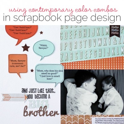 5. 3 Ways to Design Scrapbook Pages with Complementary Color Schemes
Complementary colors are colors that are opposite to each other on the color wheel. Colors like red and green, orange and blue, and purple and yellow are complementary to each other. Using complementary colors can be challenging because they can compete with each other making the other look even more bold or intense. Here are three ways to make a complementary color scheme work for your projects.

