 A pink and navy scrapbook page color scheme for your scrapbook pages modernizes a primary color combination, and changes the associations your viewer has with the page. Red has a color story of energy, passion, and danger. Pink, though, is a calming color with associations to femininity and romance. See what happens when you pair pink with navy on the pages below.
[hr]
Jett Hampton says, “These are photos Grandpa took of my cute nieces showing off their sunglasses during a summer visit. Navy and pink made me think of summer, which led me to these photos in my to-scrap stack.”
Girls in pink in summer settings get a bold backdrop with navy and pink papers. The striped print is an energetic backdrop for a composition built on a vertical band, and Jett used a sketch from the Get It Scrapped membership from Scrapbook Coach In A Band class.
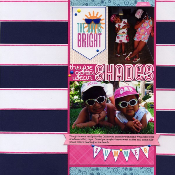
They’ve gotta wear Shades by Jett Hampton | Supplies: Sketch from GIS Membership (Scrapbook Coach Band); Cardstock: American Crafts and Provo Craft; Patterned Paper: Bella Blvd, Fancy Pants, and Amy Tan by American Craft; Alphas: Thickers by American Crafts; Enamel Dots: Basic Grey; Stickers: Doodlebug Designs; DieCuts: Silhouette; Other: Glossy Accents
[hr]
Andrea said, “Pink makes me think about when my daughter was young. Pink was her favorite color. This series of photos really show her personality at that time. She loved to dress up and play with her dolls. The navy blue is a great balance for the pink. A good dose of neutral tan allows the photos to still shine amidst such bold color.”
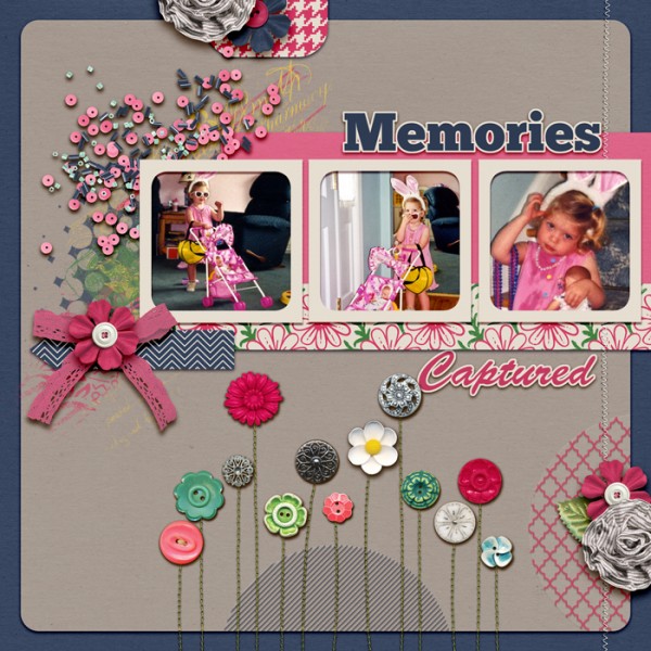
Memories Captured by Andrea | Supplies: Tiffany Tillman STS template; Gennifer Bursett, Stitched Flowers; Mya deLyon, Bits of life kit.
[hr]
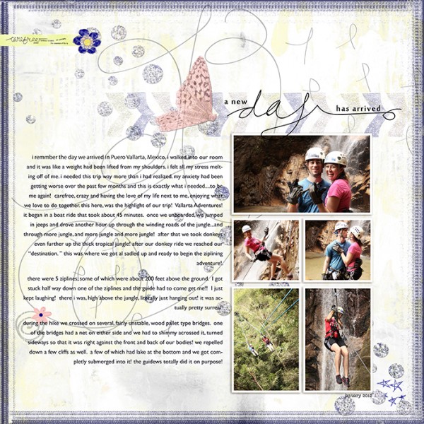
Summer Christiansen says, “This page is about a much-needed trip to Mexico that allowed me to have fun and to be carefree! I wanted a light, almost magical feeling on my page. The blue reflects the setting: the ocean and the open sky. Pink accents add a softer, almost magical feeling.”
[hr]
Kristy T says, “This layout shows my daughter holding a piece of paper with a birthday message on it for her Pop, since we were living away at the time and couldn’t see him on his birthday.”
“I began the page with pink patterned paper and then layered up different shades of pink with a range of mediums and products. The result is a pink tone-on-tone work. The touches of navy blue guide the eye around the page. I used navy colored pens for journaling, to unify the page.”
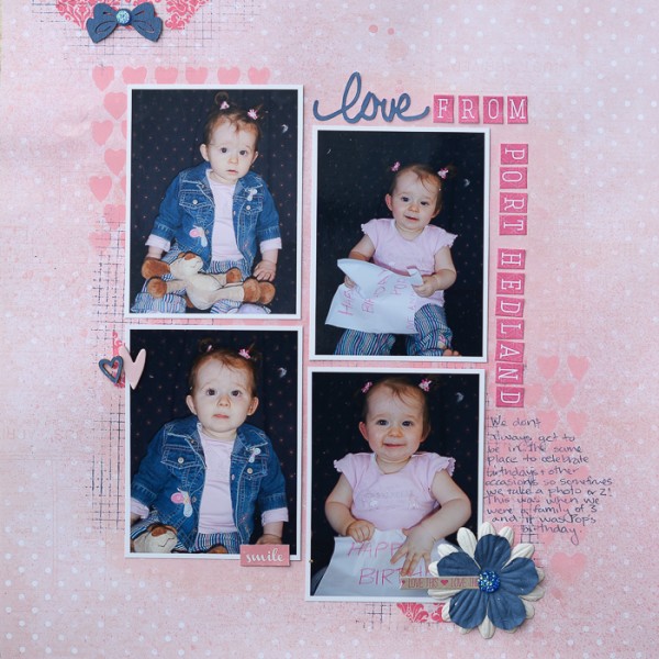
Love From Port Hedland by Kristy T | Supplies: Patterned Paper: Prima; Stencil: Tim Holtz; Alphas: Websters Pages, Jillibean Soup; Flowers: Prima; Wooden Shapes: Prima, Freckled Fawn; Gems: Prima; Paint: Jenni Bowlin, Sitress Paint by Ranger; Colour Bloom Sprays: Prima; Stamp: Stampers Anonymous; Washi Tape: Kaisercraft; Chipboard Heart: Studio Calico; Sticker: Websters Pages.
[hr]
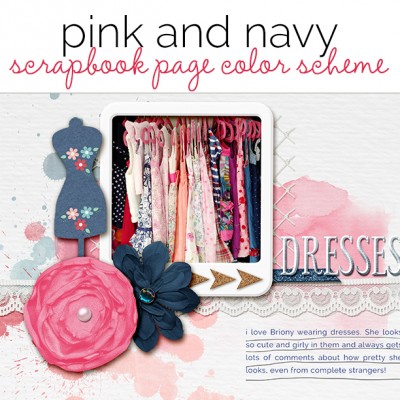
Vicki Hibbins says, “This is a photo of my daughter’s wardrobe and shows how many dresses she has. I took the photo as part of the Get It Scrapped Instagram challenge in June. It wasn’t surprising to see so much pink in her closet, but I hadn’t expected as much navy as there was. The pink elements here accentuate the girly theme, and the navy adds a touch of sophistication.
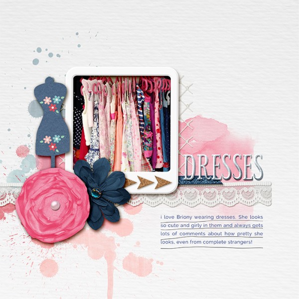
I love dresses by Vicki Hibbins | Supplies: Meta Mulandari: Write it all down; Kristin Cronin-Barrow and Sugarplum Paperie collab: Adjust your sails; Lauren Grier: Always; Mommyish: Essential Styles
[hr]
Kiki Kougioumtzi says, “This is a layout about my daughter’s baptism. The decorations and our clothing were pink. Baptism is a serious matter in our life: it is the day when a person gets a name. Because I consider navy to be an elegant and serious color I decided to use it for my page, as it supports the theme, and combines nicely with pink.”
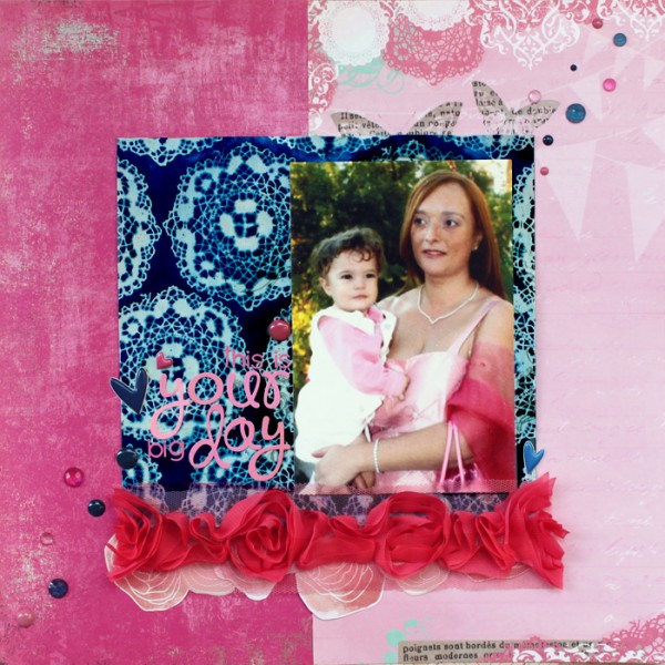
Your day by Kiki Kougioumtzi | Supplies: Patterned paper: Basic Grey, Pink Paislee, American Crafts; Ribbon: American Crafts; Alphas: Studio Calico, Doodlebug; Other: Twine+Ink enamel dots, puffy stickers, Studio Calico gems,Tattered Angels glimmer mist.
[hr]
Carrie Arick says, “On this page, I document the contents of the most recent care package from my parents and the funny return address my dad put on the box. Whenever I receive a care package from my parents, I’m instantly transported to the days after leaving home as a young adult. Pink and navy was a popular combination back then, but I updated the look by using the neon and pastel pinks.”
“My design is a block, which creates the look of a package. It’s more apparent if you rotate the page 90 degrees to the right, but in the position it’s in, it more resembles the contents of the package carefully arranged to fit the block (or box). I used the navy for the background because it’s strong, classic foundation, which is a lot like a parent. The pink is younger and lighter, more like a child, thus supporting the story.”
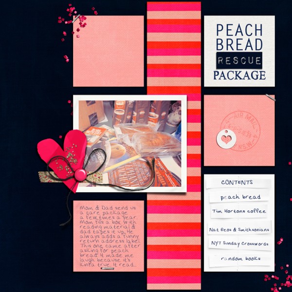
Peach Bread Rescue Package by Carrie Arick | Supplies: Valorie Wibbens: Swoon; Journal Strippers; Julianna Kniepp: Ready Set Go Brushes; Fonts: HandTIMES Regular, Arick Medium
[hr]
Karen Poirier-Brode said, “I bought Hanboks for my granddaughters when I was in Korea. We visited with these little girls earlier in the year, and I gave the Hanboks to them as a belated Xmas gift. Their Mom took this photo on their patio and sent it to me as a text message. I love how she had them pose. I went through other photos from Korea and was inspired by this one of a small building next to the large temple I visited on Jeju Island.”
“I experimented a bit with Photoshop blending modes to use the photo in this pink and navy design. I created brushes and made a patterned paper. The pink and navy add visual contrast which furthers the story of my bringing a bit of Korea back to my granddaughters.”
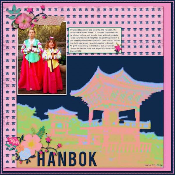
Hanbok by Karen Poirier-Brode | Supplies: patterned paper and card stock – my own design; Font: Arial; Karla Dudley for Scrapaneers: distress brush-on dates; Flergs – dreamalittledream: stitching, glitter foliage; Tracy Martin – missingyou: crystal button, flower cluster, washi, flower; One Little Bird: shadow styles
[hr]
Audrey Tan says, “This page is about my sister-in-law overcoming cancer and then raising funds for cancer research by running 10km race. We were at the race to support her, and she completed it in 1 hr 3 mins.”
“As pink is the predominant color for the race, a combination of pink and navy worked well for scrapbooking the photos. I used a navy background to bring out the pink outfit in the photo. A bit of pink splashes and embellishments completed the picture.”
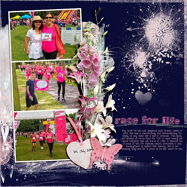
Race For Life by Audrey Tan |Supplies: Anna Aspnes: ArtPlay Palette Infatuated, Multi Media FlutterBys No2, Find My Way Compass Overlays No1; Ju Kniepp: Project365 2012 Alphas; Mye de Leon & Ju Kniepp: It’s A Girl Thing; Jen Maddoxs Designs: Nature Journal; Zig Zag Collaboration: Awakenings; Font: Pea Here’s The Diehl, Pea Hart
[hr]
Stefanie Semple says, “I was taking photos at a friend’s 50th birthday, when I saw my daughter ambling along the beach all alone and thinking deep thoughts and took these photos.”
I like to draw the colors I scrapbook with from the photos, so that the eye is drawn back to the photos. The back ground is neutral and similar to the beach sand. I used the deep pink as a foundation to the visual triangle clusters, while the navy completes the blocked design, playing more of a supporting role.”
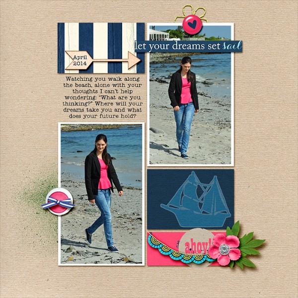
Dreaming by Stefanie Semple | Supplies: Hey there sailor! (kit) by Amanda Yi Designs and Mommyish; Lynne Marie: Misty paint brushes; Kim Jensen : Stringbats 4 (stitched flower). No template, but design was inspired by Debbie Hodge’s Scrapbook Coach Class two by two.

