Ideas for a Scrapbooking Color Scheme of White Suffused Pastels and Metallic Accents | Get It Scrapped
Use a scrapbook page color scheme suffused with white and accented with metalics and you set a mood of delicacy for your scrapbook page storytelling.
We’ve collected white-suffused pastel inspiration for you on Pinterest, and we’ve got scrapbook pages below that put this combo to work. See the products and textures our team used, see the relative proportions, and see how they made this combo work.
[hr]Carrie Arick says, “This is one of those rare photos (and times) that captures my son when he is relaxed, happy, and living fully in the moment.”
“The colors give the page an ethereal look that supports the mood of the page while highlighting that this is not an everyday occurrence because of the dreamy effect suffused white creates. For the photo, I used a combination of a graduated filter and screen blending mode to create a photo with pastel coloring. This washed out my son’s face, so I created a mask to brush my son back into photo ( see the tutorial using masks and brushes from The Lily Pad that I used). The screen blending mode came in handy for the paper and elements, too, because it removes black pixels and lightens colors by infusing them with white.”
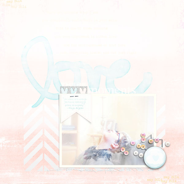
Love These Moments by Carrie Arick | Supplies: Just Jaimee: Storyteller Collection- March 2014 (Papers, Elements, Layer Styles), Storyteller Collection- June 2014 (Flair, Alphas, Layer Styles, Cut Files); Amy Martin: Need More Stitching v. 8; Fonts: Abandon, Albertsthal Typewriter
[hr]Katie Scott says, “We love the beach. These photos are from a few years ago but represent what we did today. Beach photos are a good match to this suffused pastels and metalics color scheme. My photos were a bit dark so the lighter background helped to convey the light happy feeling of the beach.”
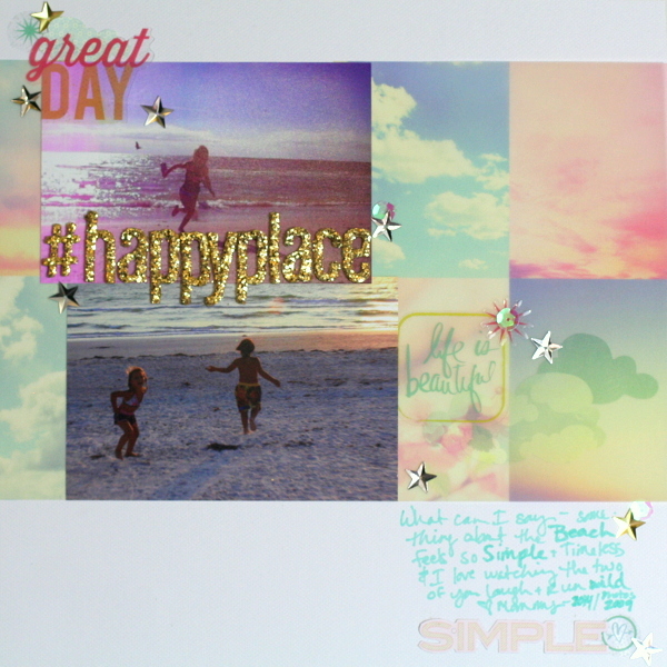
Happy Place by Katie Scott | Supplies: Cardstock by We R Memory Keepers, Vellum by Websters Pages; Transparent Embellishments by Heidi Swapp; Letter Stickers by American Crafts, Markers by Copic, Stickers by Basic Grey, sequins.
[hr]Deborah Wagner says, “My oldest son is at an age where he dislikes being photographed so when he was goofing around with my pink sunglasses, I grabbed my camera and took a quick photo. He was not happy with me or the photo, but I thought it was cute.”
“I used the pink glasses as the starting point for this page. I don’t get to use pastels very often when scrapping my sons but it worked here. I added a touch of gold for the title to increase the glamour–just another opportunity to annoy my son. To get the pixelated look on the background photo, I used the Photoshop mosaic filter and a pastel gradient fill layer.”
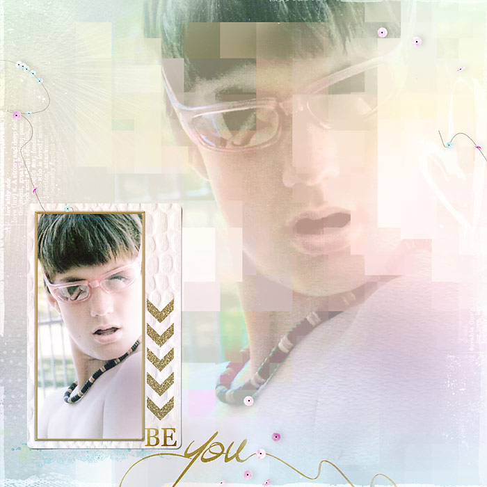
Alex Captured by Deborah Wagner|Supplies: Pixels & Company – Kate & Co Collaboration; Jana Morton – Angel’s Wings Kit Heart Stroke Overlays; Gennifer Bursett – Miss Molly; Emeto Designs – Discovering Love; Anna Aspnes – Art Play Palette Seafoam
[hr]Kiki Kougioumtzi says, “This is a layout with a short review of our latest school year.”
“Because this is something that is now in the past, a scheme of soft, faded, nostalgic colors seemed appropriate. I made a rainbow background and collaged letter stickers over it. To tone down the colors, I overlaid the page with gesso and white acrylic paint. With very diluted watercolors, I colored my title and to make it stand out more. I outlined the letters with a silver marker.”
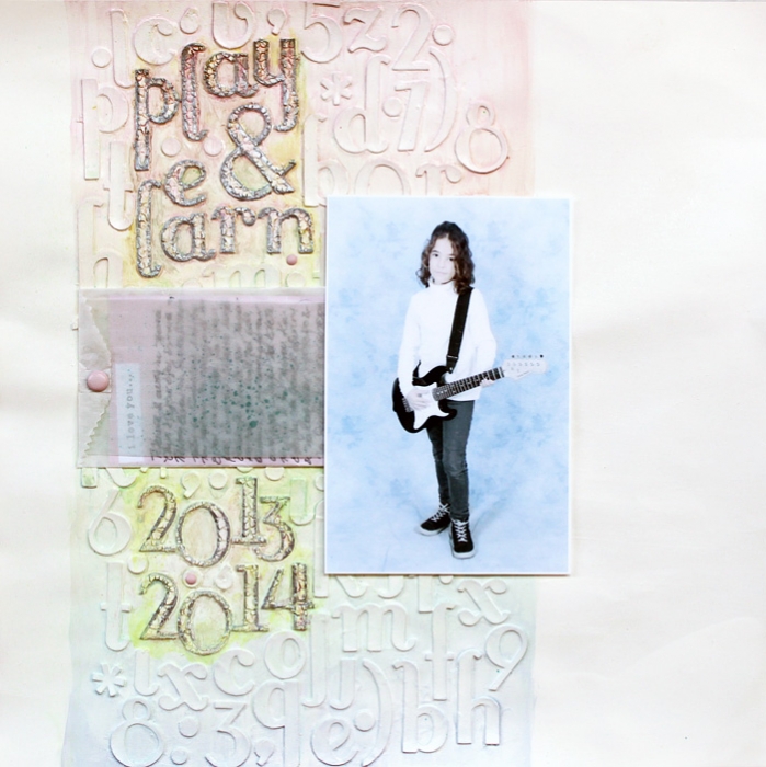
Play & Learn by Kiki Kougioumtzi | Supplies: Cardstock:Canson;Alphas:American Crafts;Gesso,acrylic paints:Liquitex;Brads:Basic Grey;Other:,Talens Ecoline liquid watercolor,glassine bag,journaling cards Dear Lizzy for Becky Higgins Project Life Digital,vellum,Sakura silver marker,Viva Decor croco crackling color.
[hr]Vicki Hibbins says, “I love this photo of my daughter taken in my friend’s studio. Pink pastels and silver are the perfect complement to her fairy outfit. I used a Photoshop layer mask and watercolor brushes to ‘watercolor’ the photo. To lighten the background paper, stitching and flourish, I lowered their opacities. All the elements work together to create an ethereal feeling.”
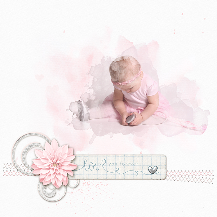
Love You Forever by Vicki Hibbins| Supplies: Anita Designs: Carefree; Digilicious Designs: Always and Forever; Kaye Winiecki: Rack and Ruin; Shelly Marie Scraps: Always and Forever; Just Jaimee: Soft watercolor brushes
[hr]Karen Poirier-Brode says, “This is a page about my granddaughter at the bowling alley with friends at her seventh birthday. I started the page with a photo full of bold color. I edited the photo with a poster filter, decreasing the saturation and then adding a mask and using a brush to take down the color even more. I also edited my digital elements (the butterfly and the flower). The final page has a fairy-princess look even thought the photo was taken at a bowling alley.”
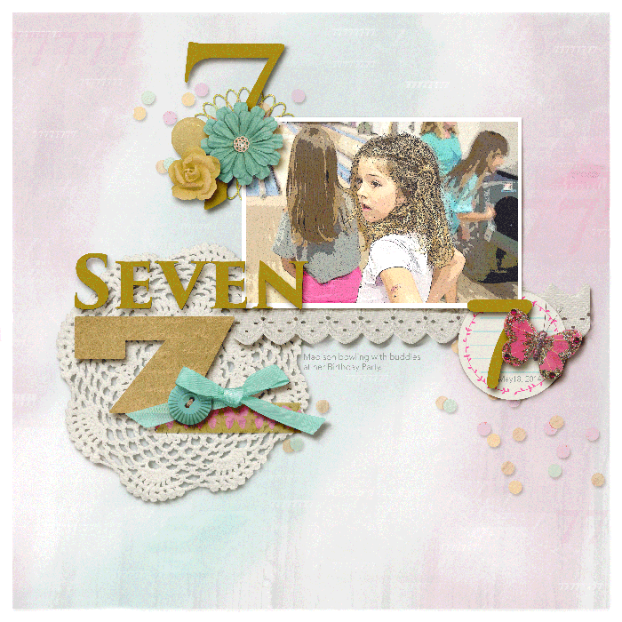
Seven by Karen Poirier-Brode | Supplies: Zoe_Pearn and P&Co: With Love; Amber Shaw: Blessed; Fonts: Avenir, Trajan Pro 3, Chalkboard, Blackoak Std; Karen Poirier-Brode: Background paper.
[hr]Kristy T says, “This is one of my favorite photos from a shoot we did with my family not long after my son was born.”
“When I am using pastels and white I like to use elements that add texture and contrast to the page since colors are muted. For this page I used crackle paint on chipboard, shimmery paints on wooden veneer and embellishments that had dimension and shine. I also made my own background paper by spraying glimmer mist onto the paper and then using a wide brush to spread the mist for more even color. A touch of metal on pastel pages adds contrast and interest.

Together by Kristy T | Supplies: Card: Artee; Patterned Paper: Unknown; Mesh Paper: Unknown; Chipboard: Dusty Attic; Wooden Shapes: Studio Calico; Freckled Fawn, Prima; Flowers: Prima; Leaves: Prima; Beads and Wire: Green Tara; Metal Charm: Unknown; Crystals: Prima; Watercolour Heart: Heidi Swapp; Mists: Glimmermists; Paint: Ranger; Twinkling H20s: Creative Imagination; Muslin; Lace: Unknown.
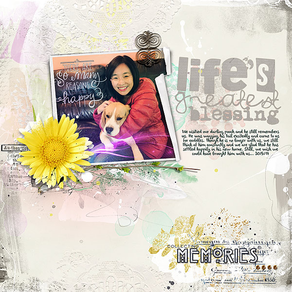
[hr]Audrey Tan says, “This page is about visiting my dog which we had to re-house as we are moving to another country soon (unfortunately, we couldn’t bring him). I applied a retro filter to the photo, and the white-suffused pastels compliment it perfectly.”

