 Choosing a scrapbook page color scheme is about more than the hues you use. Pay attention to variations in saturation and value to make choices for effective design and rich storytelling.
saturation. Saturation refers to the intensity of the color. Pastels are less saturated colors.
value. Value refers to the intensity of light present. When the light is at highest intensity, colors will become bright. When it’s less intense, colors become dim.
See the scrapbook page storytelling our Creative Team has done here with highly saturated colors.[hr]
Carrie Arick says, “It was difficult to convince my husband and son to dye Easter Eggs this year, but it ended up being a great experience for all of us.”
“I used a combination of red, blues, and yellow to play up the colorful nature of dying eggs. I added in softer tones of these colors, along with whites and an almost black navy blue to balance the saturation. The neutrals create flow because the eye instinctively seeks out places to rest between intense colors.”
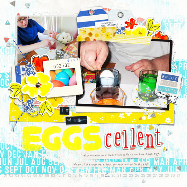
Eggscellent by Carrie Arick | Supplies: SahlinStudio: P.S. I Love You; Sara Gleason: When Papers & Elements; Paislee Pree: Say Yes Elements; Nancie Rowe Janitz: Spring Fling Elements; Amy Martin: Need More Stitching v. 8; Just Jaimee: Juicy Bits Painted Alpha, Sticky Bits Word Labels; Mommyish & Amanda Yi Designs: Hey There Salior Alpha; Tracy Martin: My Happiness; Font: Arick
[hr]
Christy Strickler says, “We posed the kids in front of the Epcot ball before going into the park for the day.”
“I used yellow and orange to create an energetic vibe. I also liked the way it contrasted the blue in the kid’s shirts. I used black and white to make the page a little easier on the eyes.”
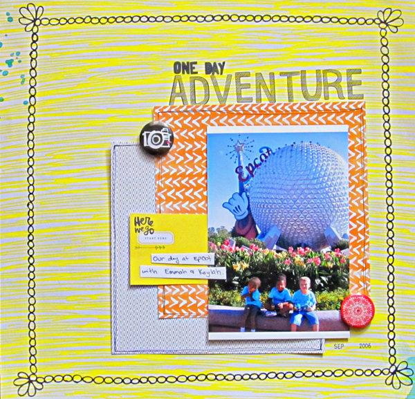
One Day Adventure by Christy Strickler |Supplies Patterned Paper, Flair: Amy Tangerine; Letters: Basic Grey, Amy Tangerine; Jewels: Hero Arts
[hr]
Andrea says, “On Easter we went to visit a wonderful garden and I got this photo of my son and daughter chatting and sharing music.”
“To make this layout I used blue and pink on a gradient layer and a brush on the mask to uncover some of the color. The blue/pink combination was used for the boy girl comparisons. With such strong colors I converted my photo to black and white. Black, white and grey were used as my neutral colors. Then I played with the title, so that the words and the color contribute to the theme.”
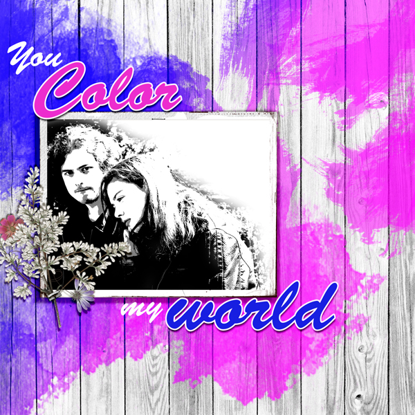
You Color My World by Andrea | Jana Morton, Autumn Memories Paper; Cottage Art, Spring Medley Floral; Anna Aspnes, Art Frame.
[hr]
Jett Hampton says, “During the Anna Aspnes Interview for the Get It Scrapped Membership, we spoke about difficult times and how making pages about those times is OK. I came across the quote and it resonated with me because of the many unexpected changes I’ve been facing. I decided to pair it with a photo I captured at the beach of a wave crashing against the rocks and put it on a layout as a reminder that things will get better.”
“I worked with navy blue and reds. The blue represented the darkness of feeling lost and of the peace once things calm down. I thought adding red created tension and a feeling of chaos. I added white, kraft and light blue as neutrals to soften the layout and bring a sense of peace. I used a sketch based on Tami Taylor’s layout from the Membership’s Photo Play class as my inspiration.”
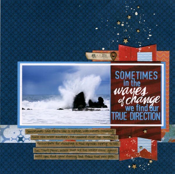
Waves of Change by Jett Hampton | Supplies: Pattern Paper: Bella Blvd, DCWV, Papertrey Ink; Cardstock: American Crafts, Paper Studio; Wood Veneer: Studio Calico; Font: DIN Condensed and Brush Script; Paint: Royal Langnickel Gouache; Silhouette to cut title and frame.
[hr]
Karen Poirier-Brode says, “This page is about a recent visit with my grandson, where his parents pointed out his milestones and gave me his latest pre-school photo.”
“The saturated colors I have used are a deep almost royal blue, lime green, turquoise and yellow. The neutrals are brown, deep gold and white. The palette also has a variety of muted rich colors in the white based blocked patterned paper. The saturated color works well with the deeply saturated hues of the photo.”
“The page uses a template from the Scrapbook Coach class “In a Block” with some changes to fit it to my style – made it more of a band design, added a border, a clipped item, and layered embellishments. The nature elements work well with the photo background and woodland creatures seem to still be a trend.”
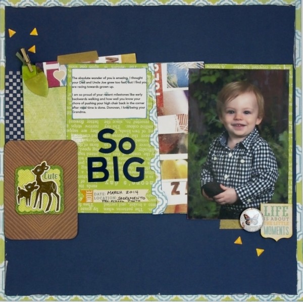
So Big by Karen Poirier-Brode | Supplies: pril 2014 Cocoa Daisy Kit:Navy card stock, Jillibean beanboard thin chip alphas in navy,Little B metallic gold tape, Doodlebug sprinkles arrows – bumblebee yellow, American Crafts Studio Calico essentials gold clothes pin, American Crafts Studio Calico lemon lush gold dipped leaf,Heidi Swapp favorite things lovely lattice, American Crafts Studio Calico Lemon Lush Passionate, American Crafts Studio Calico Lemon Lush Analytics, My Mind’s Eye Little things label stickers, Quick Quotes: Powder Puff Inks in lemonade, blue moon, & blue hawaiian, Liquitex: Light modeling paste, Scrapbook Adhesives: tape runner, 3D Foam squares, Colorbok: Friendly Forest glitter embellishment, Stash: stencil, flair
[hr]
Deborah Wagner says, “I was playing with brushes and gradients, and made a mistake, moving my gradients and brushes on top the photo. Once I started, I couldn’t stop (that’s probably pretty obvious). I used bright pinks, purples and turquoise; changing brushes and gradients throughout the process. It may be a bit feminine; but when I changed the colors to less saturated, more masculine colors the page didn’t have the same impact. I feel the vibrant, super-saturated color palette makes a statement when combined with the title work.”
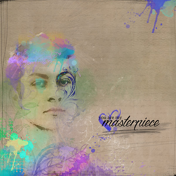
My Masterpiece by Deborah Wagner | Supplies: Jana Morton – Artful Words, Heart Strokes Painted Clusters, Winter Wonderland, Little Masterpieces, Painters Paper Pack; Katie Pertiet – Scribbled and Scratched Photo Frames, Catana, Drawn Leaves, Grungy Clusters, Alandia Rancheros, Collection Manuscrite, Splash Clusters, Fancy Flourishes No. 1, Watery Spot Brushes No. 2, Painted Wings No. 1, Mixed Brushes and Stamps No. 1, Watery Photo Masks No. 1; Anna Aspnes – Art Play Palette Seafoam, Passionaire Brushes, Erica Zwart – Watery Splashes No. 4; Jesse Edwards – Doodled Flourishes; Kim Broedelet – Retrospect; Cottage Arts – Soulful Silhouettes
[hr]
Michelle Hernandez says, “The journaling for this page tells the whole story. I had my husband and daughter lie on the ground next to some positive graffiti we spotted at a local park. It read Moments like these are what we live for. The photo makes me laugh because neither model was overly eager to participate but they humored me good naturedly and made the sentiment a reality.”
“I normally wouldn’t combine yellow and red together because of the obvious hot dog fixings connotations but I wanted to use some of my old Sassafras Lass stash and I decided to experiment with using 2 strong main hues rather than fall back on my old habit of a neutral color background paper. Since the color palette is so strong I kept the layout simple and doubled up the photo to draw the eyes.”
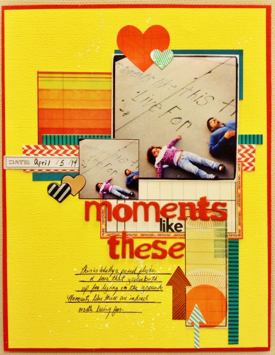
Moments Like These by Michelle Hernandez | Supplies: American Crafts cardstock and Thickers, stickers from Sassafras Lass, Amy Tangerine embellishment stickers.
[hr]
Amy Kingsford says, “These are my boys on Easter a couple years back.”
“I chose an indigo tone-on-tone patterned paper for my background and increased the saturation slightly. I love the way colors pop against a darker background and going with this particular color really seemed to help my photo pull a little more focus, despite being a little washed out because of the bright sunlight on that day. I added pops of saturated pink and yellow, as these colors are reminiscent of springtime, but these deeper, more saturated tones were a better fit with my background color. For neutrals I white and a few touches of silver here and there that help to bind everything together and move the eye throughout the page.”
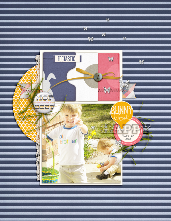
Happy Easter 2012 by Amy Kingsford | Supplies: Karla Dudley: Hop Happy Collab (with Ange Design); Deena Rutter: Layered Layouts V. 11; Font: KD Everyday.
[hr]
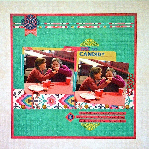
Sue Althouse says, “This page is about my sister and me being goofy and letting my husband take a candid picture of us.”
“The photos I selected were already saturated, so I knew they would stand up to other strong colors. I used a gallon of teal, a quart of red and a pint of yellow in rich jewel tones to create a sophisticated primary color palette. The deep blue title and embellishments pop off the page and the generous white border gives the eye a place to rest.”

