 by Kelly Noel
This lesson originally appeared in the Get It Scrapped Membership class Color 2. Click here to get all the lessons on this topic with an all-access pass.
Complementary colors are colors that are opposite to each other on the color wheel. Colors like red and green, orange and blue, and purple and yellow are complementary to each other. Using complementary colors can be challenging because they can compete with each other making the other look even more bold or intense. Here are three ways to make a complementary color scheme work for your projects.
1. use complementary colors in an expected way
Some complementary color schemes are associated with particular holidays. Red and green are colors associated with Christmas.
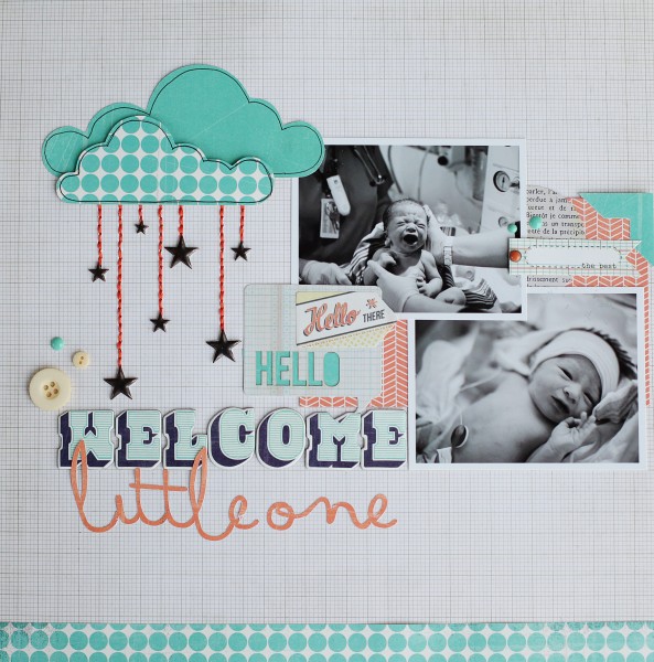
Thus, the easiest way to use this complementary color scheme is to use it the way you’d expect: on a Christmas layout. Here I’ve used a bold red with a more subdued olive green on a Christmas page. Using it with a white background makes the colors stand out for a bold layout.
2. tone down one of the colors in the scheme.
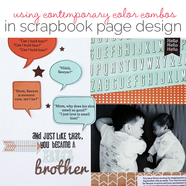
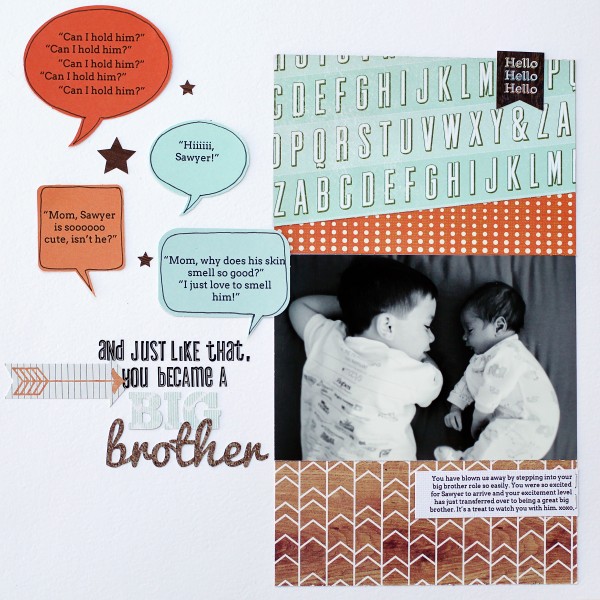
I’ve found when working with complementary colors that using one bright bold color, like the orange on this layout, and pairing it with its softer, more subdued, complement is easier on the eye.
When you use a more medium value of the color, instead of the true intense color, you’re still creating a contrast, but it’s not as striking, which works well for most pages.
Placing elements that repeat this color around the page on a neutral background is appealing because your eye travels across the page effortlessly.
3. use a neutral background with complementary colors.
The intensity of complementary colors can be overwhelming. This is why using a neutral background is key to making a complementary scheme work.
While still creating a bold look, the neutral background gives your eyes a chance to rest. If I had used a dark bold background on Big Brother, it would have completely changed the look and been far too overwhelming. The neutral background allows all of the elements to stand out, including the photo.


