We frequently share ideas for trying out new scrapbook page color schemes at Get It Scrapped. Here’s a closer look at five colors combos that we recently highlighted in articles.
Follow the links below to team members’ personal blogs and youtube channels where you can see extended technique, storytelling, and product details about layouts accompanying our technique articles.
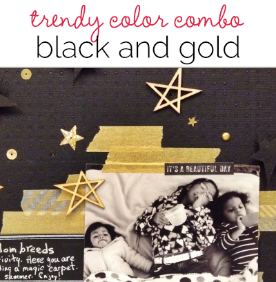 1. Ideas for a Black and Gold Scrapbook Page Color Scheme
Use a scrapbook page color scheme of black and gold, and you’ve got instant drama–a drama that’s well suited to scrapbook page storytelling. Read Ideas for a Black and Gold Scrapbook Page Color Scheme and see more details about how scrapbook layouts in the article were made:
- Get It Scrapped: Gold and Black by Christy Strickler
- Get It Scrapped: Golden by Marie-Pierre Capistran
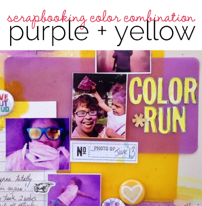 2. Ideas for Using Trendy Scrapbooking Color Combination Purple + Yellow
Complementary colors purple and yellow are a trendy scrapbooking color combination this year with Pantone’s color of the year pick of radiant orchid. Read Ideas for Using Trendy Scrapbooking Color Combination Purple + Yellow and see more details about how scrapbook layouts in the article were made:
- Outside the comfort zone: purple and yellow by Amanda Robinson
- On using purple and yellow by Stefanie Semple
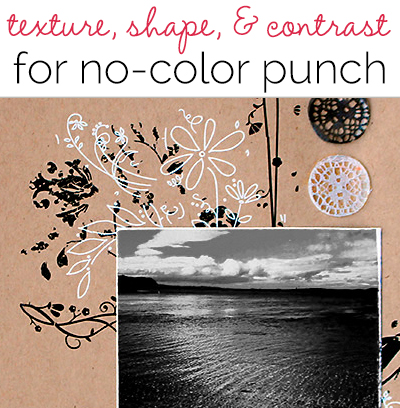 3. Use Texture, Shape, and Contrast for No-Color Pages With Punch
Make a page with high-impact and obvious mood (ranging from calm to vintage to elegant) by putting away your colors and sticking with black and white and beige on your next page. Read Use Texture, Shape, and Contrast for No-Color Pages With Punch and see more details about how scrapbook layouts in the article were made:
- Inside GIS: Black, White and Beige deconstructed design by Carrie Arick
- Inspired by Black, White and Beige by Sue Althouse
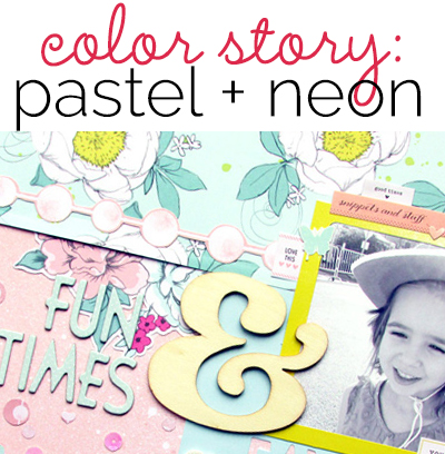 4. Add Pop to A Pastel Color Treatment with Neons
Soft pastels with neon fluorescents is a color treatment with built-in contrast and the ability to set a sweet mood. Read Add Pop to A Pastel Color Treatment with Neons and see more details about how scrapbook layouts in the article were made:
- Get It Scrapped! | Pastels + Flourescents by Ashley Horton
- Using Pastels and Fluorescents by Terry Billman
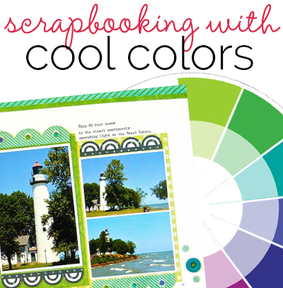 5. Scrapbooking Ideas for Using a Cool Color Palette
Cool colors on the wheel are blue, green, and violet. They tend to recede and have less visual weight than warm colors. Read Scrapbooking Ideas for Using a Cool Color Palette and see more details about how scrapbook layouts in the article were made:
- Inspired by Cool Colors by Sue Althouse
- Use Analogous Color Schemes for Harmony on Your Scrapbook Page
Which color combo will you try out first?
Are you feeling inspired to use one of these combos in your next layout? Or have you tried out one of these palettes in your scrapbook pages recently? What did you think? Let us know below.

