 A 2014 Catwalk color trend identified by Patternbank is the combination of soft pastels with neon fluorescents. This is a color treatment with built-in contrast and the ability to set a sweet mood. See this color scheme at work on pages below.
Ashley Horton says, “Our daughter loves to wear her cowgirl hat, and will wear it just about any place we go. “
“When I saw this assignment to work with soft pastels and fluorescents, I immediately thought of the Polka Dot Party collection from Dear Lizzy. I love the contrast of the softer colors with the pops of bright yellow. I repeated that pop of yellow with a fluorescent frame around my black and white photo.”
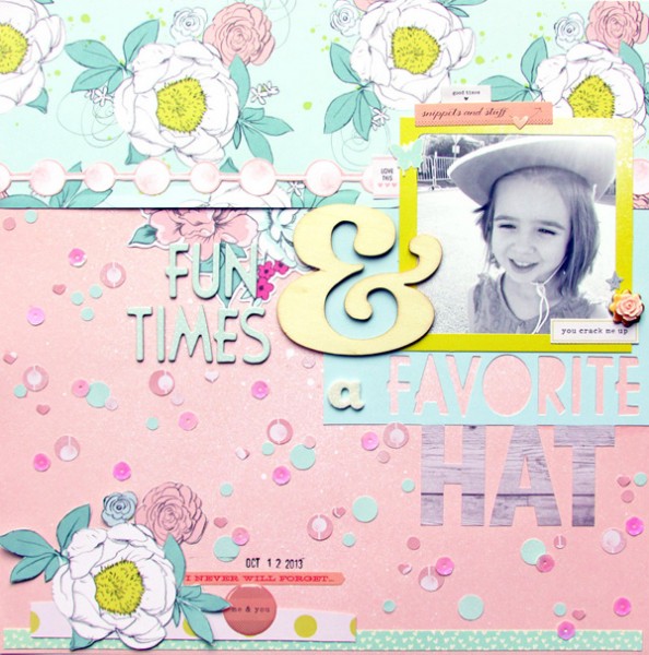
Fun Times & A Favorite Hat by Ashley Horton | Supplies – Patterned Paper, Thickers, Epoxy Stickers, Decorative Flower, Date Stamp, Wood Veneer, Stickers: American Crafts; Sequins; The Paper Bakery
Kristy T says, “My son feel asleep at the table after eating his lunch so I moved him to the couch and just had to take photos.”
“Pastel blues and greens are colors I associate with little boys, and bright lime green is a color I associate with older boys. My layout is about my son growing up and giving up his day sleep so these colors were perfect for documenting this story. When combining pastel and very bright colors I tend to use the pastels as my base and the brighter color as an accent and to draw the eye around the page.”
Tip: If creating a misted background you can use a white spray over the other colours (when they are dry) and then just wipe the mist over the page using paper towel to tone down the colours and make them more pastel.
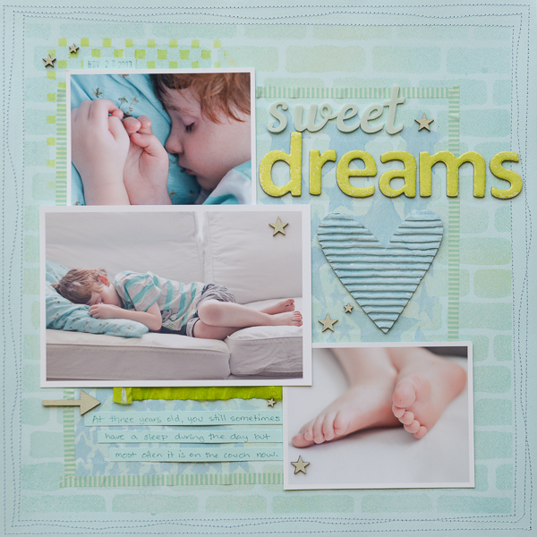
Sweet Dreams by Kristy T | Supplies: Card: Bazzill; Alphas: American Crafts; Paints: Jenni Bowlin, Ranger Distress Paint Dabber; Mists: Dylusions, Glimmermist, Studio Calico; Templates: The Crafters Workshop, Kaisercraft, Prima-Finnabair; Wood Veneer: Studio Calico; Roller Date Stamp: American Crafts; Washi tape: My Minds Eye; Corrugated Shape: Jillibean Soup, Crepe Ruffle: American Crafts, Gelato: Faber-castell; Ink: Ranger Archival; Marker: Ranger Distress Marker.
Terry Billman says, “This layout records the excitement and energy my granddaughter has when playing hide and seek with me.”
“The pastel checked paper softens the layout and gives it a feminine feel, while the fluorescent and teal mats add energy to the page. I wanted to focus on the excitement on Brenna’s face, so I converted the photo to black and white to eliminate the colors in the background of the photo.”
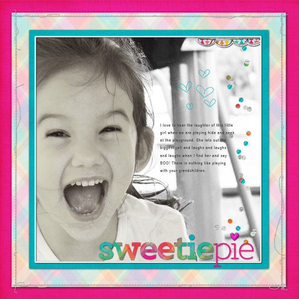
Sweetie Pie created by Terry Billman| M. Martin: Kissingbooth; Cathy Zielski: Type Set 1; Anna Aspnes: 12 x 12 Stitched by Anna Border White 1; Katie Pertiet: Little Hearts
Brenda Becknell says, “My granddaughter loves bright colors and they capture her personality well.”
“I started the page with the pastel floral print because it has a variety of soft feminine colors. I then added some of those colors but in fluorescents. I added the bright touches in small doses. I also added glossy dimensional medium and neon glitter to the inked title for extra sparkle. Adding several touches of white kept the page from being too bright and helped blend the pastels and neons.”
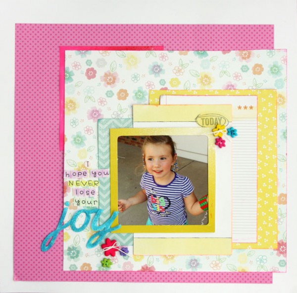
I Hope You Never Lose Your Joy by Brenda Becknell | Supplies: Cardstock: Bazzill; Patterned Paper: Doodlebug Designs, American Crafts, Neon inks: Hero Arts; Alphabet stickers: Doodlebug Designs; Cricut “Cursive 101” cartridge; Frames: American Crafts; Mod Podge dimensional magic; Wow neon glitter
Sue Althouse says, “This page is about a pumpkin vine that grew up into our neighbor’s tree.”
“A background of blue and green soft pastels establishes the outdoor theme here. The fluorescent orange framing the photos and in the playful title emphasizes the strange sight of seeing a pumpkin growing in a tree. Since I didn’t have any fluorescent paper in my stash, a neon orange stamp pad, clear stamps, scissors and punches helped me create the page elements.”
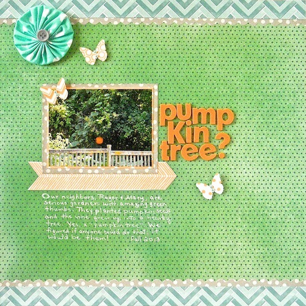
Pumpkin Tree? by Sue Althouse | Supplies: Patterned Paper, Fabric Flower: Amy Tangerine, Scallop Border Punch: Fiskars, Butterfly Punch: Martha Stewart, Alphabets: American Crafts, Stamps: Lawn Fawn, Inks: Hero Arts, Jenni Bowlin, MIni Pearls: Doodlebug
Rosann Santos-Elliott says, “This is the last photo I took before I got really sick almost 2 years ago. I like this photo of myself and I thought the purple dress fit the theme of pastel and fluorescent well.”
“Andy Warhol’s pop art painting of Marilyn Monroe was one of the first images of inspiration that came to me. I trolled the internet for a free app that would let me convert a photo to this type of pop art and I found it in Foto Flexer. Voila, I had layout with pastels and fluorescents. Pictures of yourself can often be difficult but they are also a great way to boost self-esteem and learn to love yourself for who you are no matter how you are feeling about yourself.”
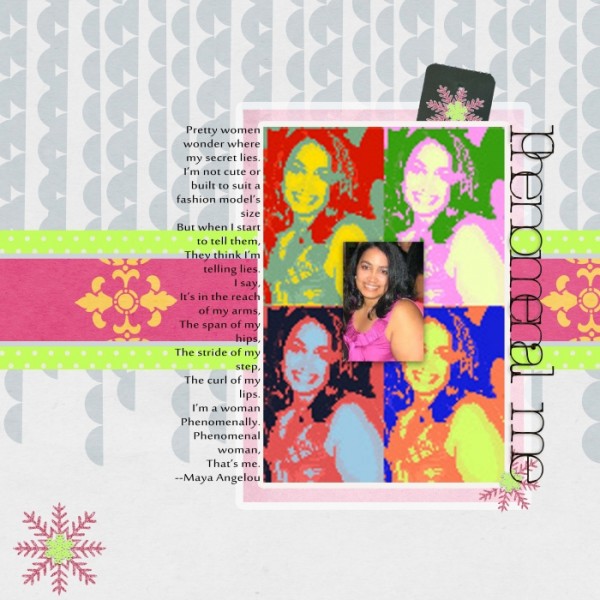
Phenomenal Me by Rosann Santos-Elliott | Supplies: Merry and Bright by Danielle Young Designs; Family Season by Pixelily Designs; Snow Flurries by Southern Creek Designs.
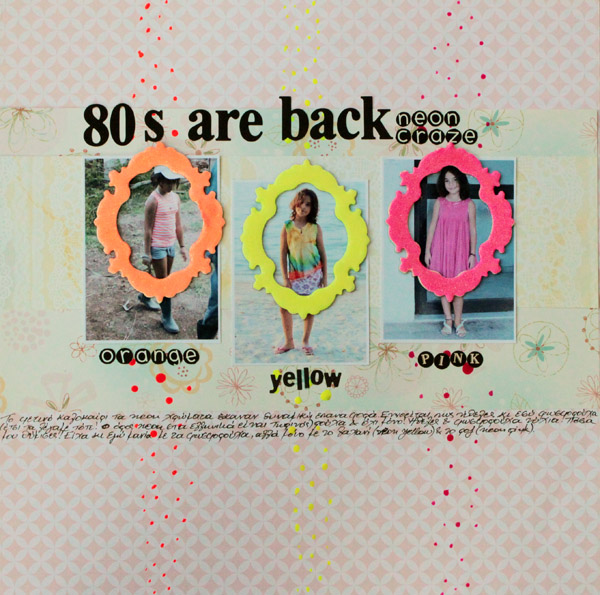
Kiki Kougioumtzi says, “This summer neon colors were popular, and, of course, my daughter had to have some of these colors in her wardrobe (and on her nails).”
“Because this layout is all about the return of neon colors and how they remind me of the 1980s, I used them on my page. I didn’t have any scrapbooking materials colored with neon so I used what I had on hand: neon flocking powder from kids’ craft materials for the frames and the actual nail polish my daughter wears in the photos for the colored dots.”

