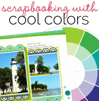
 Cool colors on the wheel are blue, green, and violet. They tend to recede and have less visual weight than warm colors. Blue and green are calming and soothing and have connections to nature. Violet, which is made from a warm and a cool color and which appears less frequently in nature is often associated with the artificial and extravagant.
Katie Scott says, “My daughter went to a birthday party at the Winter the Dolphin Aquarium, and part of the party package included ‘green screen’ photos with Winter. I took photos (bottom) of the kids in front of the green screen and later we received the green screen photos with the thank you card. I thought it would be fun to put the two sets of photos on the same page. I used cool colors because they tied in with the story: the green screen which was literally green, and the blue of the dolphin and the water at the aquarium.”
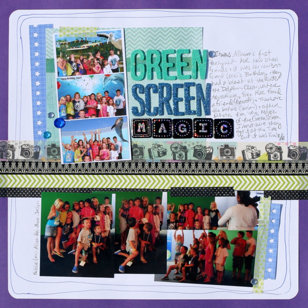
Green Screen Magic by Katie Scott | Supplies: American Crafts Thickers and star border punch; Bella Blvd. & Recollections washi tapes, cardstock, bling.
Carrie Arrick says, This page is about the things we love about summer — and that we will miss. Instead of matching my photo to the color palette, I used I used varying shades of violet, blue and aqua (or blue-greens) to exaggerate the warm colors and high contrast in my photo. Indirectly, the cool colors provide a sense of relief from the warm, summer sun in the photo, reinforcing the story I’m telling on this page. When using this a fully cool (or fully warm) color palette, using small bits of neutral colors (here the whites and blacks) and varying textures is the key to keeping the effect from overwhelming.”

C’Ya Summer by Carrie Arick | Oscraps: Starry Nights Collaboration (glitter splatter); Tracy Martin: Glitter Vellum; HGD by Laurie Ann: Heart & Hand Papers; Scrap Orchard: Storyteller Collaboration (paper); Just Jaimee: Storyteller Collection- May Alpha, You Make Me Happy; Karen Lewis: Engergize (word art); Sugary Fancy: Paint Me Papers Collection; Wimpy Chompers: Summer Blossoms (journal card); Sahlin Studio: Wonderful Day (staple); Fonts: 28 Days Later, Bobcat
Brenda Becknell says, “Scanning and scrapping all the old photos of my kids is a work in progress. I love this old photo of my son but the colors were pretty faded (it’s a 25-year-old photo) so I cropped it down, converted it to black and white, and added a grunge mask to give it a bit of a distressed look. Cool colors of teal, blue and green with touches of black worked well with the black and white photo, complementing it without clashing. Since there wasn’t a lot of variation in the colors I used, I added contrast with texture, hand stitching, paint, vellum tape, and metal flair.”

Love Your Smile by Brenda Becknell | Supplies: Cardstock: Bazzill; Patterned Paper: American Crafts, Crate Paper; Stickers: Basic Grey, Authentique, October Afternoon; vellum tape: Basic Grey; Metal Flair: Um Wow; Jessica Sprague grunge mask; Amy Tangerine stitch kit; acrylic paint, floss
Anja de Dobbelaere says, “I took this picture on a snowy day at the end of January. I like to watch the snow and how it covers the landscape. I let the picture ‘rule’ the page and digitally blended it with papers and masks from Jen Maddocks’ Jack Frost kit. I used blue and green glitters too (on the right bottom of the page), because they enhance the frosty feeling and the green of the leaf. I like that contrast between the snowy white, the feeling of frost, and the green of the leaf–as if spring was already making its entry.”
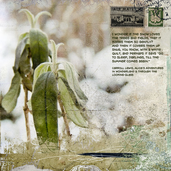
The Snow by Anja de Dobbelaere | Supplies: Credits: Jen Maddocks: Jack Frost, Parchment, Up Up And Away.
Sue Althouse says, “This page is about our visit to the Pointe Aux Barques Lighthouse on Lake Huron. Taking my cue from the sky, trees, and water in the photos, I chose a variety of blues and greens to capture the calm, restful mood of the scene. The lighter color palette and white background keep the layout fresh and crisp.”
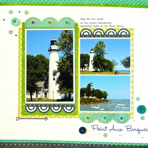
Point Aux Arques by Sue Althouse | Supplies: Cardstock: Bazzill; Patterned Paper: Basic Grey, Crate Paper, Jenni Bowlin, My Mind’s Eye; Alphabets, Small Borders: Silhouette; Vellum Arrow Sticker: Studio Calico; Buttons: October Afternoon; Floss: We R Memory Keepers; Mini Dots: Doodlebug, Queen & Co.; Typewriter: Remington
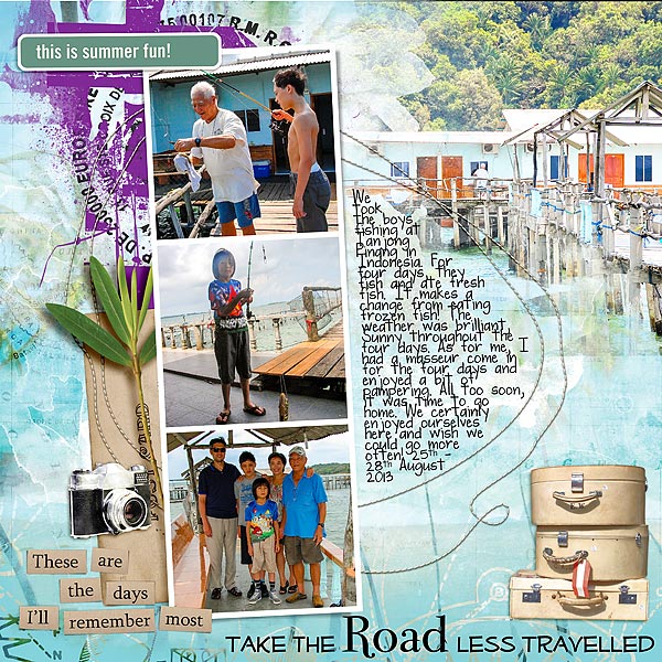
Audrey Tan says, “This page is about our fishing trip in Tanjong Pinang, Indonesia. The cool colors worked here as the place we stayed in was a sea of tranquility and peacefulness. The splash of purple emphasizes that the only action here was fishing. Other than that, all of us simply chilled out and enjoyed the sea breeze!”

