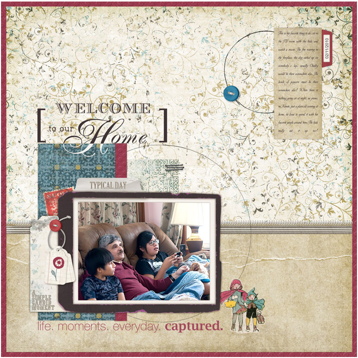
by Debbie Hodge | Mar 3, 2010 | Composition, Videos
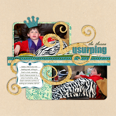
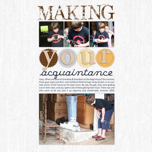
Why It Works: a closer look at scrapbook pages from the Get It Scrapped! gallery by Debbie Hodge This is the first in a series of short videos in which I talk about scrapbook pages that I like and what I think makes them successful! I’m planning to make these...

by Debbie Hodge | Mar 2, 2010 | Composition, Get Started, Photos
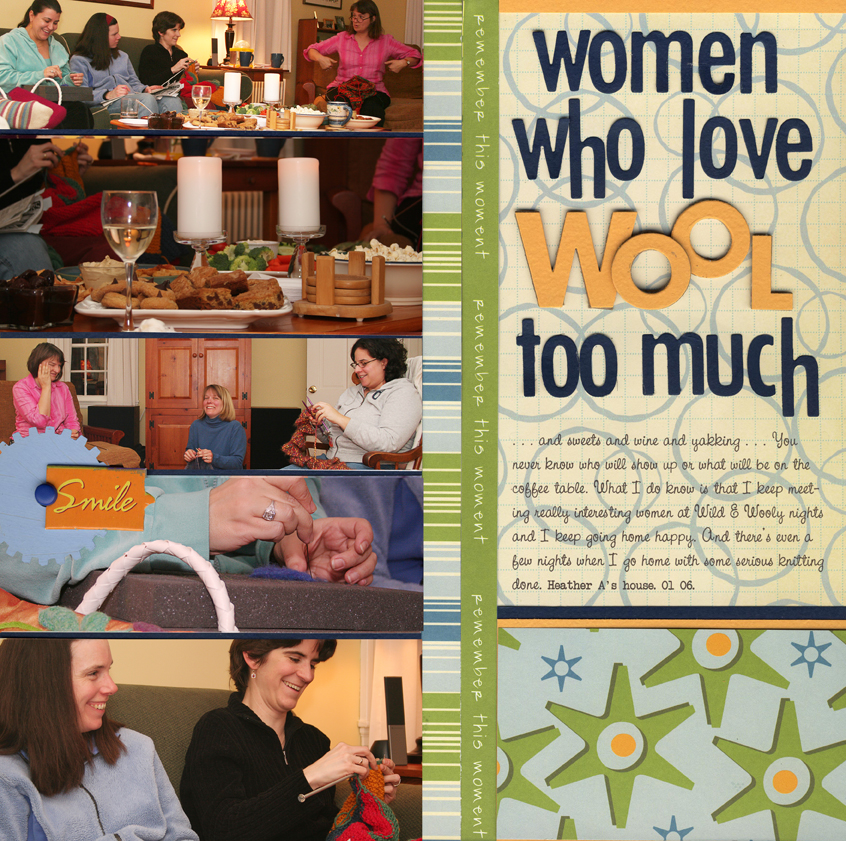
by Debbie Hodge Most of my 4×6 photos straight out of the envelope can be—and even need to be–cropped. To get clean designs that go together quickly, I always look for uniform cropping opportunities. Crop for Columns: “Women Who Love Wool too...

by Debbie Hodge | Feb 26, 2010 | Design Principles, Embellishments
Embellishments can be used with other page elements to guide the viewer’s eye through the page. We all routinely scan our surroundings – even when we focus on a spot, we eventually change our field of vision. As we make this change, we do a quick scan of the...

by Debbie Hodge | Feb 26, 2010 | Composition, Scrapbook Page Elements
Here is a scrapbook page design that you can alter and use over and over again. by Debbie Hodge The little black dress endures because it’s appealing and practical. Add a belt and jewelry and you have a different look. Learn here how to do the same thing with...

by Debbie Hodge | Feb 18, 2010 | Design Principles, Embellishments
by Debbie Hodge Think about racing stripes on a car, earrings on a woman, roses on china. Each of these are embellishments. Wikipedia defines an embellishment as something that enhances appearance without having any functional purpose. I say “not so” when it comes to...

by Debbie Hodge | Feb 17, 2010 | Design Principles
by Debbie Hodge Try this. As you place elements on your scrapbook page, consciously place each of them in relation to some other element on the page. This is alignment. Using alignments provides order, margins, and meaningful white space. It lets you organize and...
