by Debbie Hodge | May 12, 2011 | Design Principles, Doris Sander, Ideas Spurred by Design
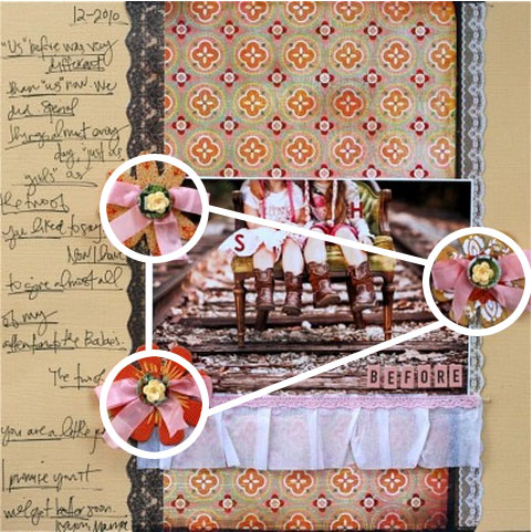
By Doris Sander If you’ve read Debbie Hodge’s recent article, “Tap the Power of ‘3’ for Your Scrapbook Designs,” you know that three unifying elements can make a powerful statement on a scrapbook page. Take a look at the layouts...

by Debbie Hodge | May 9, 2011 | Composition, Get Started
by Debbie Hodge I approach making scrapbook pages by asking myself questions that are based upon my understanding of: 5 scrapbook page elements (canvas, photos, journaling, title, embellishments), and 6 design principles (emphasis, contrast, balance, alignment,...

by Debbie Hodge | May 3, 2011 | DinaWakley, Ideas via Product & Technique, Patterned Paper
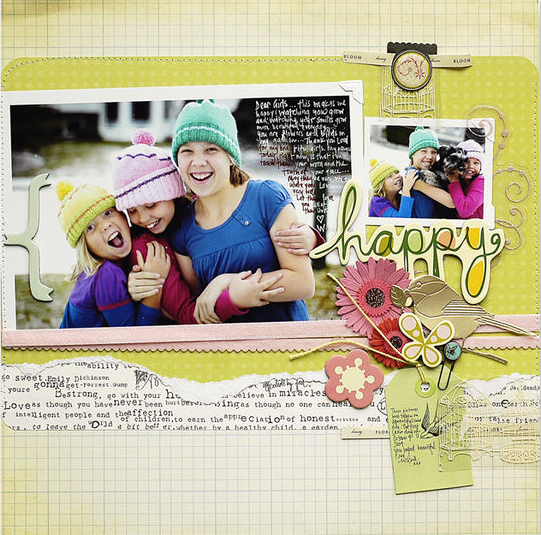
By Dina Wakley There’s nothing like the punch and wow-factor a bold and bright patterned paper gives a page. One thing I’ve learned over the years is how to make a bold piece of patterned paper work for you. Here are a few ideas for using those bright and busy...

by Debbie Hodge | Apr 30, 2011 | Design Principles
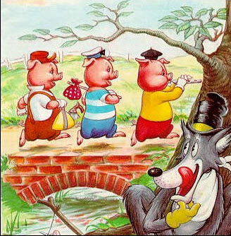
by Debbie Hodge The stability of threes The human mind likes things that comes in threes: three coins in a fountain, three-ring circuses, and Goldilocks’ three bears. Speech coaches, writers, and comedians all understand that ideas presented in threes are more easily...

by Debbie Hodge | Apr 18, 2011 | Patterned Paper
by Debbie Hodge When it comes to mixing patterned papers on your scrapbook pages, there are a four patterns that mix easily with the wildest of motif and color combinations. These patterns are text, stripes, ledger/notebook, and dots. See how guest teachers at...

by Debbie Hodge | Apr 15, 2011 | Art Journaling, Color, Design Principles, DinaWakley
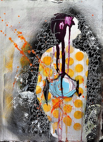
By Dina Wakley I love contrast. If you want a page element to be powerful, contrast it with its opposite and you have mega-impact. Contrast is what makes a piece of art surprising, or interesting, or even just plain good. Contrast is essentially the use of opposites...
