By Dina Wakley
There’s nothing like the punch and wow-factor a bold and bright patterned paper gives a page.
One thing I’ve learned over the years is how to make a bold piece of patterned paper work for you. Here are a few ideas for using those bright and busy prints.
1. Use strong photos with bold papers.
If your paper is bold, your photographs need to be even bolder to stand out from it.
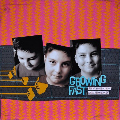
Busy Christmas morning or birthday photos usually aren’t the best choice because the details get lost against the pattern. For “Growing Fast” I chose three black and white photos of my son. The photos are strong and stand out from the overall brightness of the page.
2. Use bold paper in strips or squares.
Even the most chaotic print can be made manageable by making it smaller and using it in controlled doses.
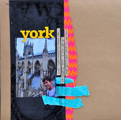
When you add just a strip or a border of a strong pattern, you provide great visual punch. On “York,” I added a torn border of hot pink paper. The pink paper pops and adds interest but doesn’t take over the layout.
3. Pair a bold pattern with a good neutral.
Try using a bold pattern in a ratio of one-third bold pattern to two-thirds neutral paper.
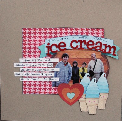
“Ice Cream” has a strong herringbone print in the center surrounded by a wide border of neutral Kraft. The Kraft helps tone down the pattern and make it manageable. There is enough of the herringbone print on the layout to provide visual interest, but not so much that it overwhelms the layout.
4. Use the bold pattern as your background and add a solid-colored foundation.
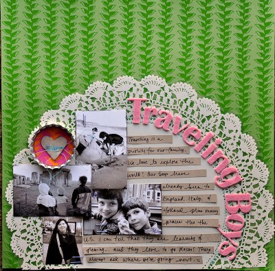
In this example, the green vine print could easily overwhelm the photos. I added the solid doily on the page and then created my page on top of the doily. The doily gives a good solid foundation for the layout and prevents the print from being distracting. I also used this technique on the “Growing Fast” page above. On that layout, a strip of black breaks up the pattern and gives a strong foundation for the photographs.
5. Use a contrasting color to draw eyes to your photographs.
If your page has a lot going on, choose a color that will pop against the other colors–then: use that contrasting color near your photographs (for example, use it as a title or as a photo mat). Your photograph will be easier to find amongst the patterns on the page.
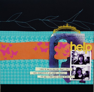
On this page “Help,” there are lots of colors and patterns, and the photographs are quite small. To draw the eye to the photos, I added the title in bright yellow letters and put the title at the top of the photos. The yellow pops against the purple and blue and stands out. This helps draw the eye to the photos.
If you use one of these ideas with your bold patterned paper, you’ll be able to make any print work. Happy scrapbooking!
[dwakley] [patternedpaper]

