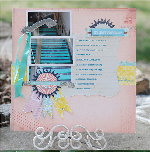
By Doris Sander
If you’ve read Debbie Hodge’s recent article, “Tap the Power of ‘3’ for Your Scrapbook Designs,” you know that three unifying elements can make a powerful statement on a scrapbook page.
Take a look at the layouts here as I share thoughts and ideas for using the three points in the visual triangle to bring balance to your scrapbook page designs.
the visual triangle
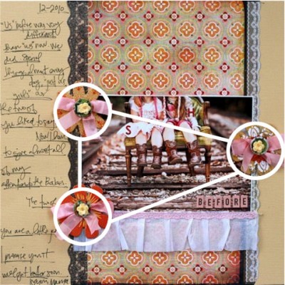
If you’re unfamiliar with the visual triangle, imagine placing a transparency over a layout then finding three cohesive points on it that could be connected with a dry erase marker to form a triangle. You may not have been aware of it, but your eye will subconsciously look for this completion in design. Learning how to use this tool effectively in your own projects will make them more visually appealing to your viewers.
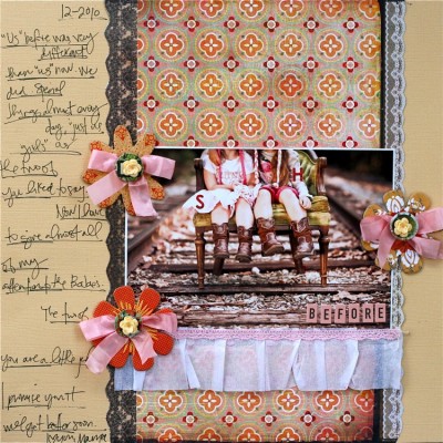
In Stephanie Howell’s layout, “Before,” the visual triangle formed by her three custom flowers is hard to miss as it frames the sweet photo of her girls.
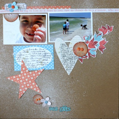 “Sea Gifts” by Doris Sander for JBS Mercantile
I am a self-professed color triangle junkie. I love to throw a wide variety of colors on my layouts and the color triangle is how I get them all to mesh and balance.
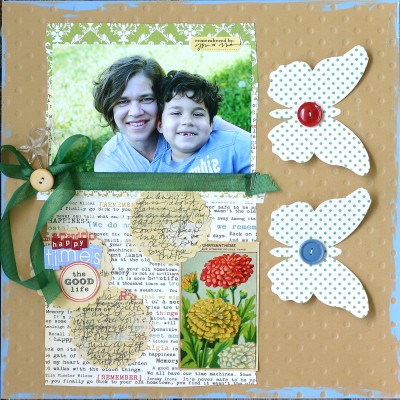
I chose my layout, “Happy Times,” to illustrate this point because it has several readily apparent color triangles. See:
- the red one with the title, button, and flower;
- the blue one with the title, button, and photo;
- the yellow one with the sticker tab, button, and flower; and
- the green one with the photo mat, butterflies, and flower leaves.
I love creating this type of fun multi-colored layout. It’s like all the elements are doing the happy dance across my page.
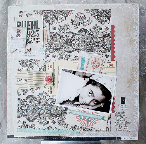
My next favorite visual triangle is the one involving text. On “Depth of Field,” I’ve let my handwriting seemingly drift aimlessly down the page. In reality it is in three specific spots to provide harmony to a page that might otherwise feel disjointed.
3. the visual triangle made with shapes
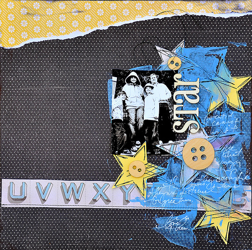
Basic shapes can also work nicely in a visual triangle. On “Star,” Dina placed a triangle of three buttons around her photo–and then she’s made an opposite-facing triangle created with the three yellow stars in her collage. While these two triangles add stability to the design, they also serve the dual purpose of adding a bit of tension with the extra yellow strip at the top of the layout.
4. the visual triangle made with dimension
Be on the lookout for visual triangles on your pages and I guarantee you will love the results (and become addicted) once you start adding a few.
[dsander]

