by Debbie Hodge | Feb 23, 2012 | Color
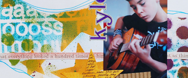
A complementary color scheme uses colors opposite one another on the color wheel, for example red and green or blue and orange. This is the highest contrast color scheme. Use it with fully saturated colors, and you’ve got a strong, vibrant look. If you...

by Debbie Hodge | Feb 20, 2012 | Design Elements, Design Principles, Design Your Story, Journaling
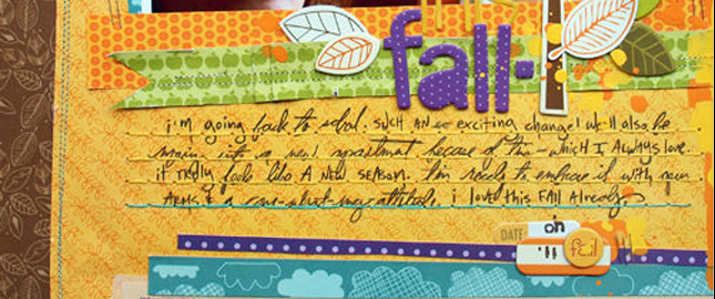
by Debbie Hodge Texture is tactile. When you add texture and dimension to your scrapbook page, you engage the viewer’s sense of touch — another sense in addition to sight. As a result you draw your viewer in on another level. It’s an obvious design...

by Debbie Hodge | Feb 16, 2012 | Color
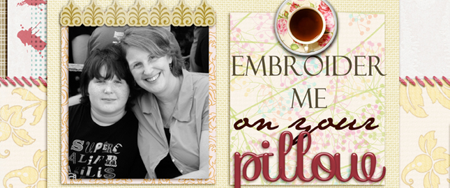
by Debbie Hodge A monochromatic color scheme uses variations in lightness and saturation of one color for most of the elements on your scrapbook page. Neutrals are often combined with the monochromatic colors. A scrapbook page with a monochromatic color scheme looks...

by Debbie Hodge | Feb 9, 2012 | Composition
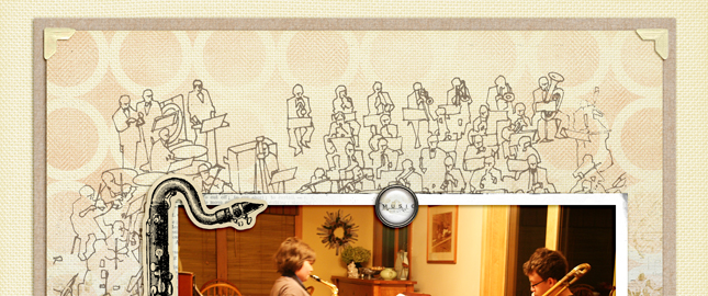
by Debbie Hodge When you make a scrapbook page you are combining elements (photos, text, embellishments, journaling, title) within space (your canvas). Your canvas shape and size are what define the space within which you create. The edges of the canvas define your...

by Debbie Hodge | Feb 2, 2012 | Ideas via Product & Technique, Patterned Paper
by Debbie Hodge Since antiquity, patterns have been incorporated into tiles, linens, rugs, wallpaper, dishes, upholstery, clothing, and more. Pattern and texture are wonderful tools for adding interest to scrapbook pages, especially when they’re mixed well....

by Debbie Hodge | Jan 26, 2012 | Design Principles
by Debbie Hodge A successful scrapbook page captures the viewer’s attention, controls the eye’s movement, conveys information, and evokes emotion. That first task–capturing the eye’s attention–is the work of making a focal point. About Focal Points A...
