

One function of a frame is to set a framed piece off from its surroundings. The white frames on these photos contrast strongly with the darker wall and create separation between the two.
by Debbie Hodge
When you make a scrapbook page you are combining elements (photos, text, embellishments, journaling, title) within space (your canvas). Your canvas shape and size are what define the space within which you create.
The edges of the canvas define your scrapbook page boundaries and the treatment of them offers opportunities for affecting how a viewer sees your page. You can use framing and matting to orient the viewer’s perspective of your scrapbook page.
Why would you want to do this? To get the viewer’s eye and mind immersed in your page and taking in its story.
Adding a frame to a scrapbook page can:
- make a more aesthetically pleasing image
- keep the viewer’s eye focused on the framed image
- add depth to create the sense of a window presenting a subject being viewed in three-dimensional space
- emphasize the separation of the image from its immediate environment (and, thus, create the sense of a metaphorical window into another time and space)
1. Add a frame for aesthetics
I often frame or mat my pages as I’ve done on “1 More Time,” choosing cardstock or patterned paper that enhances the elements on the canvas and adds repetitions of color or motif.

2. Add a frame to focus and contain the eye
Not only does a frame focus the viewer’s eye initially,it also acts as a border that keeps the eye from straying off the canvas.
The mat beneath my photo on “Jammin'” is layered with masked brushwork bleeding off page edge and a large, detailed stamp of a concert band. Before I matted the piece, my eye was wandering off the edge of the canvas. With double matting, though, it becomes a more cohesive piece with a figure that holds my eye.
Jammin' by Debbie Hodge | Supplies: Artplay Palette Concerto, Vintage Fotokorners by Anna Aspnes; Just Hint At It Brushes No 6 by Lynn Grieveson; Krafty Canvas No 1 by Katie Pertiet; Just Linens No 1 by Maplebrook Studios. Century Gothic, Impact fonts.

You can contain the eye with a simple border like the one on Anna Aspnes ‘”Spring Crafts.” The dark black scallops around the edge contrast with the white canvas and keep the eye within the piece even as the large blended photo on the page bleed off diagonal corners.
Spring Crafts by Anna Aspnes (Masterful Scrapbook Design Canvas Issue) | Supplies: ArtPlay Palette Easter Bunny, SprayPaint No. 2, AnnaBlendz Artsy No. 2, FotoGlow Flowers No. 1, ThinStrips Masks No. 2

Karen Grunberg makes most of her scrapbook pages on white cardstock, and she almost always frames the composition with a stitched border as shown on “I Know the Feeling.” It gives the page more defined edges and keeps the eye from straying off the canvas.
I Know the Feeling by Karen Grunberg (Masterful Scrapbook Design Photos Issue)

3. Add a frame with depth to create a sense of 3D viewing
A frame with lots of depth can act as a window and create the illusion of seeing that subject in three-dimensional space. See how the ornately decorated and deep frame on this portrait does this.
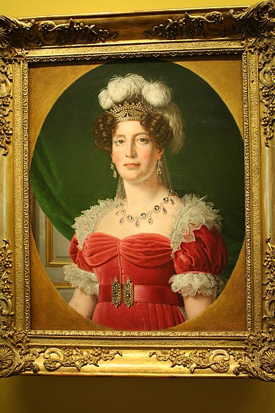
Portrait of Marie Thérèse Charlotte de France by Alexandre-François Caminade
Melanie Grimes has created this sense of viewing her photo in three dimensions on “Go Climb A Tree.” The wide deep aged photo frame and the woodgrain backdrop as well as the subject of the photo all combine to create this effect on the viewer.
Go Climb a Tree by Melanie Grimes | Supplies: Katie Pertiet -Square date spots date spots No. 1, krafty cuts leaves, twill definitions No. 3, Christmas memories Kit branch {recoloured} Santa land kit fir branch, Game cards holiday, working woods papers, weathered wood word strips No. 1, My baby kit frame, Ali edwards ‘go outside’ word art

4. Add a frame to separate an image from its surroundings and create a metaphorical window
When you emphasize the boundaries between an image and the immediate environment in which it’s being viewed, you are separating it from that environment in both time and space.
When you do this it’s possible create a sense of a metaphorical window into the time and space of your image.
The wide mat on “Life is in the Details” boldly demarcates the vivid scene Jana Morton has created from its surroundings. This “framing” is a powerful window into the world of a little boy at play in the grass.
Life is in the Details by Jana Morton | Supplies: Katie Pertiet: Art Time Element Pack, Vintage Text Paper, Alandia Rancheros Kit, Defined Discs No. 1, Lifted Wings No. 3, Little Shores Kit, Eat Cake Photo Corners. Anna Aspnes: Label Transfers 2, Art Play Palette 8, Magic Flares No. 1, ArtPlay Palette No. 2, Wander Kit, Fotoblendz Overlays No. 1, Spackle Texture, Curvy Corners Stitch Borders No. 1, Artists Edge Overlays No. 6. Maplebrook Studios: Jelly Alpha No. 18, Just Ribbed No. 2. Pattie Knox: Ragbag Remants, Baker’s Delight Kit, Little Folded Ribbons 2. Jesse Edwards: Caught Red Handed

Look at Lisa Dickinson‘s unframed “Beach Beauty” now. Not only has Lisa forgone a page frame for separating her design from its surroundings — she’s let one of the elements within that composition extend beyond the page edge.
The result is that this design is not separate in time and place from the viewer, but, rather, occupying the same space and place.
Beach Beauty by Lisa Dickinson (Masterful Scrapbook Design Design Play Issue) | supplies: cardstock (Bazzill Basics, KI Memories) + patterned paper, chipboard, brads, jewels (KI Memories) + die cut machine (Silhouette by QuicKutz) + Halo Handletter font + date stamp

I usually add framing or matting near the end of my page creation. What about you? Do you often frame or mat your compositions? Is it for one of the reasons above or something else? Do you ever not only forgo a frame, but extend your elements off the canvas?
