by Debbie Hodge | Apr 30, 2012 | Design Principles, Ideas Spurred by Design
by Debbie Hodge When you incorporate visual flow into your scrapbook page design, you guide the viewer’s eye through it, ensuring they understand what’s important about the story you are telling. The most common types of scrapbook page flow are visual triangle,...

by Debbie Hodge | Apr 26, 2012 | Color
by Debbie Hodge The work of selecting and combining colors for scrapbook pages is much like the work of of employing design principles: it’s not a straightforward, step-by-step task. Rather, it’s one with points or questions to hold loosely in you mind and cycle...

by Debbie Hodge | Apr 26, 2012 | Design Principles
by Debbie Hodge A focal point is the center of a design. It is the most important part (or parts) of a piece. A scrapbook page benefits from having a focal point because Without some variation in emphasis among the elements on your page, everything takes on the same...

by Debbie Hodge | Apr 25, 2012 | Composition
by Debbie Hodge There are several layout configurations of combined elements that scrapbookers use again and again when making scrapbook pages (for example, blocked, clustered, and shaped). These foundations are used again and again because they work well for housing...

by Debbie Hodge | Apr 12, 2012 | Composition, Finding and Using Inspiration, Lift These Ideas, Photos, Picture Your Story
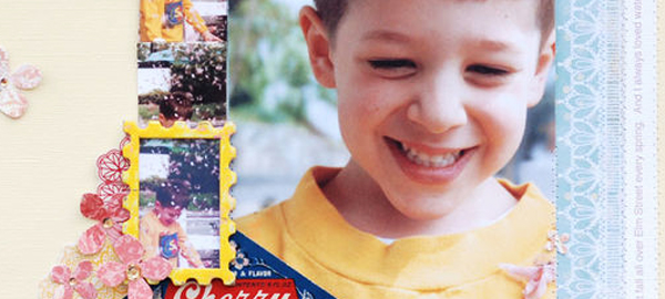
Betsy Sammarco scrapbooked two of her favorite photos on “Cherry Blossoms.” One photo is enlarged and the other is repeated many times — with one instance of it framed. (Check out 4 Ways to Use Repeated Photos for more scrapbook page ideas.)...

by Debbie Hodge | Apr 11, 2012 | Design Principles, Titles
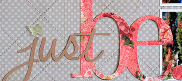
When one element is different from another, there is contrast. The bigger the differences, the greater the contrast. Greater (i.e., obvious) contrast is what you’re after to make better page designs because contrast draws the eye and makes your elements...
