 When one element is different from another, there is contrast. The bigger the differences, the greater the contrast. Greater (i.e., obvious) contrast is what you’re after to make better page designs because contrast draws the eye and makes your elements “pop.”
Contrast in titles
Your title can not only contrast with the other elements on the scrapbook page — it can also have contrast between the parts that make it up.
You can add contrasts in color, typeface, size, dimension, styling and more. Take a look at five pages with high contrast titles.
1. Juxtapose freestyle script with traditional serif
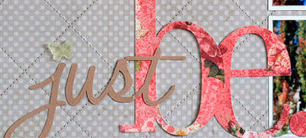
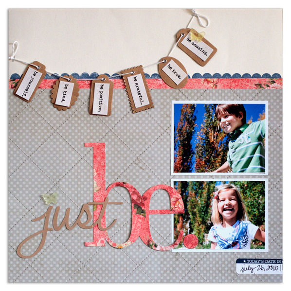
On “Just Be,” Lisa Dickinson used a casual, handwriting-style for the word “just” and paired it with a solid, bold serif font for the word “be.”
Lisa says, “I love the juxtaposition of a loopy, freestyle script with a traditional serif font–or a sleek, san serif font mixed with an rustic, eroded typewriter font While the mix of font styles adds insterest and makes the title visually appealing, it also is used to represent the variety of emotions on this page. The script font reflects the free and happy feeling portrayed in the photos, while the more classic serif font conveys the more serious advice featured in the tag banner.”

Just Be by Lisa Dickinson | Supplies: Just Be by Lisa Dickinson | Supplies: cardstock (Bazzill Basics) + patterned paper (Webster's Pages - pink; Lily Bee Design - grey) + stamp, ink, label (Jenni Bowlin Studio) + tags, mist (Maya Road) + journal strips (Pink Paislee) + acrylic butterflies (John Allen) + fonts (Halo Handletter, Didot) + die cut machine (Silhouette by Quickutz) + pen (American Crafts)
2. Match typeface “personality” to word meaning
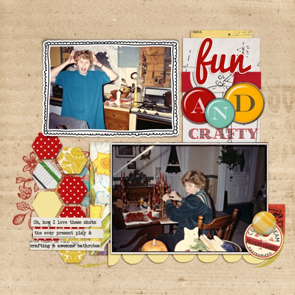
As I made “Fun AND Crafty” showing two sides of my mom, I used two typefaces that I feel convey each of those sides. The thick and loopy Pacifico is great for “fun” while an etched, multi-colored typeface goes with the idea of “crafty.” To draw even more attention to the titlework AND the differences I’m conveying, I used large glossy epoxy alphas for the word “and.”

Fun AND Crafty by Debbie Hodge | Supplies: Precocious, Ephemera Stacks by Krista Sahlin; Rimmed Framers, Doodle Do Frames No 2, Journaling Strips by Katie Pertiet; PuddleRounds Alpha by Amy Martin; Zoey by Amy Wolff; ATC Yellow, Splatter Graffiti Gypsy Spirit by Tangie Baxter; Child Play by Paula Kesselring
3. Pop AND soothe with dimensional contrast
The message of Kayleigh Wiles‘ page “Keep Calm” is exactly what the title says, and her titlework choices draw the eye and convey this message. There’s contrast in dimension, texture, size and tone between the thick and glossy epoxies and the flat font rendered in a shade of blue that’s just a bit darker blue than the canvas upon which it sits.

Keep Calm by Kayleigh Wiles | Supplies: Lucious Kit by Maplebrook Studios; Vintage Photo Frames No. 25, Basic Polka Dot Ribbons No. 01 and Tabbed Dates by Katie Pertiet; Hint at it No. 08 Brushes by Lynn Grieveson; Easy Curled Edges No. 01, LoopDaLoop Artstrokes No. 04 BrushSet, ArtPlay Palatte Special One & Seafoam by Anna Aspnes; Painted Christmas Words Brushes and Stamps by Ali Edwards
4. Deliver bigger punches with large-size contrasts
Emily Pitts used a whole “lotta” BIG in her titlework on “Happy Girls are the Prettiest.”
It not only grabs the eye, it shouts “happy” as a result of the colors and casual typefaces. Emily says, “I wanted a nice big alphabet so I hand-cut my own and paired them with tiny clips for “are the.”
Emily says, “You don’t have to be afraid of hand cutting letters; they don’t have to be perfect! I then backed each letter in a darker (or lighter) piece of cardstock so they’d have a bit of a border. This allowed them to stand out against the photo.”

Happy Girls by Emily Pitts | Supplies: Patterned Paper: Simple Stories, Chipboard: Maya Road, Embossing Powder: American Crafts, Ink: Tsukeniko, Mist: Maya Road, Ribbon: Maya Road, Pearls: KaiserCraft, Twine: Maya Road, Thread: Coats and Clark
5. Mix up fonts within one word
Anna Aspnes not only contrasted the words in her title here, she contrasted the letters within the word “good.”
Anna says, “Using multiple fonts in coordinating colors is one of my most favored titlework techniques. The key to successful implementation of this technique is to select complementary fonts that create balance. For example, pair your fonts so that an artsy scripted or handwritten font is balanced by a more simple serif font for example.”
“Two serif fonts can lack interest but two script fonts can overwhelm the eye. Combining one with the other often creates the perfect balance. I also like to mix fonts and sizes within a single word to create a focal point. The wordart is completed by selecting colors from my layout using the color picker. On this layout I also used Photoshop Transform tools (Perspective and Warp) to manipulate the word “memories” to make it look as though it were printed on the envelope in the underlying image.

7 Good Birthday Memories by Anna Aspnes | Supplies: MultiFoto DoublePage Template No. 13, ArtPlay Palette WHPH, Straightline Stitched White No. 1
[designclass]

