by Debbie Hodge | Jan 24, 2013 | DoubleUp, Feature, Sketches and Layered Templates
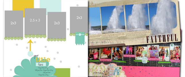
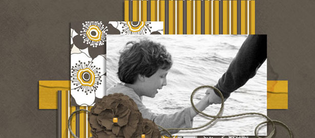
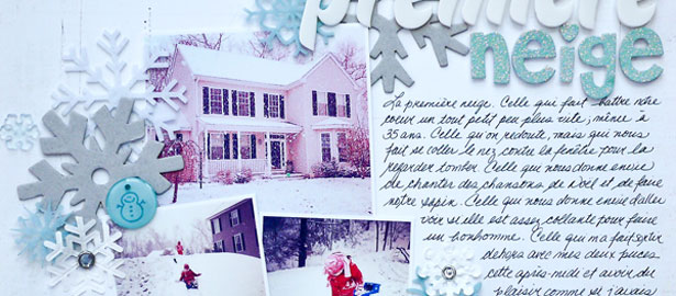
See how scrapbookers Katie Scott, Terry Billman and Brenda Becknell used a one-page sketch/template from Amy Kingsford’s Scrap Like Doris Sander Bundle on their two-page layouts. Katie Scott stuck fairly close the to the design of the sketch and chose...

by Debbie Hodge | Jan 23, 2013 | Feature, Patterned Paper
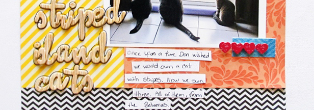
Pattern is incorporated into tiles, linens, rugs, wallpaper, dishes, upholstery, clothing, and more. Pattern is a great tool for adding interest to scrapbook pages, especially when it’s mixed well. Patterned papers for scrapbooking (and decorating) fall into in...

by Debbie Hodge | Jan 17, 2013 | Composition, Feature, Photos
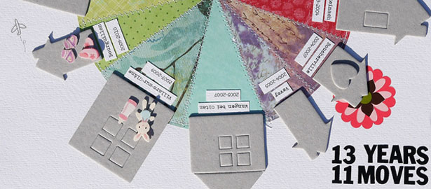
While photos are often the catalyst for a scrapbook page, other times there are stories you’d like to tell even though you don’t have photos to go with them. Paula Gilarde wrote about the 5 approaches she uses for replacing photos, and now our Creative...

by Debbie Hodge | Jan 16, 2013 | Color, Feature
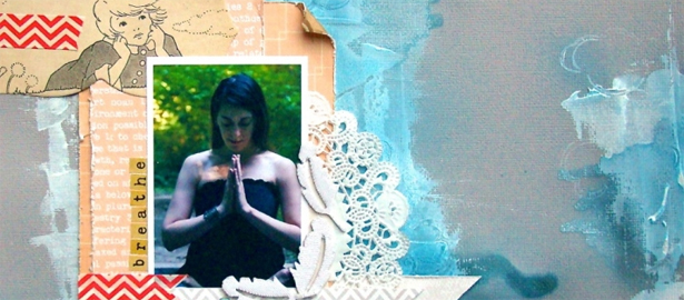
Studies have found that a majority of humans share physiological reactions to certain colors. These responses are different from psychological associations viewers have with colors which will are dependent upon experiences and culture. Physiological responses have...

by Debbie Hodge | Jan 9, 2013 | Feature, Ideas from Current Trends, Patterned Paper
Home decor trends can be a good source of ideas for scrapbook page design. Julie Rogowski of the Boston Decorating Center says that when it comes to home decorating currently, the emphasis is changing from ‘Where can I save the most money’ to ‘What’s...

by Debbie Hodge | Jan 6, 2013 | Design Principles, Feature
The visual triangleWhen you have three spots on your page that have something in common and that stand out, they catch the viewer’s eye. The viewer’s mind looks for things that stand out. Check out these idea for making visual triangles: 4 ways to...
