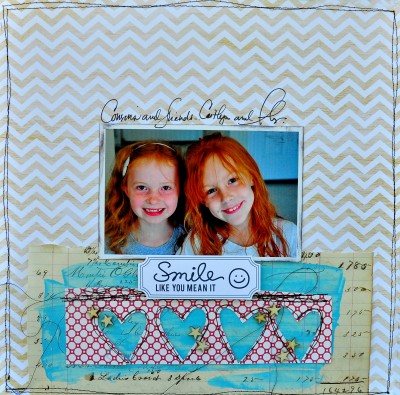
Smile by Dina Wakley | Supply List: Paper: Studio Calico, Vintage ledger, Jenni Bowlin Studios; Word die cut: Basic Grey; Wood stars: Studio Calico
Pattern is incorporated into tiles, linens, rugs, wallpaper, dishes, upholstery, clothing, and more. Pattern is a great tool for adding interest to scrapbook pages, especially when it’s mixed well.
Patterned papers for scrapbooking (and decorating) fall into in four types: floral, geometric, motif, and pictorial. With any combination try to use:
- a mix of large and small scale prints,
- prints that vary in their density (i.e., how closely the motifs are placed), and
- colors that work together.
The Get It Scrapped Creative Team has made pages that use THREE — no more and no less — patterned papers. See how they’ve made their pattern choices and put them to work on scrapbook pages, then set yourself the challenge to make your next page with THREE patterned papers — no more and no less.
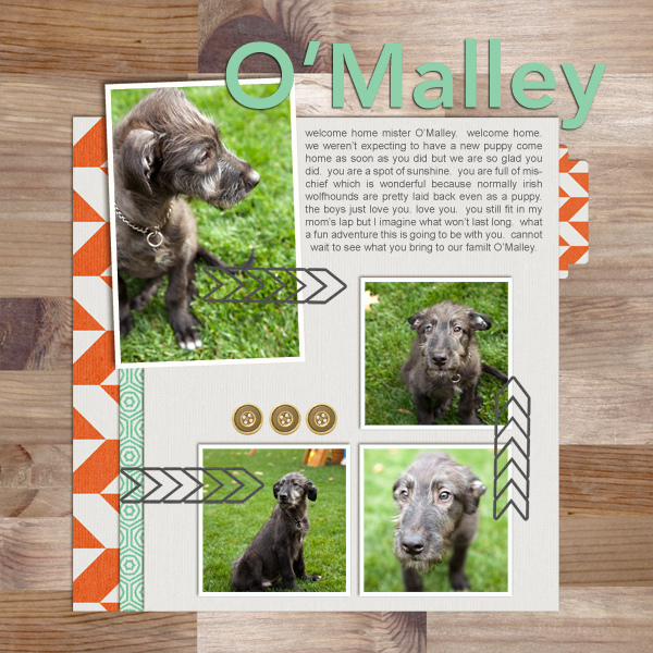
Tara McKernin says, “I paired a neutral wood pattern and with a bold orange herringbone. I then added a smaller scale turquoise geometric pattern to the mix to offset the others in color and scale.”
Christy Strickler says, “This page is about my 3 tabby cats, adopted while living in the Bahamas. I included a striped paper to support the theme of striped cats then added a coral floral print to symbolize the island they come from. The color is common on conch shells and also at the resort where my husband works. The chevron pattern reminds me of waves.”
“The photo looked best when backed by the less-busy floral print, and I used it in a “gallon” quantity with the striped papers in quart and pint quantities. The diagonal yellow lines lead the eye to the photo, and the wood veneer alphas are like driftwood. Almost all of the supplies came from the same collection. This made it easy to choose and mix the patterned papers. It was simply a matter of how I associated the papers and embellishments with my story.”
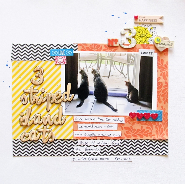
3 Striped Island Cats by Christy Strickler Supplies| Cardstock: Colorbok; Patterned Paper, Die Cuts, Stickers,Alphas: American Crafts;Chipboard: Sassafrass,October Afternoon; Mist: Ranger; Other: wood heart
Dina Wakley says, “I rarely use a whole sheet of paper without cutting it down in some way, but I liked the overall look of the chevron.” She added two more prints, modifying each of them. The vintage ledger makes a shelf below her photo and she’s painted a blue swath across it to back up the red and white geometric print with hearts punched out and balck stitching around the edge.

Smile by Dina Wakley | Supply List: Paper: Studio Calico, Vintage ledger, Jenni Bowlin Studios; Word die cut: Basic Grey; Wood stars: Studio Calico
Doris Sander blocked her background into two pieces. The white-on-grey star print has less visual weight than the teal geometric and works well at page top. A tab of patterned paper in a third print peeks out below each photo.
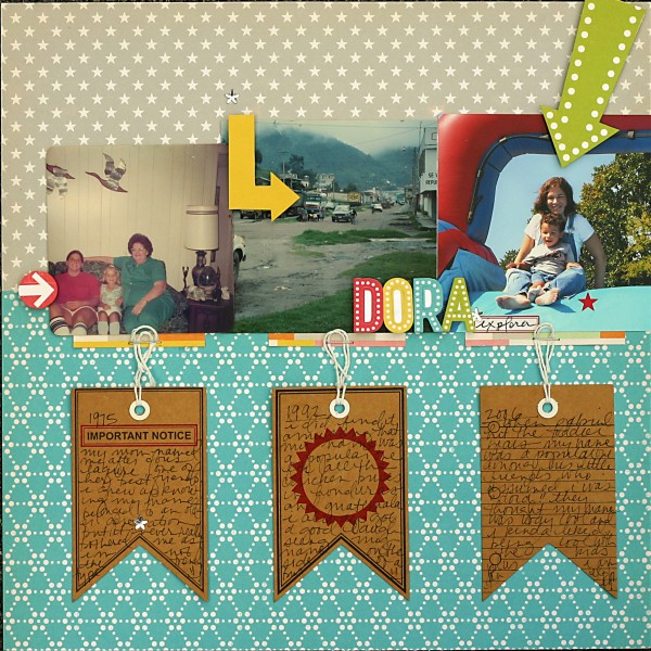
Dora by Doris Sander | Supplies: patterned paper, alphabet stickers – October Afternoon, journaling tags, label stickers, rhinestone stars – Jenni Bowlin Studio
Vicki Walters combined all floral prints on her page. The blue has a single oversized flower motif. The yellow paper has a tone-on-tone floral print and the white has an even more subtle tone-on-ton pattern. She mixed the three in gallon-quart-pint quantities. A single flower embellishment accents the three floral prints.
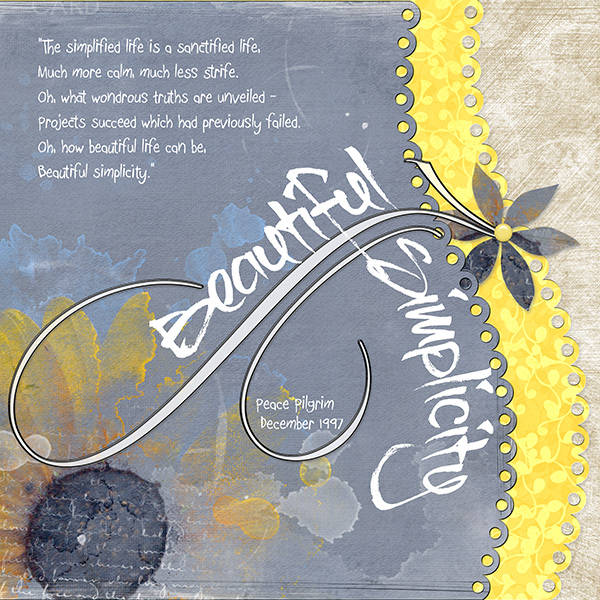
Beautiful Simplicity by Vicki Walters | Supplies: Fonts BrushTipC and Boopee; Anna Aspnes: Color Fall Paperie, FloralArt Paperie no 10, Fluffy Stuff Pet Paperie and FloraPaper Layered Templates no 1; Jen Maddocks Designs:Edgy and Artisian Favorite Templates.
Kiki Kougioumtzi says, “I chose two florals and a polka dot print for a page I wanted to feel girly and playful. I chose prints in pink and blue to echo the colors in the photo.”
Kiki used one large-scale, dense floral print with a second smaller-motif and less dense floral print and a small scale Swiss dot. She made generous use of cardstock mats to give her many patterned banners definition — to define where one ends and the other begins.
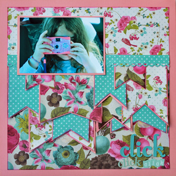
Click click click by Kiki Kougioumtzi|Supplies:Patterned papers:Prima, Echo Park;Cardstock:Bazzill Basics;Alpha stickers:American Crafts,Echo Park,Webster’s Pages;Other:Paper border punch Martha Stewart, Clearsnap Colorbox ink.
Meghann Andrew says, “The three patterned papers I used on this layout were featured in a kit, which made it easy to choose. If you don’t subscribe to a scrapbooking kit, you can always study different kits to see what kind of patterns they are mixing.”
Meghann used the yellow geometric for her background because its tone-on-tone and small-scale design let it show off other layers without confusion. The small floral print complemeted her Mary Poppins theme and the red arrow pattern made a bright mat for her photo.”
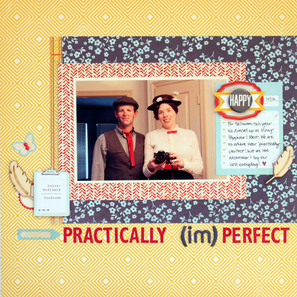
Practically Imperfect| by Meghann Andrew| Supplies (from Studio Calico’s November kit and add-on): Cardstock- American Crafts; patterned paper- October Afternoon (yellow), Basic Grey (red & blue floral); vellum tape- Basic Grey; stickers- Jenni Bowlin (red letters & red pinked circle), Basic Grey (black letters), Studio Calico (red label); transparent shapes & journaling tag- Basic Grey (arrow, butterfly); cardstock shape- American Crafts (clipboard shape); wood veneer- Studio Calico; journaling pennants- Elle’s Studio; epoxy dots- My Mind’s Eye
Deborah Wagner says, “I wanted to evoke a soft dreamy feeling, as if my photo were floating away on the clouds, and, thus, my first selection was the fairy patterned paper. I positioned the paper to show only one fairy so I could place my title on top of it. The next paper I chose was the background paper. This one had much more color, texture and pattern to it; and it gave me the “floating on clouds” look I wanted. The 3rd choice was a simple flourished paper without much color, but it added some texture, and supported my theme.”
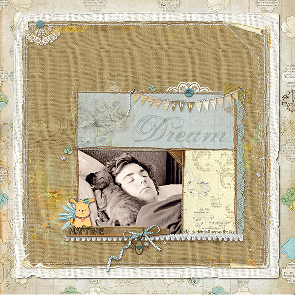
Shh by Deborah Wagner. Supplies – Designer Digitals: Katie Pertiet – Far Away Fairy Land Kit, Chandra Kit, Defined Tapes No. 2, Catana Kit, Garden Stakes Words, Banner Twine Templates No. 1, You And Me Kit, Crowning Affair Vibrant Kit, Graduation Quotes, Watery Pencil Lines Fairies, Wooden Photo Corners No.1, Dog Park Kit, Carte Post Kit, Painted Overlays No. 1, Scatterings No. 1, Stamped Doilies No. 1, Messy Stitched Borders White No. 2, Spring Twists No. 1, Elfin Magic Kit; Lynn Grieveson – Worn Photo Edges, Worn Page Edges
Doris Sander says, “I used three subtle one color patterned papers in a feminine blend of toilles and doilies to set the stage for this layout. While the focal photo is of my son holding a bamboo shoot, the layout is actually about the relationship the two of us have and our shadows can be seen in the bamboo of the larger photo. The soft patterned paper choices help emphasize my presence in the photos without overpowering them.”
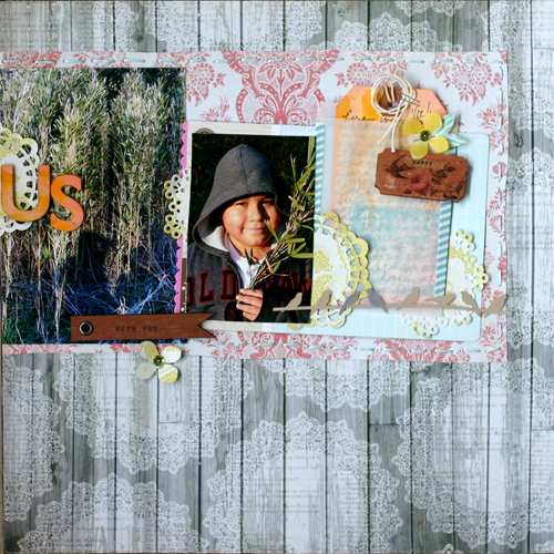
Us by Doris Sander | Supplies: patterned paper – My Mind’s Eye, doily die-cuts – Paper Tray Ink, punch – Martha Stewart, wooden embellishments – Prima, wooden letters – Pink Paislee, tag – Avery, stamp – JBS Mercantile, other – rhinestones, washi tape, vellum
Brenda Becknell says, “When my scrap bin starts to fill up with leftover pieces of paper, I try to make a layout using only these smaller pieces of paper, which is what I did with this page. I loved the colors in the argyle plaid piece, plus it contained all the colors in my photo. I chose the darker blue print to add some depth, and then lightened things up with the yellow lined paper. The kraft cardstock made a nice neutral base for the splash of color.”
“To help tie everything together, I matted the photo and all the papers with a very thin border of dark teal cardstock, and then matted the kraft background with the same dark teal. To help the title words stand out, I used black rubons and alphabet stickers, and placed them on banners cut from the plaid paper, with gem brads as accents. Since the yellow paper piece was so much lighter than the rest of the background, it needed a little something to fill the space, so I made another banner from the plaid paper and added gem brad accents.””
I wasn’t really trying to adhere to the gallon/quart/pint theory of color when I put this page together, but it came out pretty close.”
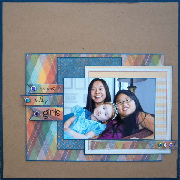
Sweet, Silly Girls by Brend a Becknell | Supplies: Cardstock: Michaelsm Bazzill, Patterned Paper: We R Memory Keepers, Fancy Pants, Rubon alphabet: American Crafts, Alphabet Stickers: Doodlebug, Brads: Making Memories
Debbie Hodge blocked her page into 4 sections, filling the largest area (and its diagonal opposite) with an oversized ornamental print. The bottom right corner is an outlined floral and then border strips have the same pattern but in yellow and white.
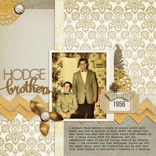
Hodge Brothers by Debbie Hodge | Supplies: Big Ideas by One Little Bird; Retro Mod by Sahlin Studio; Petals 3 by Sara Gleason; Reminisce by Leora Sanford; Coastal, Garden Song Letter Box by Katie Pertiet; Bollywood by Brittish Designs; Mercury Script, Bohemian Typewriter fonts
Emily Pitts blocked her canvas with three tone-on-tone prints in bold colors.
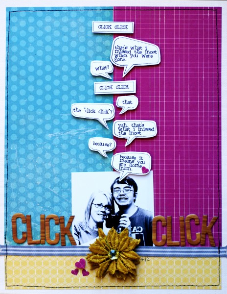
Click Click by Emily Pitts | Supplies: Cardstock: American Crafts (cream), Bazzill Basics (white); Patterned Paper: Simple Stories (turquoise), American Crafts (magenta), My Mind’s Eye (yellow); Flower: Maya Road; Mist: Maya Road; Ribbon: Maya Road; Alphabet: American Crafts for Studio Calico; Punch: Martha Stewart; Font: Black Boys on Mopeds; Pen: Micron; Thread: Coats and Clark; Software: Photoshop CS3
[patternedpaper]

