
 Studies have found that a majority of humans share physiological reactions to certain colors.
These responses are different from psychological associations viewers have with colors which will are dependent upon experiences and culture. Physiological responses have to do with the way the viewer’s body responds, for example creating calm or excitement.
A physiological response to red is to feel stimulated or aggressive, passionate or dangerous, while psychological associations with red include love and wealth. Take a look at pages incorporating colors aimed at evoking physiological responses that support the page subject.
- BLACK: Powerful, strong, commanding, ominous, depressing.
- BLUE: Calming, comforting, soothing. People are more productive in blue rooms. Weight lifters can lift more in blue gyms.
- GREEN: Refreshing, quiet, natural, calming. That’s why they have “green” rooms at TV studios for performers to wait in.
- RED: Stimulating, exciting, aggressive, dominant, dynamic, passionate, dangerous.
- PINK: Tranquilizing. Some sports teams have painted the opponents’ locker room pink to sap their energy and dangerous criminals have been housed in pink cells.
- YELLOW: Cheerful but it’s the most difficult color for the eye to take in. People lose their tempers more often in yellow rooms, and babies cry more.
- WHITE: weak, passive, pure
BLACK: Powerful, strong, commanding, ominous, depressing. Christy Strickler says, “I used black here because it is a commanding, strong color perfect for masculine layouts. I like to use bold, bright colors with black. The black absorbs some of the intensity of the red, blue, yellow and metallic accents.” Marvel Heroes Popping Candy by Christy Strickler Supplies| Cardstock: Colorbok; Embossing folder: Lifestyle Crafts; Brads: Basic Grey;Die cuts: SEI; Other: Candy wrappers, sculpting wire, electrical tape, vellum, sequins Barb Brookbank says, “This is about how determined my grandson is – no matter what he is doing. I used black because it is authoritative and powerful and I thought it fit the theme of karate. I extracted my grandson from a background, ran a texture filter, and clipped him to this strong mask in a way which let the black dominate. I flipped the mask and put it on the diagonal to convey movement and strength.” Determined by Barb Brookbank | Supplies: Anna Aspnes: ArtPlay Palette Bicycle, WarmGlows; Font: Texture Road, Britannic Bold; Quote: Bruce Lee 

BLUE: Calming, comforting, soothing. People are more productive in blue rooms. Weight lifters can lift more in blue gyms.
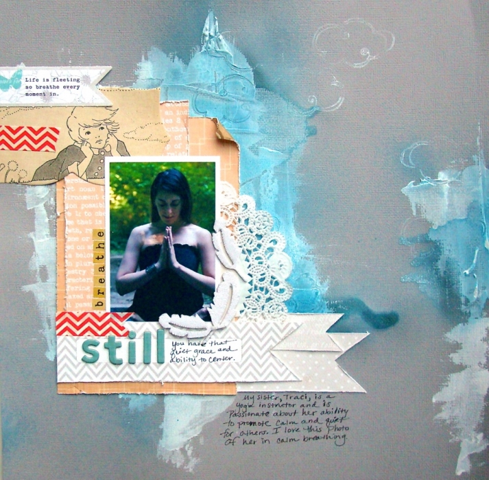
Jennifer Matott used blue to create a sense of peace, calm, and meditation here. She says, “My sister is a yoga instructor and teaches others to be calm and mediative. I wanted to show her in that state along with the color blue that makes me feel calm, cool, collected.”
“The color was applied over gesso to allow it to stand out a bit and also create different tones of blue. I used soft embellishments and stamped into the gesso to create areas where the blue would puddle a bit. Try applying a color over white and then over a colored background to create variations of tone.”
Still by Jennifer Matott | Supplies: Cardstock: Bazzill; Patterned Papers: Scrapbooking From the Inside Out November kit (Cosmo Cricket, Teresa Collins, My Mind’s Eye); Washi Tape: Glitz; Letters: American Crafts & Glitz; Feather stickers: Studio Calico; Doily; Gesso: Liquitex; Spray ink: Tattered Angels
Vicki Walters says, ” There is nothing more peaceful and soothing than being at the seaside with the blue skies and blue sea and the rhythm of the waves. Surrounded by the beautiful blues in nature is the most natural place to feel relaxed and peaceful.”

Blue by Vicki Walters | Supplies: Font Cafe & brewery; ArtPlay Palette H20 and Doily Edge Overlays no 1 by Anna Aspnes at Oscraps.
GREEN: Refreshing, quiet, natural, calming. That’s why they have “green” rooms at TV studios for performers to wait in.
Sue Althouse used green on this page for its quiet, calming effect. “The layout is about Firestone Farm as it looked in the 1880’s. We never miss a stop here on our visits to Greenfield Village. There’s always plenty going on, yet the pace is relaxed and unhurried. I chose to work with olive tones to give the layout a nostalgic, old-fashioned feeling. The white scallop border and coral floral patterns add to this affect, while providing contrast and variety.”

Fire Stone Farm by Sue Althouse | Supplies:Cardstock: Bazzill, Patterned Paper: Echo Park, My Mind’s Eye, Alphabets: American Crafts, Border Sticker: Crate Paper, Brads, Washi Tape: My Mind’s Eye, Mini Pearls: Doodlebug, Punches: EK Success, Fiskars, Martha Stewart, Tonic Studios
Audrey Tan used subtle shades of green here to mimic the calming influence of her dog has on her little boy. “The dog has certainly helped my boy to concentrate on his homework.”

Twosome’ by Audrey Tan | Supplies:Viva Artistry: Fall Jubilee, Sweet Songs; Anna Aspnes: ArtPlay Palette Sweet Pea, ArtPlay Palette Heraldry, 12×12 Sand Scratched Overlays No1; Pink Reptile Designs: Wicked; Font: Stars From Our Eyes
RED: Stimulating, exciting, aggressive, dominant, dynamic, passionate, dangerous.
Chris Asbury used the color red for a high-contrast page featuring cardinals, which can be quite aggressive birds. Surviving in the snow requires the kind of dominance the red here evokes. The cardinals become the immediate focal point.

Snowbirds by Chris Asbury | Supplies: Anna Aspnes Designs: ArtPlay Palette SnowFun, ArtsyPaint No.1, FotoBlendz Overlays No.2,Skinny Lined Overlays No.2, WarmGlows No.1, Cool Glows No.1, Magic Snow Spray No.1, Magic Snow Overlays No.1, Warping Frames No.2, Crocheted Snow No.1, Crocheted Snow No.2, ArtPlay Palette Sophistica (branch), Music Notes No.1. Photo: courtesy of my friend NancyR.
PINK: Tranquilizing. Some sports teams have painted the opponents’ locker room pink to sap their energy and dangerous criminals have been housed in pink cells. Debbie Hodge says, “I always think of the church fairs and cookie walk on the first Saturday of December as the start to our Christmas season. It’s a fun and relaxing day of visiting the churches and then having a long lunch. I accented ‘Cookie Walk’ with pinks and pale blues — both of which are calming — for a page that’s as relaxing as the day itself.” Cookie Walk by Debbie Hodge | Supplie: Hipster Holiday by Mommyish; Jolly Ole Papers, Jolly Ole Buttons, A Spring Day by Sahlin Studio; Winter Peony Elements, Hey There, Flossy Stitches by Katie Pertiet; A Very Small Alpha, Cliff Notes Warm & Fuzzy Edition by Allison Pennington 
YELLOW: Cheerful but it’s the most difficult color for the eye to take in. People lose their tempers more often in yellow rooms, and babies cry more.
Debbie Hodge says, “Candlepin bowling is an eastern New England, eastern Cananda kind of activity. We had great fun when our Hollywood relatives came for a fall visit and we bowled a few games together. I love yellow and I did want to evoke a cheery tone with this page. Using a herringbone in two-tone yellow and white keeps the yellow from overwhelming the page.”
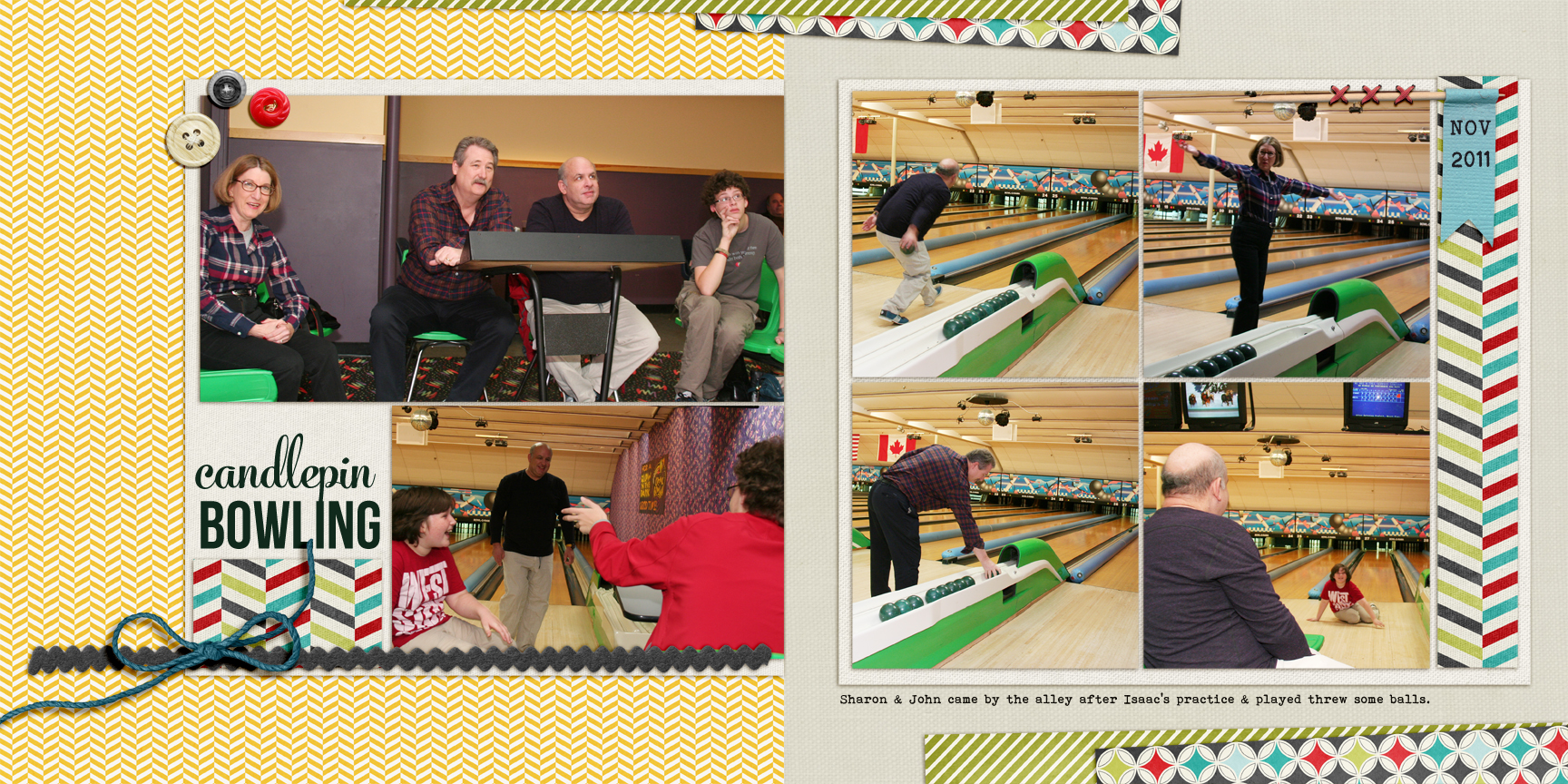
Candlepin Bowling by Debbie Hodge | Supplies: Hipster Holiday by Mommyish; Wesley by Ardent Sparrow; Winter Peoony Elements; Woodland Jangle Alpha and Elements; Flossy Stitches Red by Katie Pertiet; A very Small ALpha, A Simple Mixup ALpha by Lisa Sisneros
WHITE: weak, passive, pure
Katie Scott says, “Looking forward to the Christmas Season, I want to keep this year’s celebration meaningful and simple, with less running around, spending, and stuff hoopla. This year we had simple beach Christmas card photos (and I let the kids pick their clothes) and a real tree (for the first time). I am going to put this layout in a frame in our kitchen to remind us all to keep this season calm and bright, simple and real.”
The white page base, with tone-on-tone title-work and doily paper, emphasizes the simple and pure sense Katie wanted to achieve. She says, “The blue from the water is calming and the setting sun gives us a glow. I lightened up the photo and added a white vignette in Picassa to make the photo look a bit more airy and light.”

Calm & Bright by Katie Scott | Supplies: Cardstock, doilies, chipboard letters, snowflake brad, machine stitching.
Adryane Driscoll says, “I used white to evoke feelings of innocence, calm, and cold. With digital, getting all white elements is pretty simple. After placing the elements, I used a hue/saturation adjustment to achieve the desired tones, which range from white to an off-white. I also used brushes that were set to more of a gray tone to ground the three element clusters. To emphasize my theme, I used softer elements (crocheted snowflakes), clear crystals, white flowers and snow-covered branches. Surrounding the baby with the soft element clusters creates a nice protected space for him to dream his holiday dreams.”

Baby It’s Cold Outside by Adryane Driscoll: Credits: Anna Aspnes: CrochetedSnow No.1, CrochetedSnow No.2, Stitched by Anna Snowflakes No.1, MagicSprinklez No.1, MultiMedia Christmas Trees No.1 (bird), ArtPlay Palette Shabby Christmas, and SnowSpray No.3 Brushes; photos:internet stock
