by Debbie Hodge | Apr 5, 2013 | Composition, Digital / Photoshop Techniques for Scrapbooking, Feature, Time Lapse Video Tutorials, Videos
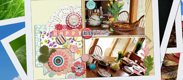
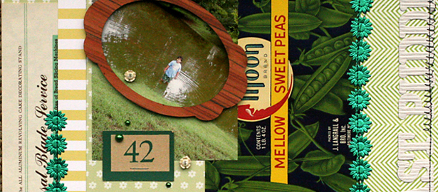
by Debbie Hodge When I began this page I knew that I wanted to make a page that included lots of buttons and pretty bits in a profusion alongside two photos from the Easter Table. I started with two same-sized photos. It took me a bit of time to figure out that I...

by Debbie Hodge | Apr 4, 2013 | Composition, Embellishments, Feature
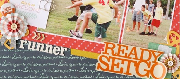
When you set up a visual situation with tension, the viewer feels like something isn’t quite right, that something might happen they don’t want to miss. And so they dive into your piece and stay! One way to add tension to scrapbook pages is to “break...

by Debbie Hodge | Mar 27, 2013 | Composition, Design Principles, News, Videos
About Figure and Ground and Page Foundations Make a “shelf” page with embellishment “scatters” Click here for Quick Reference PDF [box type=”download” icon=”none”] On A Shelf – Available as a part of Scrapbook...

by Debbie Hodge | Mar 27, 2013 | DoubleUp, Feature, Sketches and Layered Templates
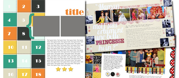
See how scrapbookers Adriana Puckett and Marie-Pierre Capistran used a one-page sketch/template from Amy Kingsford’s August 2012 Sketch/Template Pack on their two-page layouts. balance the smaller photos from the original sketch with a enlargement Adriana...

by Debbie Hodge | Mar 26, 2013 | Color, Feature
You can use color on your scrapbook pages to evoke feelings — and, thus, make your story more powerful and more readily understood. While some color associations derive from personal and cultural experiences that vary around the world, the ones that come...

by Debbie Hodge | Mar 21, 2013 | By # of Photos, Composition, Feature, Photos, Picture Your Story
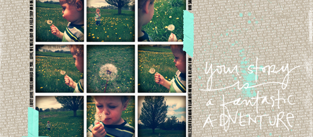
Got lots of photos? Check out the Get It Scrapped team’s ideas for getting 9 photos onto the page. Katie Scott says, “These photos are from a fun layover at the Denver Airport. My husband had seen a show about this airport on the SciFi channel so I took extra...
