
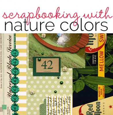
 You can use color on your scrapbook pages to evoke feelings — and, thus, make your story more powerful and more readily understood.
While some color associations derive from personal and cultural experiences that vary around the world, the ones that come from nature are universal. Vegetation is green. The water and the sky are blue.
These color associations cross cultures and endure over time. Here’s a look at some occurrences of color in nature and the resulting associations.
- BLUE found in the ocean and sky => calming, restful
- GREEN found in vegetation, grass, leaves => refreshing, growth, fertility
- RED found in berries, roses, blood => intense, powerful
- YELLOW found in lemons and flowers and the sun => cheerful, sunny
- ORANGE found in butterflies, citrus, and pumpkins => warmth, transition
- PURPLE found in blossoms => can seem artificial if used too much
- BROWN found in earth, wood, stone => steadfast, loyal.
The Get It Scrapped Creative team has used these associations to strenthen the meaning of their scrapbook pages.
The color BLUE is found in the ocean and sky and is associated with calming, and restful feelings
Adryane Driscoll scrapbooked a beach photo with an emphasis on the blue tones of the water and the sky.
She says, “The different blue tones capture the peacefulness of my daughter by the sea without overpowering the tans and yellows of the sand. To heighten the effect of the blues, I played with the photo so that the mountains in the background have a blue tint. I increased the clouds and colors in the sky, and I added a light blue mask behind the photo: it acts as a frame and pulls the blue of the sky down through to the bottom of the page. To keep with the peacefulness of the scene, I added soft, free-form artstrokes and watermarks.

more than by Adryane Driscoll: Credits: Anna Aspnes I FotoNFrameBlendz No.1, ArtPlay Palette Chills, MonoBlendz Avalanche Paperie, Layered FotoBlendz No.7, ArtsyKardz Chills, Cloud Brushes No.1, and ArtPlay Palette Find My Way (brads)
The color GREEN is found in vegetation, grass, and leaves and brings associations of refreshment, growth, and fertility.
Doris Sander says, “Green is such a lovely color to work with. I find that because it is so prominent in nature, it is almost a neutral to the eye. Even though green is very colorful, large doses of it are still very soothing. On this page, I’ve created a patchwork effect with a background of a variety of green patterns. The prints and colors enhance my theme which is especially important in this case as the content of my photo is very small.

Last Puddle by Doris Sander | Supplies l patterned paper – Lisa Dickinson for Jenni Bowlin Studio, alphabet – Pebbles, tab punch – Jenni Bowlin for Fiskars, pearls – Kaiser, wooden frame – Crate Paper, label, price tag, letterhead, flowers – vintage, metallic floral – German foil
The color RED is found in berries, roses, blood and trigger feelings of intensity and power.
Audrey Tan says, “I’ve used the poppy as a symbolism of sleep, peace, and death: sleep because of the opium extracted from poppies and death because of the common blood-red colour of the red poppy. Hence, my page theme is on Remembrance Day, a day in which we commemorate those who died in war. Every year, in November, my boys, as part of their uniform group activities, are involved in Remembrance Day. We usually have a church service and then observe a 2 minute silence. Everyone wears a poppy.”

Remember by Audrey Tan | Supplies: Anna Aspnes: Art Play Palette Poppy; Rosey Posey: Never Forget; Font: Pea Jazz Skinny
The color YELLOW is found in lemons and flowers and the sun and evokes a mood that is cheerful and sunny.
Terry Billman says, “This photo of my grand daughter was taken on a bright sunny day at the beach. I emphasized yellow because it is associated with sunshine, joy, and happiness. Cami is the all of these things to me. She brings an enormous amount of joy and happiness to my life. I often tell her she is my sunshine. To achieve a soft subtle feel to the page I used a white background and yellow brushes sparingly, highlighting the word sunshine in yellow. I used a yellow overlay on the photo to give it more of a yellow cast.”

Sunshine created by Terry Billman| Maplebrook Studios: Just Linens 1, Dara Solids; Katie Pertiet: Touch up Paint, Patterned Letterbox, Letterbox, Pencil Line Twists, Painted Photo Masks 1; Lynn Marie: Mellow, Mellow Photos; Anna Aspnes: Cool Glows 1, Art Play Embrace Life, Art Play Storm, Art Play Special One; Ali Edwards: You Sentiment Quotes
The color ORANGE is found in butterflies, citrus, and pumpkins and can be evocative of warmth or transition.
Christy Strickler says, “Because orange can often be associated with the changing of the seasons — and, thus, transition, it was the perfect color to document a move we made across the island. Not only were we moving to a new home, we were also making a transition from a single family home to a smaller condo. Orange can be highly energetic. Using a vibrant hue meant I needed to ground it with something neutral. The steadfast properties of brown made it the perfect neutral for this layout. The numbers and arrows on the brown paper reinforce that we have moved a number of times. In chemistry, triangles are often used as a symbol for change. I used them here both for their symbolism and as a means to help direct the eye. The orange buttons have a bit of glitter which adds a feeling of excitement evident in any new move. Look closely at the orange patterned papers, and you will see that I have used one stripe, one dot and one floral pattern.”

Moving to P.I. by Christy Strickler Supplies| Patterned Paper: Jillibean Soup,My Mind’s Eye; Alphas: October Afternoon; Tape: Target; Other: Buttons
The color PURPLE is found in blossoms, and can be pretty, but also artificial if used too much
Michelle Houghton says, “It amazes me when I look at these photos how much my daughters have grown and how truly beautiful they are. I think the association of purples in nature to blossoms helps support what I am feeling about my girls. I purposefully picked a paper with large blossoms on it that I could hand cut and add to my page. I love that this particular purple has a lot of red in it, keeping the page warm and helping me showcase the love between my girls and me.”

The Best Things In Life by Michelle Houghton | Supplies: cardstock and patterned paper; Recollections, bling; Prima, letters; American Crafts, ink; Sharpie and Copic, other; jewel tag
The color BROWN is found in earth, wood, and stone, and conveys the ideas of humility, strength, steadfastness and loyalty.
Adriana Puckett says, “Shades of brown reinforce the association with the animals we saw on our safari at Disney’s Animal Kingdom. Brown was a natural color to use as the base of this layout because the colors in the photographs were all in browns, greens, and a little blue. I also brought in gold and blue to the layout’s palette to add a little zing and work off the striped paper. I used 3 different shades of brown in the layout to add depth as well. I find brown to be a good color for grounding a layout as the base or a primary color.”

On Safari by Adriana Puckett | Patterned paper and chipboard embellishments: Bella Boulevard; Cardstock: Basic Grey; Brad: Basic Grey; Silhoutte Cameo – Silhouette giraffe (downloaded design); diecut title (Frankling Gothic Bold font); Sketch found on Pinterest – original source unknown
[current]
