by Amy Kingsford | Jul 31, 2018 | Color, Composition, Feature
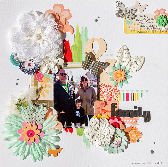
Physical balance in our surroundings is something we’re used to. We understand that if all the kids sit at one end of a narrow bench, it’s going to tip. Achieving balance on a scrapbook page isn’t quite as clear-cut. There isn’t any actual physical weight to work...
by Amy Kingsford | Nov 21, 2017 | Color, Feature, Ideas from Current Trends
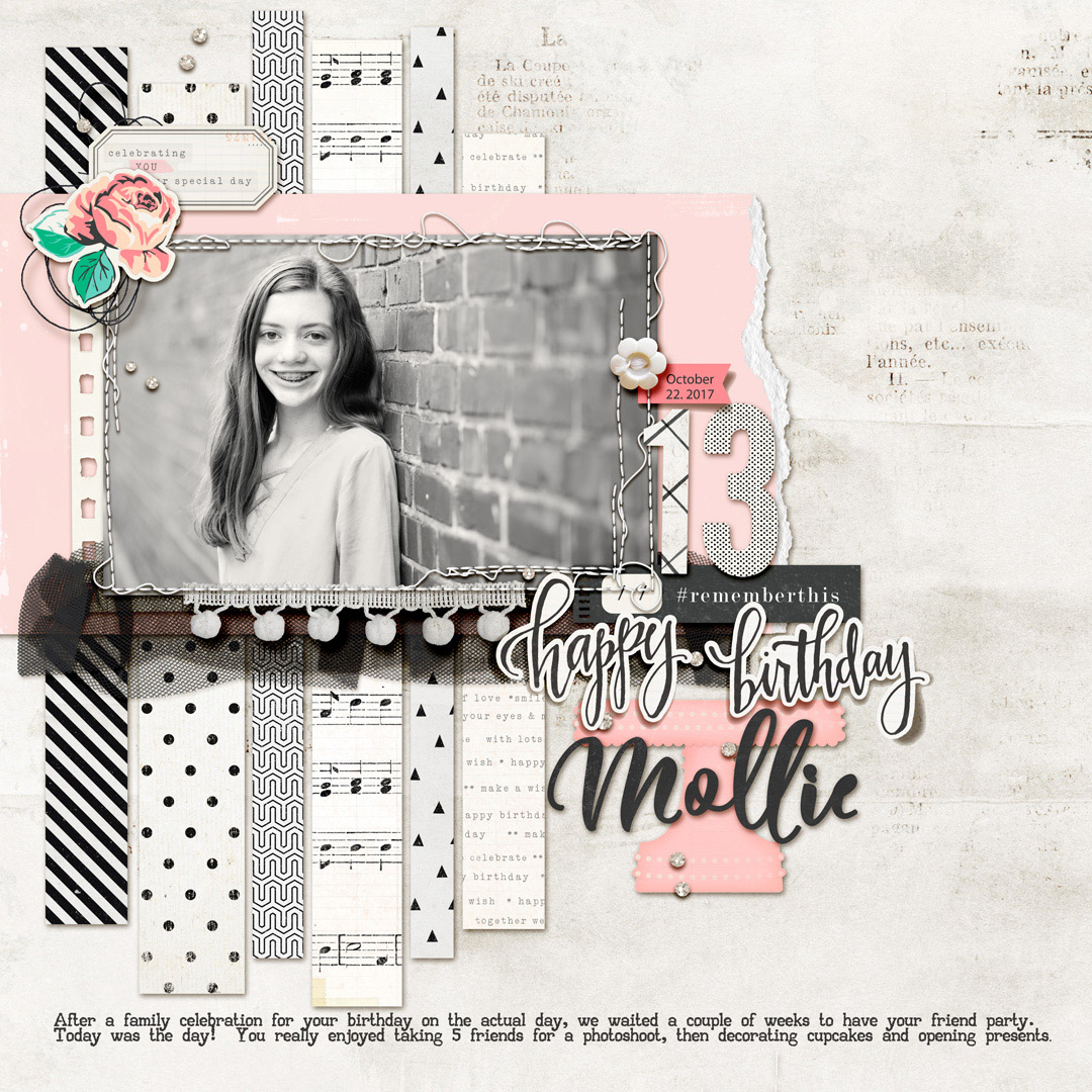
Pairing black and white with pastels is a currently popular color scheme in interior design, fashion, and even scrapbook page supplies. This color scheme can give your page a clean yet playful tone. See here how our creative team has used black and white and pastels...
by Amy Kingsford | Mar 7, 2017 | Color, Feature, Page Guides
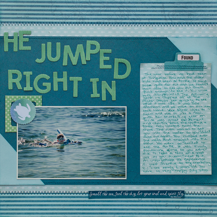
Color is one of your best tools for creating visual impact on the scrapbook page. Quite often this work is done with a bold and rich palette of strongly contrasting colors. You can also create impact with a subtler, limited color palette when you use variations in...
by Debbie Hodge | Jan 5, 2017 | Color, Feature
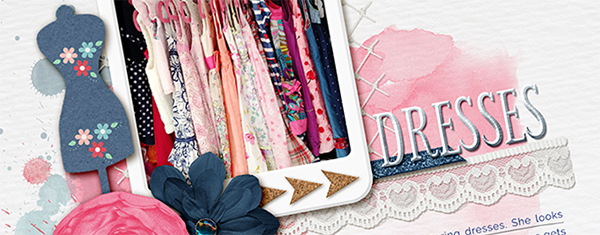
A pink and navy scrapbook page color scheme for your scrapbook pages modernizes a primary color combination, and changes the associations your viewer has with the page. Red has a color story of energy, passion, and danger. Pink, though, is a calming color with...
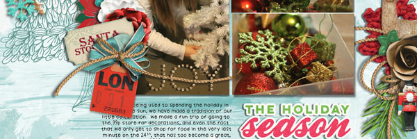
by Amy Kingsford | Dec 20, 2016 | Color, Feature
While complementary colors can give a design punch, they can also present challenges since their strong contrast has them competing with one another–and even with your photos. The Get It Scrapped Creative Team shows you how they worked with three solutions for...
by Amy Kingsford | Oct 4, 2016 | Color, Composition, Design Elements
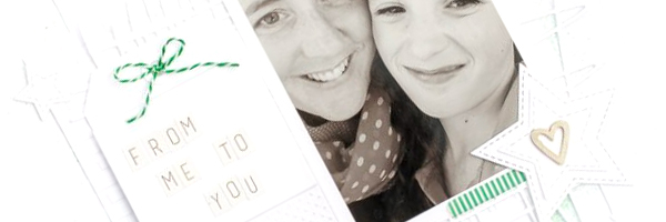
On scrapbook pages, “white space” refers to an area devoid of photos, embellishments, journaling, and title, and there are many good reasons for incorporating this space into your pages. This white space provides a resting point for the eye and breathing room for the...

